New York-based events platform Meetup has released a simplified redesign of its homepage as it pursues a design strategy of paring down features on its desktop Web version and establishing its mobile experience as the product baseline.
We’ve been hearing a lot about companies taking a “mobile-first” approach lately, but Meetup is taking things one step further. Rather than simply prioritizing work on its mobile website and native apps, the company is reworking its platform so that it is not dependent on any non-mobile features.
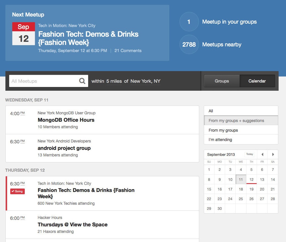
The new member homepage actually collapses two pages into one – the old member home and the find page. It’s a nice clean look that includes group suggestions, calendar information and search functionality on the same page.
This is what it used to look like:
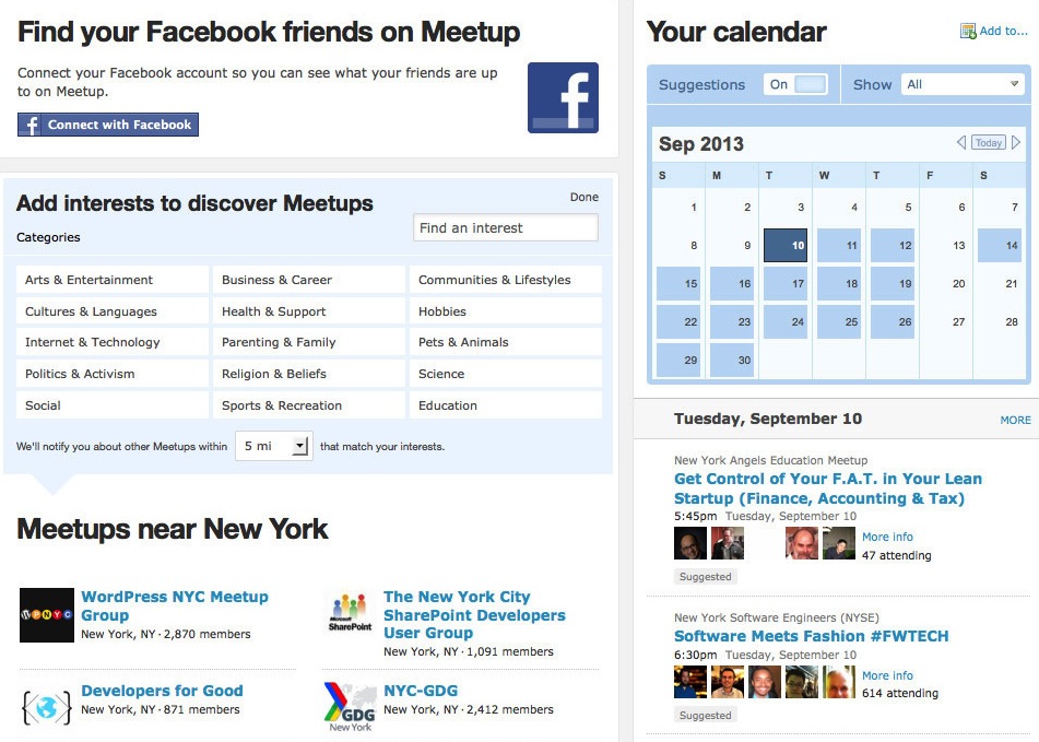 And this is the new design:
Having emerged in the same era as other notoriously plain websites like Craigslist and OpenTable, Meetup isn’t exactly known for cutting edge design. However, the company is using the move to mobile as an opportunity for a fresh look.
“We’re assuming that Web will be dead,” Jimena Almendares, Meetup’s Product Lead, explained in an interview. “If it doesn’t make it to exist on mobile, we’re just throwing it away.”
The process involves evaluating whether each feature in a product has the right to exist and then cleaning up if it doesn’t. The end result for Meetup will be parity across all platforms. The new look is arriving first on desktop, but Meetup is in the midst of bringing these changes to the mobile Web, iOS and Android versions of its service.
Meetup has seen a 380 percent increase in activity on mobile devices since January. Its short-term goal is to achieve an even split between Web and mobile activity.
The company has also been rethinking the 300 million emails and millions of mobile push notifications it sends out every month. Meetup has added an intelligent system for calculating exactly how often to contact users about events. During the design process, the team envisioned notifications as bullets and the system as a gun that could be trained to fire at different ranges based on the priority of the trigger and the preferences of the user. Meetup.com alerts, emails, mobile push notifications and text messages fall on a spectrum of invasiveness that the company uses to personalize settings.
Meetup’s personalization efforts also extend to its group recommendations. Previously, the company used a one-to-one system for suggesting groups based on matched topics, but now it employs 20 variables to try and predict which groups users have a natural affinity for.
The company, which has been around over 10 years, has a lot of data available to base its recommendations on. It has 14 million members and crossed the 100 million total RSVP mark earlier this year.
To test all its new design theories, Meetup has created a usability lab that brings in people daily to try mockups of its products. Along the way, the company decided to abandon designs that were beautiful, but took too much brainpower for users to figure out.
“Meetup was an ugly site that worked,” Almendares confessed. “We want it to not just be the quirky random site – smart but also pretty, but there’s a point where pretty or beautiful can be complex.”
The startup faces a particular challenge because of its highly diverse user base. I’m regularly surprised at the diversity of meetups that are taking place on its platform. The company has to create an interface that both young and old people are able to use.
Almendares says the company makes sure that 90 percent of people will get a design change to know that it’s ready for release. She emphasized the importance of designing not just on buzzwords or trends, but through understanding users and focusing on simplicity.
As Meetup builds up its design department, it is working to preserve the feeling of a small company. The design team takes a holistic view of the service, rather than splitting up based on features and platforms.
Meetup’s goal is to help people go from being inactive to getting out to real-world events. As such, the flow of its user experience is vital to its success. There’s a high amount of friction that Meetup faces in convincing users to get out the door and go hang out with a bunch of strangers, so it spends a lot of time designing the emotional aspect of the site.
At least for now, the Web isn’t going anywhere, so Meetup probably won’t really have to switch to mobile-only. However, the strategy has laid the foundation for a consistent look and feel across platforms while keeping feature bloat, which is all too common among older websites, in check.
Image credit: Creatas
Get the TNW newsletter
Get the most important tech news in your inbox each week.