When physicists at CERN discovered the Higgs boson — the so-called ‘God particle’ — they used Comic Sans to make the announcement. For all the hate it gets by designers, humans love the typeface, and researchers felt it added an approachability to the science. So, they used it to announce arguably the biggest discovery in physics.
Had the announcement happened today, perhaps they’d use Inkwell instead.
Inkwell is a typeface that begs the comparison to Comic Sans. It’s quirky, informal, and looks as if it were hand-written with a ballpoint pen. “Comic Sans is shooting for ‘informal’ but hits ‘amateurish,’” says famed typeface designer Jonathan Hoefler. “I wanted Inkwell to be informal, but proficient.”

It hits the mark.
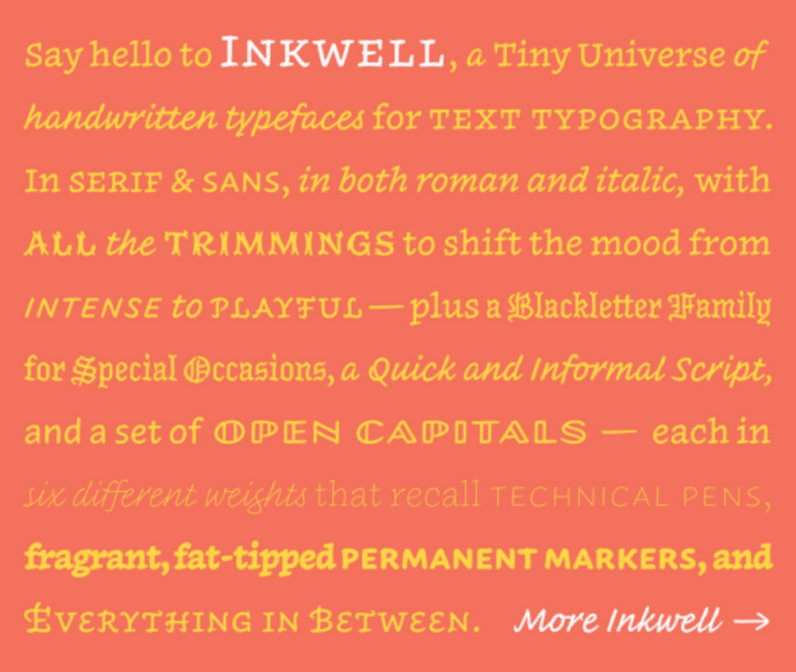
Aside from its playful nature, the typeface is exquisitely-designed and well-equipped. Inkwell is a “tiny universe of fonts,” according to Hoefler. It features both a serif and sans serif version, as well as a cursive script, all-caps set, and even a blackletter for more formal announcements.
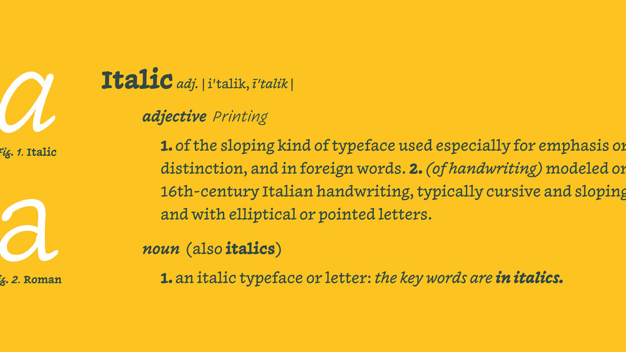
“To render anything sophisticated you need typefaces with relationships,” Hoefler says. “Italics have a syntactic value—without them you can’t communicate in English. Same for small caps and bold. But a single face doesn’t have those relationships for semantic emphasis. Inkwell brings the classical needs of a typographer to this genre.”
All told it took Hoefler over a decade to create, mostly while sketching on pen and paper. Recently though, he began designing on the iPad Pro, which he says is the first digital thing he’s worked on to feel like a real pen and paper.
Inkwell is available now, and you can grab it here.
via Fast Co. Design
Get the TNW newsletter
Get the most important tech news in your inbox each week.


