Great interface design is quickly becoming a priority as companies everywhere start realizing that it’s paramount to their succeeding in the crowded online space.
Then why, despite its importance, has there been such a gap in the UX design tools space?
Atomic, a startup team of ten based in Wellington, New Zealand, thinks it has the tool that finally fills the gap that will allow product designers to create great experiences for the Web and mobile devices. It’s in private beta right now, but the team has given us a first look at what it’s building.
Remember all the way back in 2013 when Adobe announced that it was killing its interface prototyping and design tool, Fireworks? I remember it well because my designer friends were mortified that Adobe would do such a thing, with little warning and basically no replacement tool.
Users came out in droves to express their disappointment and disgust that Adobe didn’t care about them or realize how important Fireworks was to their workflow. They were left to work with tools like Photoshop or Sketch.
The idea
Around this time Grant Robinson, Darryl Gray and Vim Jobanputra, co-founders of Atomic, realized that there was an opportunity to build something that really catered to product designers who didn’t have a tool built specifically with them in mind.
Gray told me that, “it felt like the time was right: Adobe had killed off Fireworks and Sketch had shown that UI designers needed a much smaller feature set than Photoshop or Fireworks. The browser was getting really powerful, and prototyping was becoming much more important.”
But there’s more to it; designers are living in this weird halfway house between the offline world and the digital one; they’re using fragmented tools to collaborate; files are shared via Dropbox or some other syncing tool; feedback is done via email or Invision; changes are done back in the original tool and then the process starts all over again.
Designers are constantly jumping between contexts and making hundreds of versions of the same document because of this.
As developers got better tools like deep version control with Git and real-time collaboration tools, designers have been left behind, quite literally.
Gray and Robinson know these pains all too well; they’re experienced award-winning designers that have worked together for over 15 years in agencies, on products and at startups like Xero and others.
Atomic was born
Atomic was born out of these frustrations, but it’s not like the interface tools that designers have come across before; it’s entirely built in the browser and has some unique features thanks to the power granted to it by modern Web technologies.
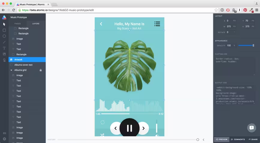
The company’s tagline on its homepage is “design the future” and it’s hard to disagree with that assessment when you see it in action. When you first open Atomic, it resembles a familiar desktop design tool, but it offers some powerful differences.
You can design your entire interface right in the browser and it’s incredibly snappy. Even though it’s still early in development, everything one would expect from a interface design tool is already built in. You can draw shapes, import images and manage layers.
Objects can be directly styled with CSS if the user pleases, so they’re able to do some impressive tweaking in addition to the basic design tool set, if they know how.
As you design your interface, Atomic keeps track of every change you make. There’s a history slider at the bottom that you can drag to go back to any point in time. If you make a change here, it’ll create a new “variation” of your design and keep your other changes safe. It’s like Git’s version control, but visual and incredibly easy to use.
This means if you try a design but change your mind, you can quickly go back to an earlier point in time and use it as a springboard to test something different. The sheer simplicity of it frees designers up to try hundreds of variations to their designs without any friction in the process.
Dragging the history slider shows a time-lapse style view of you designing the file. Every change is tracked and shown as you drag it. Gray tells me that this feature alone has gathered “a lot of interest” and it’s easy to see why; Atomic is exposing the designer’s process.
Dropbox recently snapped up Pixelapse, a visual version control tool that works with your existing tools like Photoshop or Sketch. Atomic’s version control takes it to the next level, building it into their first-party design tool and tracking every single change so they it be viewed in a timelapse-style view.
There are some interesting tricks the tool can do, thanks to it being built for the Web; Atomic can link two pages in different documents together and animate them between their different states.
For example, if you were working on a desktop and mobile design, it would be useful to show the transition between them. In Atomic, you can design the two different interfaces, add clickable interaction hotspots and the tool does the heavy lifting to show the transition between states.
https://vimeo.com/120035868
Not only does this give product designers the ability to show off interfaces in a way richer than previously possible, it means they can test what a design will actually feel like in the real world before it’s built, with no coding and minimal effort.
Gray showed me a mock up of Chrome for iOS’ new tab page and used the tool to quickly get a feel for what it would look like to animate Chrome opening a new tab.
The result is shockingly high-fidelity that almost feels like the real app; which is powerful for when you’re showing off designs to non-designers. When demonstrating a designer’s work, instead of saying “now imagine it’ll do this when we click here,” they’re able to show the real deal.
Atomic also builds in sharing and feedback right into its core tool. Designers can quickly share their ideas with a link and collaborators can give feedback right inside the product. You can check out a shared design for yourself here; some areas are clickable, just like the real product would be.
Competitors like Invision already do this for designs produced out of tools like Photoshop or Sketch, but Atomic not only bakes this functionality right in, but again allows designers to show off what it’ll actually feel like by setting it up to work with those animations and clickable areas like the real product would.
With Atomic, interface designers can finally communicate what they imagine the final result will be.
The web is finally fast enough
What surprised me most about about Atomic is just how responsive and fluid the tool is, despite being in the browser. The browser has come a long way in recent years and Atomic has been born at a time where it’s finally possible to build complex software like this without sizable drawbacks.
I wondered why Atomic was so quick and discovered it’s basically the bleeding edge of Web tech; the front-end is rendered using React with Flux architecture so everything is rendered in native HTML.
On the back-end, Atomic is entirely Node.js and Postgres. One of Atomic’s developers, Alex Gibson said that because Atomic is using React it can “generate the design document with Phantom on the back-end without a browser to generate design previews as images.”
Gray told me that technologies like React.js “totally changed” the fact that browser performance often wasn’t good enough for complex tools like this. He even admitted that “being in a browser was a big issue for people when we started building Atomic” but over time, it’s become less of an issue to the point where the company gets no comments about it, “except for the people who tell us they are surprised that it’s so performant.”
In the future, Atomic is going to have even more impressive features; the team is working on real-time multi-user editing of designs, as well as full Git-style history for design. Users will be able to create separate branches of their designs, work on them and then merge them back together. Gray says there’s “loads to come this year.”
The tool is targeting product design teams at companies who understand that collaboration pain when designing interfaces and are looking for better tools that they can use to work together, without all the fragmentation that exists today.
There are competitors for Atomic, but they’re all operating in slightly different spaces. Macaw, a recently released interface design tool, allows designers to create their entire website design, then export the code so they don’t need to actually do anything but runs on the desktop. Others like Canva are built for the web but target the “anyone can be a designer” audience.
Atomic has the potential to totally turn the way those teams work upside down, if it gets the mix of collaboration, prototyping and version control just right. Getting designers to switch tools is no easy feat; many will wait to see how a product develops over time before considering switching tools.
To me, it seems like the opportunity is ripe for the taking. Gray says that since the company opened up a waiting list, thousands of users have flocked to sign up from big-name companies around the world. Many have been entire design teams wanting to get onboard. He thinks there’s a real desire for something that works better, but it just hadn’t existed before now.
Right now, Atomic is in private beta while it works to ensure that everything works as expected and gauges what features are needed for a wider launch, but you can sign up to receive an invite as they go out over the coming weeks.
➤ Atomic
In the interest of full disclosure, my partner took a job at Atomic after I began writing this story. I have no personal interests in the company and her employment there has not influenced this profile.
Get the TNW newsletter
Get the most important tech news in your inbox each week.


