Fresh off of a $57 million funding round and valued at $400 million, blogging platform Medium is making some big changes to its look and feel. At an evening event in San Francisco, Medium founder Ev Williams and his team introduced a redesigned Medium for Web and mobile.
“We’re happy Medium is a default place to share perspectives on a growing number of issues that matter,” Williams said. “And it’s increasingly the best place to find commentary about what’s going on in the world.”
Medium for Web
The version, dubbed “Medium 2.0,” was also articulated in an accompanying blog post by Williams. Medium’s aesthetic overhaul — with new fonts and buttons — is matched in changes to its editor.
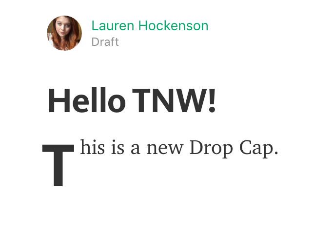
In addition to that aforementioned read-friendly font, the startup made adjustments to font sizes, weights, and shortened links. Additionally, the new editor now allows for drop caps, so the first letter in your first paragraph can make a big, magazine-style impact.

There are also new ways to interact with other users on Medium. First, users will now be notified when you use an ‘@’ to mention them.
Additionally, the traditional, public way to engage with a user is now called ‘Responses,’ and the user is now allowed to comment on entire pieces as well as specific sections of the stories. On the other hand, ‘Notes’ are private — Medium suggests they are direct communication largely reserved to help alert writers of typos or other errors.
Additionally, the company has a new API to help developers take advantage of the platform, and will now allow users to link custom domains to their Medium pages.
Medium on Mobile
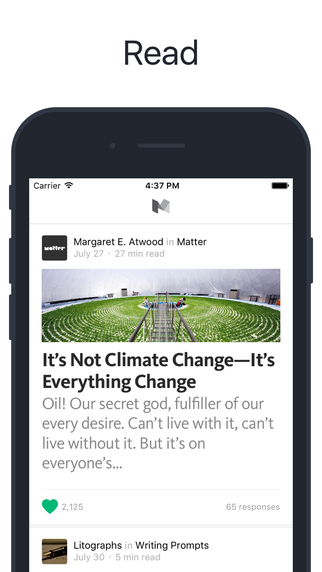
Along with its desktop update, Medium made changes to iOS and Android apps. In addition to bringing the new brand look to both, the company has tried to make writing and creating on mobile much easier.
Medium started on iOS, and its latest update (version 2.0.2508) brings new functionality with iOS 9. The app now supports deep linking from within the app, as well as 3D touch capabilities that allow users to execute quick actions before even tapping in the app.
Meanwhile, the Android app now has both Marshmallow and Jellybean support.
Both mobile apps get a huge boost with a new sync feature that automatically links edits made on mobile right to desktop and vice versa. Previously, users could either begin and finish a draft in one or the other. The new syncing method will likely make content creation on mobile a much easier and more pleasurable experience.

It’s also a lot easier to track story performance on mobile, thanks to an updated notifications tab that shows a users recommends, follows, highlights, mentions and responses. Highlighting is now actually possible on mobile as well.
Users will be able to see all actions taken through an updated user profile system, which includes how many times a user has recommended or highlighted an article.
Medium is also working to make stories more visible. On mobile, the company has introduced a “Suggested Tags” feature to ensure writers promote their own story within Medium’s system. The app also has a new “Explore” feature, which includes a fresh list of curated content.
All in all, it’s the fresh coat of paint designed to show how serious Medium is about living up to its hype. Which, depending on how bullish you feel about writing platforms and social networks in general, may work to its desired effect.
Get the TNW newsletter
Get the most important tech news in your inbox each week.


