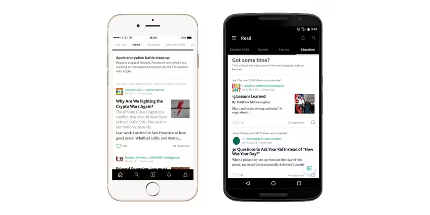
Medium is giving curation a shot.
A new feature for iOS and Android named ‘Collections’ will see Medium staff and “trusted testers” push content to the forefront. The home screen will now feature popular topics like politics or technology in a menu along the top.
Medium’s current feed — or at least the one you’ve grown used to — will reside under the ‘For You’ tab. Elsewhere, its bottom bar is now dark, which should provide less distraction while reading.
It’s a bit of re-positioning by Medium, and leverages partnerships in a big way. The ‘Sports’ tab, for instance, features a lot of content from The Cauldron, Sports Illustrated’s foray into Medium. While you or I could also find content pushed to those tabs, bigger names will still have the spotlight.
But it also means Medium is more than a blogging portal, and can now be considered more competitive with Flipboard or Apple News. The top bar adds a busy feel to Medium, but it’s necessary for surfacing content, and that’s clearly where Medium is headed.
Get the TNW newsletter
Get the most important tech news in your inbox each week.


