It’s highly unlikely that you, and maybe even your children, will be able to divorce yourselves from email. It’s too engrained into Internet culture and serves as a direct allegory for the ancient and waning but still mostly reliable Postal Service.
But now, we’re moving away from using stationary desktops and laptops as our primary computers and towards more portable, personal devices. AS this happens, it’s well worth pondering whether the paradigms of email are meant to be translated directly over to these devices using the same methods and structures that we’re used to.
Mobile devices like smartphones are as different from the desktop as they can be, they’re simply not the same kinds of computers. Shouldn’t we be looking for a solution for email that is as different and tailored for these devices as well?
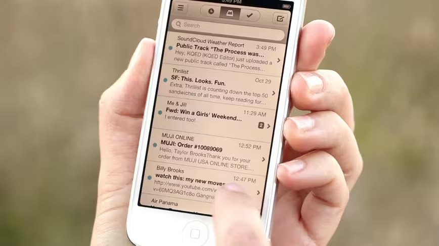
That’s the general principle that guided the Mailbox project. It’s an app that ostensibly joins the wide array of email ‘clients’ already available on the iPhone, but thinks about email in a significantly different way than many others that have come before it.
http://vimeo.com/54553882
The early stages of this could be seen in Sparrow for iOS, which focused on quick actions that you can perform while mobile that allow you to winnow down your inbox without all of the standard foldering and finicky management that normally comes along with it.
Mailbox takes that to its next logical step, providing you with a way to deal with email on the go. All of the situations that we find ourselves in with our mobile devices that we never would have with a desktop or laptop. This new method feels a lot more like task management than it does email management, which is no accident.
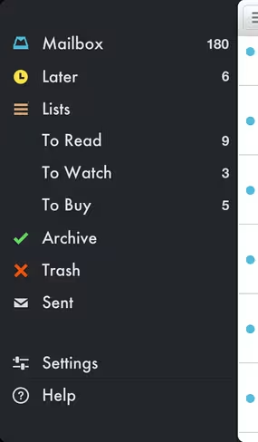 The app is set up to take advantage of three main actions, all linked only to a Gmail account for now. For every mail item, you’re able to move it to your archive (check it off), delete it or postpone it until later. Much like a list of items that you can complete, remove or time shift until you’re ready to deal with them. The time-shifting mechanism allows you to choose between general times like later today, tomorrow morning or this evening, or specific dates that you choose.
It’s a clever arrangement that allows for, above all, triage of your inbox. Quick, decisive action that can stop the bleeding and help you to keep it manageable while you’re on the go. This is definitely not an app made for extensive inbox organization, and there are some limits which I’ll explain later. But it is something wildly different from other email apps, and it allows you speedily execute these actions on a small portable screen with a series of swipes.
Mailbox comes from the team that built the task manager Orchestra. I spoke to co-founder Gentry Underwood about the inspiration for the product and whether there was a logical jump that made this new method feel ‘right’.
“There really wasn’t any one single leap,” says Underwood. “We started orchestra based on the insight that nearly everyone used their email as a terrible to-do list, and designed Orchestra to be a way to side-step email by sending one another tasks directly. As we grew, though, we realized that even our most active users still had plenty of tasks in their inbox, mostly because not everyone they worked with used orchestra. so at best we had a world where now you had two inboxes to maintain.”
These two inboxes caused them to re-evaluate how they’d handle the duplication of task lists. Underwood says that, using the company’s “iterative, ask-wild-questions-and-defer-judgment sort of design process,” they came up with the idea to just send every email to Orchestra. This would treat it as a task to be managed, rather than an email to be organized or read.
As the company realized that what they were creating would eventually become an email client, there were reservations.
“Startups don’t create new email clients and live to talk about it,” jokes Underwood. “But as we pushed on the concept we began to realize that there was so much about mobile email that just plain sucked. We began to feel like we had to at least try the angle.”
Though its external veneer is that of a task manager, Orchestra was built on the bones of a real-time messaging system. This meant that Mailbox came together fairly quickly, as the underlying structures were already there to handle messages like tasks. Underwood says that a prototype took about 3 and a half weeks.
“Once we started using it we knew we were onto something,” says Underwood, “email inside of our app felt fast and light in a way other clients hadn’t felt.”
And the app does feel fast, for several reasons. It’s built almost entirely using frameworks native to the platform. This is a different approach than some other email apps like Gmail, and ends up making it feel lightning-quick. Swiping, tapping, reading and moving between screens is blazing fast and feels very lightweight. Something that tends to escape apps which heavily utilize viewports that display web content.
I’m not here to tell you that you can’t build an insanely fast HTML5 app, because I’ve seen some super quick ones. But I can tell you that building with technology that’s native to the platform may provide less flexibility with updating live remotely and other ‘server side’ actions, but what it does bring (when done right) is pure speed.
And when a system like Mailbox is as focused on quick actions being taken to email ‘tasks’, it’s important that the app around it feels just as quick. I’m happy to report that it very much does.
I’ve been fascinated for some time with the idea of email being handled completely differently on phones and tablets than it is on the desktop. The use cases, environment and nature of mobile are as different as reptiles are to mammals. The ideas that I see in Mailbox (and saw glimpses of with apps like Sparrow) center around the idea that email on your mobile device is mostly (90% of the time) about triage, not in-depth management. Walking down the street with the sun in your eyes and the person next to you jostling you and whatever else while dealing with email is a lot different than sitting behind your desk.
I asked Underwood whether this was a guiding principle with Mailbox.
“Absolutely,” he says. “As we started looking at how people use email on their phones we began to realize that triage is the number one use case, but no existing tool was designed to facilitate that. you have a couple of minutes here or there and you open your mail app to see what’s new.”
Sifting through your inbox to find the important stuff quickly and moving the rest into the future is a basic mechanic that most of us employ, even if we don’t know it. “…in most apps the best way to flag the important stuff becomes mark-as-unread,” says Underwood. “It’s a silly hack that is pretty error-prone. people end up dropping balls and carry a general anxiety around knowing they’re forgetting stuff.”
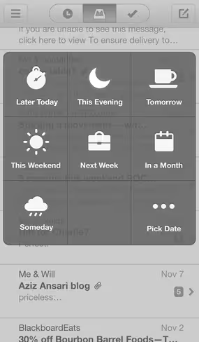 The arrangement that Mailbox uses for this is the ‘Later’ section. This is a cloud-based inbox that holds all of the items that you’ve chosen to put off until another time. To send an item there, you swipe to the left and are presented with a grid of tappable options. These include: Later Today, This Evening, Tomorrow, This Weekend, Next Week, In a Month, Someday and a date picker. This feature, by the way, is the reason that Mailbox syncs your email through its servers, so it can schedule and resurface them for you. Your email is not accessed in any way while on the servers, but this could provide a hitch for those with security protocols to follow for work.
Allowing you to quickly choose from these general times becomes more of a help than you can imagine when breaking through the traditional gridlock of email management. Too much time is spent wondering ‘what to do’ with a particular email once you’ve read or looked at it. Do I move it to a folder? Do I put it in the archive? Do I mark it as unread so that I see it as new later?
Later takes care of all of that, letting you shove your paperwork back to a time when you know you’ll have the chance to deal with it properly. Yes, it’s simple and obvious in hindsight, but the best ideas are.
Now for the ‘but’ section of the piece. There are a couple of early rocky patches with Mailbox that may put some heavy email users off. Currently, the app’s search feature only includes emails that have been downloaded to the phone. Underwood says that in the future, the search feature will be expanded to include all of your Gmail in its various nooks and crannies. Until then, however, I’ve found the search to be…less than useful…in surfacing important emails. I’ve had to fall back to the Gmail app or the web interface multiple times during testing for search purposes.
The ‘delete’ vs. ‘check’ actions seem a bit finnicky to me. You swipe to the right to ‘check’ something off or move it to your inbox and you swipe ‘all the way’ to the right to delete something. At the moment there is a lot of cognitive load involved when it comes to making sure I’m deleting an email. A slight pause when waiting for the item to turn red can turn into an annoyance when dealing with a lot of email.
Underwood says that most people don’t have a problem with it, but that they’ve tweaked it and that there is definitely room for improvement. I noticed a significant improvement with the latest build (the one that is going out to users today).
There is also no real support for Gmail’s priority inbox, though stars are supported. Underwood says that this will be coming.
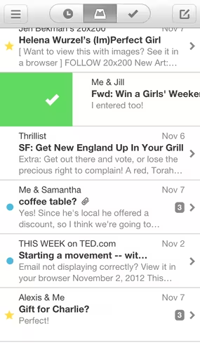 And my last quibble is with multiple item support. Being able to check off a bunch of items, put a bunch off until later or delete a bunch is a matter of individual swipes right now. There needs to be a way of dealing with multiple items via tap and swipe, especially for people with exceptionally active inboxes.
Still, even with the issues, Mailbox is something special. It’s well designed, crisply executed and features insanely obvious and satisfying mechanics. As the app is free, you’d be silly not to at least try it out. In the immortal words of Ferris Beuhler, “It is so choice. If you have the means, I highly recommend picking one up.”
And Underwood says that making sure Triage works well is just the start of what Mailbox is up to. “As you hinted at,” Underwood tells me, “there are so many ways that mobile email wants to be different than desktop-based email, and we’ve got a lot of features in the pipeline that we’re very excited about.”
Note: Mailbox is available today on the App Store, but there is a reservation list for access due to the server components needed for the Later feature. So you can grab the app now and sign up, then watch the progress towards your access in a progress bar in the app.
Get the TNW newsletter
Get the most important tech news in your inbox each week.


