I’m a huge fan of Adam Savage’s One Day Builds. At the beginning of the day he starts with a pile of materials, and ends up holding something that he once coveted (this one is my favorite).
So with this in mind (and a day off from work), I set myself a challenge…
Create an entirely new font, from scratch, and submit it to Google Fonts in under 24 hours.
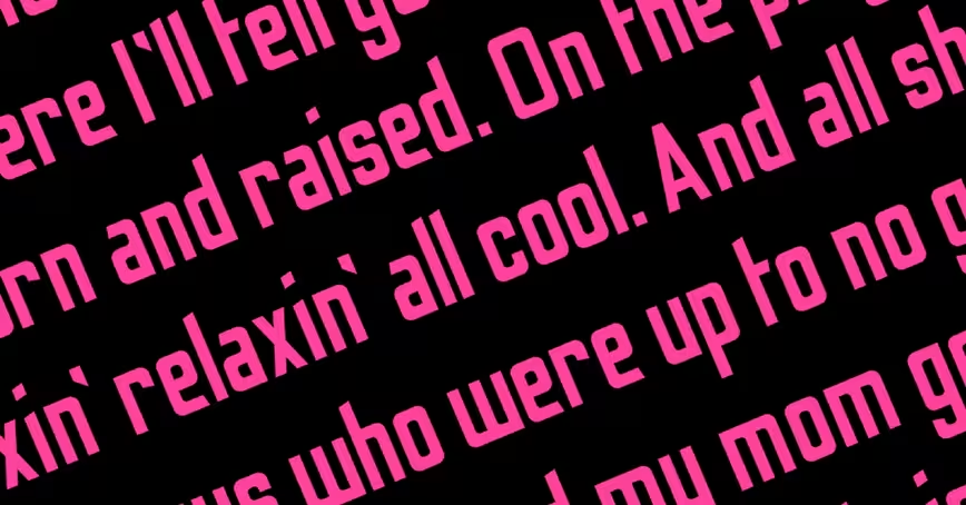
I had a couple of letters already sketched out in an old notebook. I wanted to create a tall, sans-serif, display font that could be used in posters, or large scale artwork. In my early days at Men’s Health, I would have to use fonts like ‘Tungsten’ or ‘Heron’, which were terrible for chunks of body copy, but amazing when used in headlines, or for promotional material (which was my main job there). This was the style I set out to create.
1pm, Wednesday
I went straight to Adobe Illustrator with the two or three letter styles I had sketched out. I set up five grid lines on my art board, one each for the descender line, baseline, x-height, cap height and ascender line. I then decided on a width for the capital letters, and from there, the thickness of the stem (e.g. the width of the letter I).
I did a lot of research on letter proportions and ratios, and actually measured some existing fonts, working out how the lowercase letters should relate to the caps. From here, I made some rules:
- X-height = 2 × height of ascender/descender.
- Stem width = 1/4 capital letter width
- Lowercase width = 3/4 capital letter width
From here I created the letters O and B first. I made a decision that any letters that would usually have curves, would have a rounded corner instead. Most letters would be a tall block shape, but with letters like O, B and D, the edges with curves would have rounded corners.
The outside corner would have a 12mm radius, and the inside had 6mm. With these rules agreed, plus a height for my crossbar (across the letter H) I started churning out my capital letters.
My font was very simple, but with one defining ‘flourish’, if you will. Any aperture, which is the opening in a letter, like the cut in the letter C, or the end of any arc, like the curved end of the letter J, would be cut at an angle. The hardest letters here were G and K.
With the CAPS completed, I moved on to the lowercase letters. This was undoubtedly harder, but with my rules agreed upon, it was just a case of churning through them. I used a lot more of my ‘flourishes’ here, especially at the end of the ascenders and descenders. The letters f, g, a and e were the trickiest, as they were completely new styles.
9pm, Wednesday
I was now moving on to some of the extra glyphs, like the question mark and exclamation mark. My pace picked up, and before bed I had managed to work up around 35 of them.
Thursday morning
In the morning, I completed the numbers 0 to 9 pretty quickly, and then began to actually create the font file.</p>
This was completely new territory. Ian Barnard, a calligrapher pal on twitter (with my surname), recommended a program called Glyphs, which you can download for a free 30-day trial.
I downloaded Glyphs Mini and watched a couple of tutorial videos, then realised I’d set up my illustrator file completely wrong. So I had to paste each character in manually and scale it up to match the guides in the app.
10am, Thursday
With my characters in place, I went about spacing and kerning the letters. This part was incredibly time consuming. There are a series of keyboard shortcuts in this app which you absolutely must master before setting out on this. And before starting the kerning process, you have to get your letter spacing as close as possible to how you want the file to look.
Apparently as a rule of thumb, measure the width of the counter of the letter O (the hole in the middle) and divide that by three. That is the spacing distance you should start with on the left and right side of your letters.
11am Thursday
With the spacing set up (accounting for wider letters like M and W) I started kerning. This was a massively painstaking process. I visited this website, and pasted in their example kerning text.
Using the keyboard shortcuts (use this tutorial) I plodded through and adjusted kerning groups for every single distance that didn’t look right to me. The obvious ones are between V and A, but there are so many letter pairings within that example copy that I wouldn’t have thought of.
Once complete, I converted the kerning text to all caps and did the whole thing again, to pair the capital letters.
12:59pm Thursday
I exported my font and converted it to a .ttf file ready to submit to Google. With quite a few glyphs still missing (like square brackets and copyright symbols), I was certain that it wouldn’t be accepted. I also didn’t have time to include the multitudes of accents required for full language support.
It’s not the greatest of fonts, but it wasn’t bad for my very first go. And considering I had to teach myself how to use the Glyphs software from scratch, and it was completed in a single day, I was pretty proud!
The name?
Odibee Sans
…pronounced “oh-dee-bee”. My very own ‘One Day Build’ (ODB).
Afterword
I submitted Odibee Sans to the Google Fonts team back in May 2017, and as it stands the font is still in their pipeline to be added. The team quite rightly suggested that I should spend some additional time on the font to refine the design (although they admitted that this was against the spirit of the project).
With this in mind I spent an additional day on the font. I have since added all the extra glyphs (I think) required for extended latin support. I also made some major changes to around 30 of the glyphs, including new styles for the letters (caps) S, B, R, and lower case s, c, y, a, e, r, f, t, p, q and j, as well as a couple of number tweaks.
On top of this, there are now more than 1500 kerning pairs, which has made a massive improvement to the typeface.
And I made a website! odibeesans.com
The site was also made in a day using Adobe Muse. More on this here.
Thanks for reading! I’d love to read about any projects you may have tackled in one day. It’s quite an effective technique, if you can spare the time (God bless the freelance lifestyle)!
James Barnard is a freelance graphic designer, formerly of The Daily Telegraph, Bauer Media and Hearst UK. Check out his portfolio here and follow him on Twitter down here:
Get the TNW newsletter
Get the most important tech news in your inbox each week.


