Apple has released the latest version of its desktop operating system – macOS Mojave – to the public. Woo.
It was named in, uh, honor(?) of California’s Mojave Desert and is part of the tech giant’s landmark-monikered series of updates, something that started with OS X Mavericks.
While there is nothing earth-shattering about this update – which is pretty much what we expect from Apple’s macOS updates these days – there are a few nice features in there. Also, there are some really, really boring ones.
This means one thing: we need to rank (some) of these features.
Why? Because I enjoy ranking things and you, my friend, cannot stop me.
So, let’s order the new major features in macOS Mojave by the best (because I’m feeling positive today) to the worst (because I want you to leave this article questioning your life).
ABSOLUTE FIRE: Remodelled screenshots
Look, I spend about half my day taking screenshots of things and then either poorly editing them, or firing it across to a group chat with a pithy comment. It’s a problem, I know, but one I’m happy to indulge.
Thing is, creating a screenshot and editing it quickly has been much easier on an iPhone than a Mac. For example, when you take a snap on your phone, it pops up on the bottom left of the screen, which is great for cropping out your lackluster response to a gnarly burn.
Well, you’re in luck, as this feature has now been transported to macOS Mojave. So now when you take a screenshot, the image appears in the corner of your screen. Allowing you to crudely draw comedic genitals on that photo of your friend so much quicker.
Apple has also updated the entire screenshot system. You can access it with ‘shift-command-5’ and it now lets you record video, choose where to save files, and set a timer.
Can’t wait to disappoint my coworkers by overloading our Slack channel with awful, boring, and supremely amateur images.
TOP NOTCH: A new way to de-clutter your desktop
I said before that I take a lot of screenshots. This means that my desktop is a hellscape filled with thousands upon thousands of images that mean nothing to anyone else. But, do I have the time, nay, the will, to do anything about this? No, of course not.
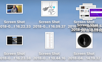
So, enter macOS Mojave’s Stacks feature. It works by stacking (ugh) the files on your desktop into groups. For example, all those random screenshots you’ve taken will now collate into one… stack, as will those weird PDFs you don’t remember downloading.
It looks like this:
This is exactly what technology should be about: doing things for me that I don’t want to do. The future’s here, folks.
PRETTY OKAY: iOS apps are now on macOS
Yeah, this is the definition of okay. You can now use vaguely popular iOS apps Stocks, News, and Voice Memo on your shiny Mac computer. Yay, I guess?
Nah, you’re right, this is shit.
But – and there’s always a but – the reason it gets a “pretty okay” rating is the potential. These are actual iOS apps running on macOS. In other words, it won’t be long until we can literally download iOS apps on a Mac.
Watch out crappy freemium games, I’m coming for you.
MERELY ACCEPTABLE: The function that lets you snap a photo with your iPhone and it appears on your Mac
Firstly, this has a horrible name: Continuity Camera. No. Nope. Nuh-uh.
Now, I’m not saying I could come up with a better name, but I totally could. I’m also not going to tell you that name because I don’t work for free. Apple, hit me up.
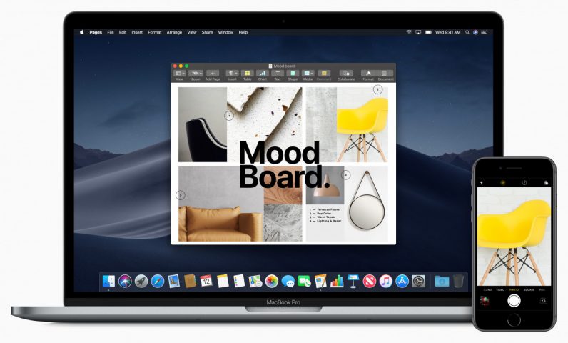
Let’s get into it. On the surface at least, Continuity Camera is a cool add-on for macOS Mojave, as it brings the desktop and mobile operating systems closer together.
Well, apart from the fact that it currently only works with native Apple apps, like Numbers, Notes, and Pages. And, let’s be honest here, who uses those?
Also, it didn’t really work that well for me when I tried – something I assume will be ironed out in the future. Maybe it’ll be more useful when a larger array of apps are integrated, but now? It’s merely acceptable.
A BIG OLD MEH: A desktop background that changes depending on the time of the day
I always spend about three hours each and every day staring at my desktop background willing it to change. Thank you for this Apple, THANK YOU.
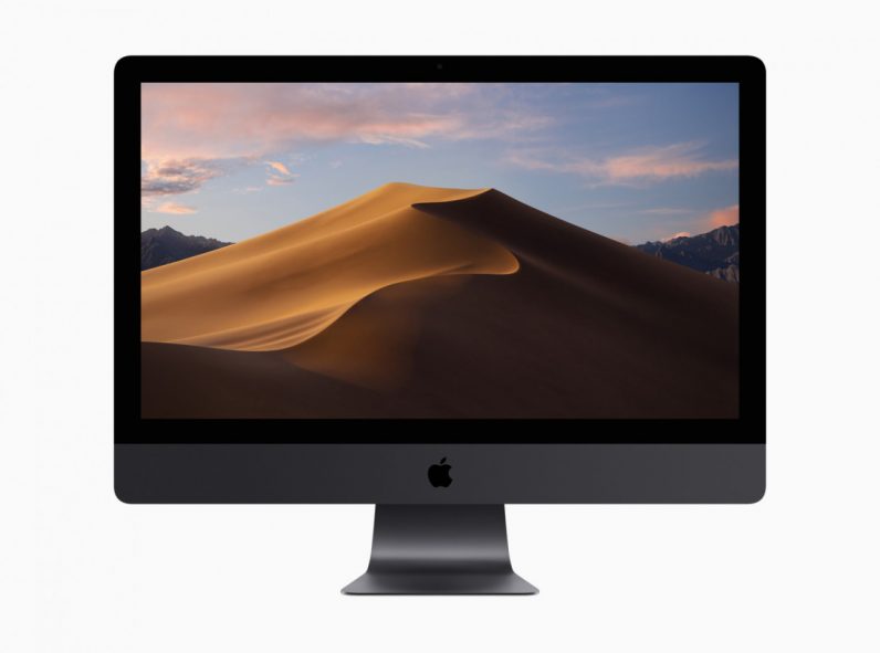
To get serious for a second though, this is dumb. I can’t even tell you what my wallpaper looked like before I upgraded to macOS Mojave. If I wasn’t writing with that image below, I would’ve forgotten what the Mojave wallpaper even looked like.
FOR SHAME: Dark mode
Fuck dark mode.
I’ve heard people in TNW’s office get excited about it, but I don’t rightly know why. It looks like those awful Winamp skins folks used to have.
Computer hurting your eyes at night? Turn a light on. Or, you know, stop using your computer and go hang out on a street corner around a burning bin like a normal person.
You could also make the menu and dock dark before macOS Mojave. Or enable Night Shift. This update is boring.
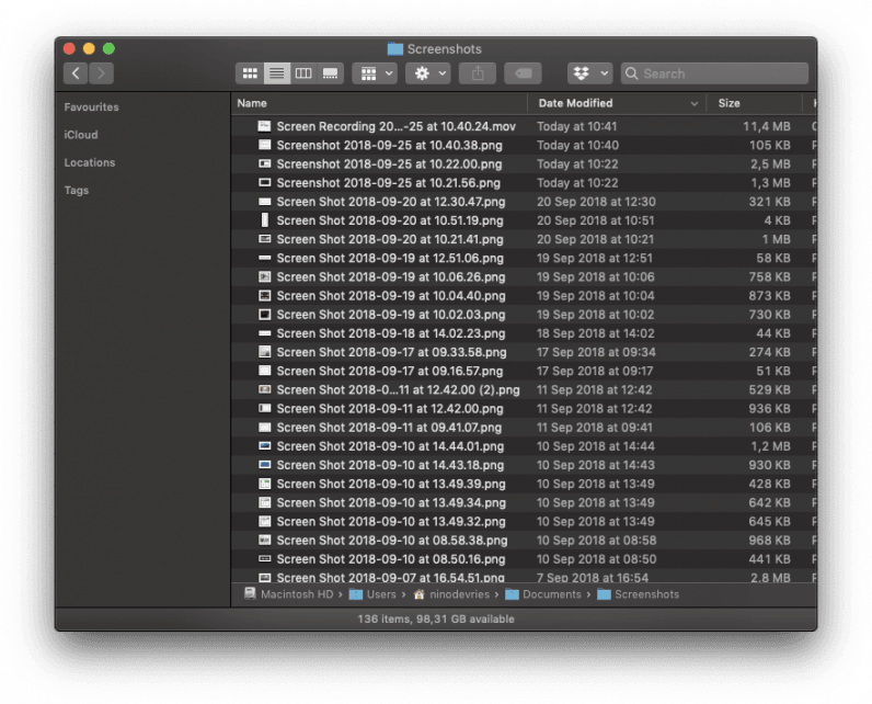
Here are some photos if you care:

If you disagree with our ranking, let us know on social or in the comments below. I’m looking forward to letting you know just how wrong your opinion is.
Get the TNW newsletter
Get the most important tech news in your inbox each week.
