On Thursday, LinkedIn announced a bunch of big changes to their website to try and lure people back to their website.
The Microsoft-owned social network for professionals is betting on a redesign and a revamped messaging system to make its users log in more and spend a bigger part of their day on the platform.
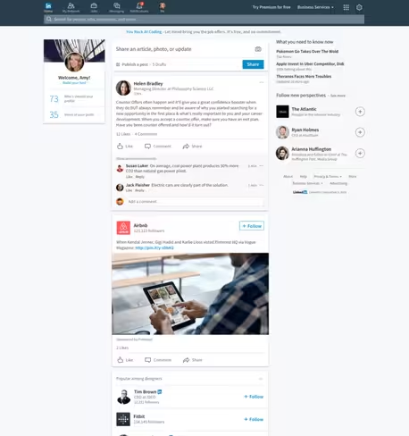 The redesign is aimed to make the desktop version look more like its recently updated smartphone app, in an effort to improve consistency between the platforms.
After having tweaked its messaging platform a year ago to make it work more like a chat service, it’s now also adding the option to talk to chatbots. When you decide you want to meet someone, the bot can look into both users’ calendar and pull up a time that works for both. Exciting! Oh wait, not really.
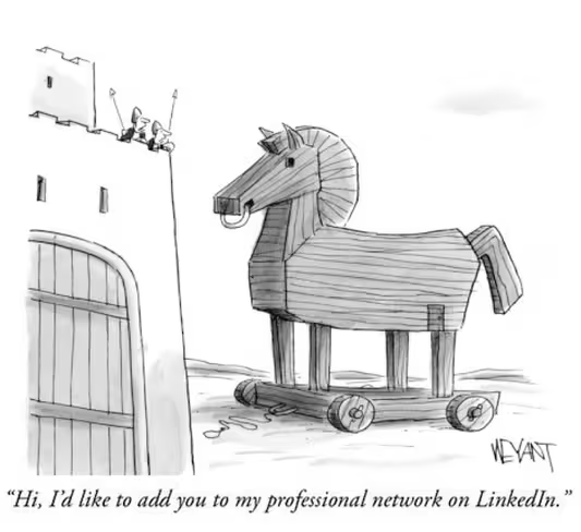
But will a redesign solve all the problems for the world’s most hated social network? To me it just looks like a fresh coat of paint, without actually addressing the real issues it has.
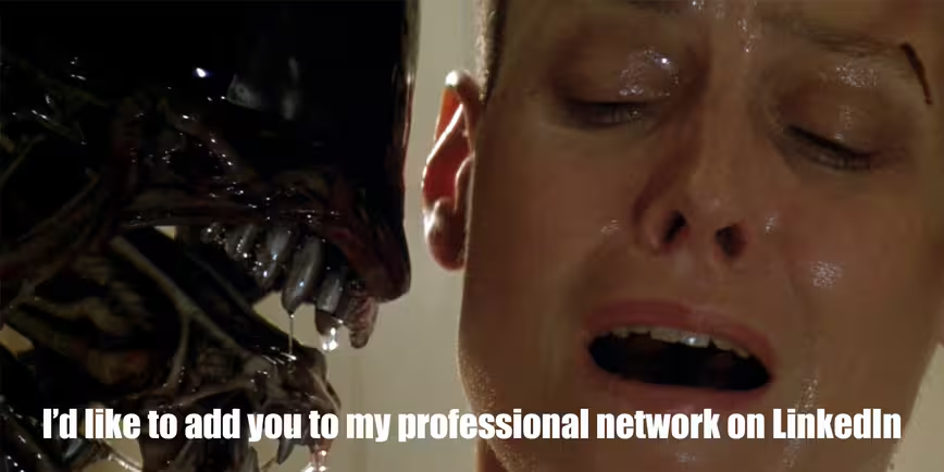
Every time I log on and see the onslaught of random friend requests people send me, I weep. Then I take a look at my inbox, and it’s just a bunch of these:

The entire network seems to be about people trying to connect with each other for no apparent reason — it’s all noise and no real substance. If its goal is to help people make meaningful professional connections, it should start right there — fixing the focus on useless friend requests.
Sure, the Jobs section might work fine, but the actual ‘social network for professionals’ just isn’t what it could be.
Even though it has 450 million users, only 25 percent of them use it monthly. Time will tell if Microsoft’s $26 billion acquisition was a good decision, but I feel like it needs more than a refreshed design and messaging bots.
Get the TNW newsletter
Get the most important tech news in your inbox each week.
