LinkedIn has been evolving as a publishing platform in recent years, so when it weighed in with an offer to acquire Pulse last year, this merely served to confirm its intentions to move far beyond that of being a simple social network for business.
Pulse was always a fantastic news aggregation service, taking your favorite news feeds and websites and transforming them into an interactive mosaic. A little like Flipboard. Today, ‘LinkedIn Pulse’ represents a major part of LinkedIn’s distribution mechanism, looking at what’s being written by people and then sorting them into channels for easy reading.
Now, LinkedIn is leaning more heavily on Pulse as you’ll see from the refreshed reading layout on the Web and mobile apps.
Read between the lines
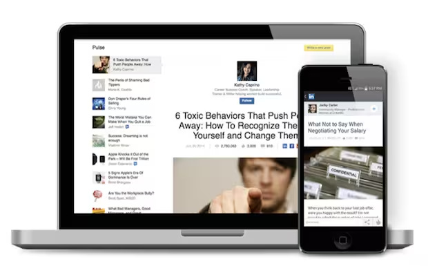
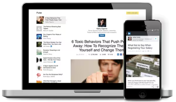
LinkedIn is making it easier to read and share content from LinkedIn Pulse, and is looking to emphasize content with “clean, uncluttered text” set against prominent images.
Indeed, it has integrated Pulse into your customized news feed on your desktop browser, and you can scroll to the next article that’s tailored for you once you’ve finished reading one article.
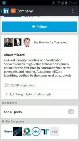
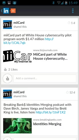
 Over on mobile, you’ll be able to view more posts at the bottom (‘See All Posts’) from the author who originally shared a piece to your timeline.
You can checkout the new LinkedIn reading layout on the Web and through the Android and iOS apps now.
Get the TNW newsletter
Get the most important tech news in your inbox each week.
