LinkedIn has made a few changes to its iPhone app today, including a simplification of the app’s home screen, a reorganization of its various status updates, and the addition of its “Buzz”, which allows you to track what people are saying about your company/brand/product on Twitter.
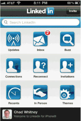
First of all, LinkedIn has reduced the number of icons on the app’s homepage from 12 to 9. “Status” has been taken out completely, with “Favorites” and “Profiles” rolled into the new “Updates” and “Buzz” added to the home screen. Also, the “Inbox” icon is now in the first row, moved up from the second (which is a better place for it) as you can see in the comparison of version 3.2 (left) with the new version 3.3 (right):
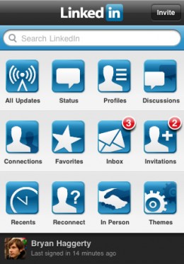
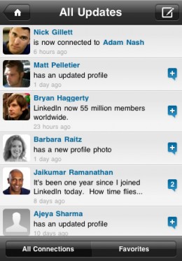
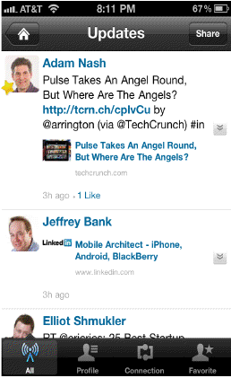
Also, the “All Updates” icon has been turned into simply “Updates”, and the combined features under this one icon make sense. Again, 3.2 on the left and 3.3 on the right:
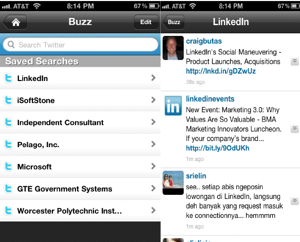
Finally, there is the addition of “Buzz”. For people that work in very large companies, run a small business that has active social media interactions, or for marketing/PR people, LinkedIn’s Buzz app may be compelling. However, if you don’t fall into one of those groups, this might not be something that you’ll use very often, we’re guessing. However, that group of people we just mentioned equals a lot of people, so if Buzz can provide more than a similar Twitter app can, then it should be a popular addition to the app. Here’s what it looks like:
One final note: LinkedIn tells us that it has no plans for an iPad app if by any chance you were hoping for one.
Get the TNW newsletter
Get the most important tech news in your inbox each week.

