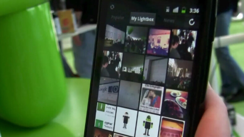
Back in June of this year we took a first look at Lightbox for Android. It’s a camera application, but much more and at the time I said that it could very well be the best Android app yet. Now, 6 months later, a new version of Lightbox is releasing and it further cements my previous opinion.
I had a chance to talk with Lightbox created Thai Tran the other day, about numbers, the present and the future of the app. Tran tells me that so far Lightbox is approaching 1 million downloads. By comparison, Path for Android launched just 2 weeks after Lightbox and presently sits in the 50-100k installs bracket. To further measure the success, Flickr’s Android app has yet to top 500,000 downloads, meaning that Lightbox is potentially doing twice the amount of business.
But Tran wasn’t convinced that Lightbox had gone far enough yet, so Lightbox version 2.0 adds to the existing beauty of the app, but also gives you some amazing abilities on your Lightbox site, too.
Previous to version 2, Lightbox displayed your photos quite like what you’d seen in Camera Roll. With the new update, the team is looking to transform the app into a photo journal, where important moments are grouped together with a representative “postcard”. The moments themselves are collated not only by time, but also location data that’s included in the Android app.
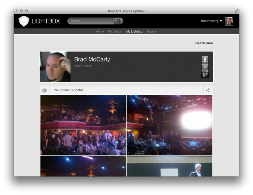
“We want to do what Tumblr did for blogging. We want to make it really simple, but then take it even one level simpler. You get a photo blog that’s automatically created and curated for you.”
 So now, instead of having to create albums, it’s done for you automatically. These “photo stories” are curated into your timeline and you can then subscribe to the stories of others, as well as allowing them to subscribe to yours. In essence, Lightbox is creating its own network, internal to the app and site itself; a move that made me cringe, at first, until Tran put it into perspective.
“We’re doing our own community features because we found out that only a small fraction of our users ever shared to Facebook or Twitter. For the most part, they kept it on Lightbox.”
When you then consider that the Web-based version of Lightbox is going to take a much more highlighted position than it might have in the past, this move starts to make more sense. Taking that one step further, Tran tells me that soon there will be an option to sign up as “Web-only”, so that you can work from your browser instead of your phone.
At the moment, however, that’s the only type of curation that will be available that isn’t automated. As such, I asked Tran about situations where the automatic curation might not work as well, such as an event that starts in one place, but ends up in another. This is, arguably, a weakness for Lightbox at the moment, but I have a funny feeling that the Web-based signups will allow you to shuffle photos around into different moments, in time.
Want to see why Lightbox for Android is growing so fast? Head over to the Android Market, snag a download and then get to taking some shots. The app itself is fantastic, and the newly-released curation makes it dead simple to get a great-looking photo blog in minutes.
➤ Lightbox
Get the TNW newsletter
Get the most important tech news in your inbox each week.

