So today, Apple released its iOS app for the Worldwide Developer’s Conference coming up next week. Speculating on the happenings at WWDC based on the app is one of the Apple community’s favorite pastimes, so I thought I’d take a swing.
First off is the design of the app, which has been a bit of a precursor for design changes happening internally at Apple in recent years. Last year’s WWDC app ditched the stock menu bars that Apple supplies in the iOS SDK and took on a silvery sheen which ended up matching the new Maps app when that rolled around. It also shaved the depth of buttons and bars and burnished the high polish to a dull glow.
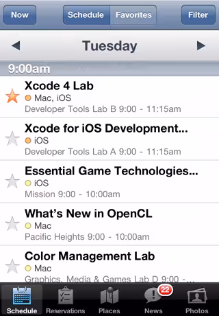
This year’s app is significantly trimmed again when it comes to 3D effects. Though buttons are still defined well with outlines, their heavy shading is gone, and the bottom bar is almost completely without shadow.
While the app hasn’t always telegraphed the look of iOS as a whole, you’d probably be safe looking to the more restrained feel as a signifier of at least some of what we’re going to see shown off next week.

The 💜 of EU tech
The latest rumblings from the EU tech scene, a story from our wise ol' founder Boris, and some questionable AI art. It's free, every week, in your inbox. Sign up now!
The icon is also much more matte than its predecessors (thanks Johan), and no longer features a backdrop designed to look like Moscone center in San Francisco.
Note that the design cues here aren’t so much ‘flat’ as ‘matte’. There’s still plenty of layering and 3D effects here, they’ve just been pulled back. A far cry from Windows Phone’s ‘Metro’ language, for instance.
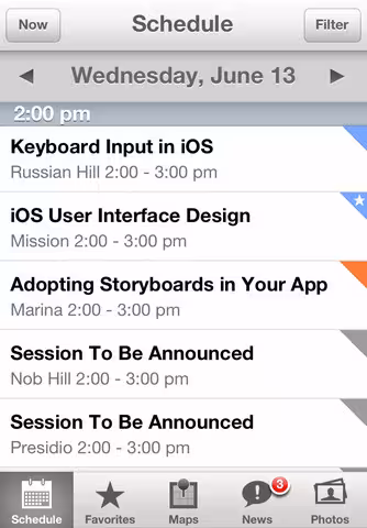
Next up is the sessions listed in the app which, as usual, feature a bunch of ‘Session To Be Announced’ labels. This is how Apple marks talks about new features of iOS that it has yet to announce, so the number of sessions marked this way are always closely watched.
Last year there were 43 sessions marked TBA, not including duplicates due to re-runs of the programs later in the week. Unfortunately, this year’s app does not mark duplicate sessions when you mark them as favorite, so we can’t get an exact correlation between the two. But here are some statistics from the app for you to chew on this year:
- Sessions To Be Announced: 64
- OSX Sessions (so far): 29
- iOS Sessions (so far): 28
- Sessions To Be Announced held in Presidio: 17
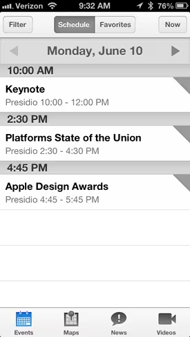
Presidio is always the largest room at WWDC, as it’s the one that the keynote is held in, as well as the one that the highest profile sessions are held in. These are the ones that signify big changes to iOS, the new features and frameworks that Apple wants every developer to learn about and adopt as fast as possible. Previous sessions in this arena include new tech like Newsstand, Maps and multitasking.
And, as noticed by Tom Harrington and mocked up by Daniel Jalkut from the app’s art files here, Presidio is also even larger than it was last year, indicating that Apple wants as many developers as possible to attend these sessions. It’s typically pushed out to its larger size for the keynote, then pulled back for the week. This year, it’s staying at full size.
Apple has evidently increased the capacity of Presidio, their main WWDC presentation room. (thx@atomicbird) twitter.com/danielpunkass/…
— Daniel Jalkut (@danielpunkass) June 3, 2013
This year’s app also lets you watch videos directly within, starting with a batch from previous years. This year is the first time Apple is providing videos of sessions during the event itself and the app indicates that they will be ‘available daily’, perhaps in batches.
So, depending on how much stock you put in speculation based on a conference app, we could be in for an interesting WWDC this year. Regardless, we hear that the changes being made to iOS are anything but slight, and that alone is exciting.
Get the TNW newsletter
Get the most important tech news in your inbox each week.