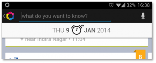
Binil Antony is the co-founder and CMO of Dexetra, the startup behind the Friday app – a contextual personal search application for Android.
Friday is a featured app in the Play Store. And not just on any list, it is on the Play Picks list!
It has been 1.5 years since Friday came out of alpha. Friday has been demoed at multiple conferences and expos, bench marked against the best for security and battery efficiency, and has even gone through durability tests by multiple OEMs.
The team comes together to rigorously check for any dangling pointers, design inconsistencies, adherence issues. Dialapp, the contextual dialler that we built, was featured before. We thought we had Friday being featured completely covered.
Nope.
No amount of times you get (luckily) featured can prepare you for the first onslaught of enthusiastic users, installing, rating, reviewing your app.
Here are a few things you should watch for in preparation to hit the masses.
Your app is going to be super visible
As a featured app, your app will find its way in front of more eyeballs and fingertips than before.
To make sure you get the most out of this limelight, ensure the app icon is crisp. The icon size needed for featured apps is bigger, so create something with the right resolution. Aim for 1024 x 500 px for the best graphics.
Users are getting curious. Get them to install the app
This is where users will go away, if you have not taken care of the small details.
Essentially, clean up your profile page. This is a low investment, high impact activity.
Are the screen shots updated with the latest changes you made to the app? Even the tiny settings change that you made should be reflected if you have a screen shot for it. They should be the picture equivalent of the description, showcasing the features and benefits.
Which brings us to the description: How good is the copyrighting?
Include all the mentions from different websites without overselling. Much like Zen state, it is all about finding the right balance. The first two lines, along with the first two images should be able to convey the core proposition of the app.
Make sure when people install your app, they keep it
This is not so easy to do, as you have to force yourself to look through a perspective of someone who does not know anything about the app.
Check the microcopy inside the app. With a bunch of first time users coming up, it is important that you have the right nudges in place, to control the user experience. Keep it simple.

Next, take a look at the app’s zero state again. If the app has to do some processing before it starts surfacing content, then ensure that your zero states can keep the user interested with feature introductions, tips or dummy content.
Don’t let the user leave, before actually seeing what your app can do.
Lastly, take a quick look at the latest android design guidelines again. The guidelines help make the experience consistent. If there are any quick changes, that will make your app more compliant, without the risk of breaking anything, you should make the changes.
Realize that things can go wrong or have already gone wrong
Do you know your weakest links?
Have a backup for the backup. A lot of people are going to install your app… at the same time. If your app is server dependent, then can your server take the load? Prepare for the worst case.
Be wary of time zones. If there are a lot of users in a different time zone who are going to download the app, you should keep tabs. You might just wake up in the morning with a drop in ratings.
But users are nice and benevolent. They will generally give you a second chance if you reply to negative reviews immediately. Silence is bad, as negative reviews will pile up on your app page.
Appreciate the time users have taken to write the reviews. We saw many users change their ratings and reviews, after apologized and replied that the problem has been taken care of. Quick and proper communication is as important as fixing issues that come up.
Here were some of the reviews we absolutely appreciated from the feature.
- “Excellent. I’ve been using it for quite a long time now and love how it has progressed over time. Love the UI, the depth of information that you can get without even doing anything. Keep it up guys.“
- “Great app, useful, fun Friday helped me to find out some important phone numbers I forgot to save.“
Receiving such feedback makes our day, and keeps us motivated.
Thank you all for helping us get featured. Have a great year ahead!
Get the TNW newsletter
Get the most important tech news in your inbox each week.


