 Here’s something that avid Last.fm users will find fascinating – a new tool that charts your listening habits over time.
Innovation has been thin on the ground recently at London-based Last.fm. Since the music service got a design overhaul in summer 2008 there have been lots of commercial deals (with Microsoft’s XBox Live service, for example) but little in the way of new features for long-time users to get their teeth into.
One place where the innovation has continued is the Last.fm ‘Playground‘, an experimental section of the site similar to Google’s Labs. Much of what’s available here is locked away only for use by paid-up subscribers to the ad-free version of the Last.fm.
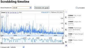
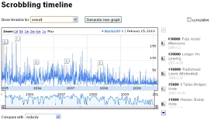
However, a new Scrobbling Timeline has just been launched that is open to all, and if you’re a heavy user of Last.fm you’ll be data visualisation heaven. The graph shows exactly how many songs you have listened to throughout your membership of the service, picking out key milestones like your 5000th track or your 10,000th.
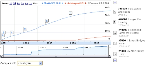
You can compare your graph with that of your friends and a ‘cumulative’ mode shows how quickly you’re adding to your overall total of songs listened to. In the example below you can see that I’m much more of a Last.fm addict than my brother.
It would be great to see data visualisations like this make their way into the main Last.fm site. New features would renew interest in the service among long-time users whose enthusiasm for it may have waned. In the era of hot new music start-ups like Spotify it’s easy to forget that Last.fm was there way before them and is sitting on a lot of interesting listening data.

Get the TNW newsletter
Get the most important tech news in your inbox each week.


