Poor Steve Harvey. The guy was just reading a card, but it ended up as one of the weirdest, most cringe-worthy events of 2015.
The Miss Universe winner was from the Philippines, but Harvey announced the Colombian contestant as the winner. Why? His cue card was a mess.
In correcting his error, Harvey gave us all a glance at what he was looking at, and a collective groan rippled across the internet. Not because Harvey erred, but because his card was a mess.
On the left side were the two runners up: USA and Colombia. They’re noted as ‘2nd runner up’ and ‘1st runner up,’ which seems easy enough to grasp. The problems only start there, though.
The actual winner is noted on the bottom right, far away from any runner-up mention. While ‘MISS UNIVERSE 2015’ was big and bold, it was removed from the other text.
The countries of finishers was clearly added last-minute, and that’s fine — the actual card format is the issue. In a moment like that, nothing should be left to chance. Harvey was left out in the cold; that card was just not designed with readability in mind, plain and simple..

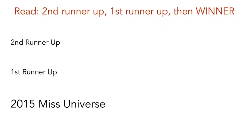
My submission, which you can see above, took three minutes in Pixelmator. It gives a few clear directions to the host up top, with the order in which the finishers should be announced. The winner is still last, but larger and in-line with the others.
If the card were printed ahead of Harvey receiving it — as it seems to have been, considering the countries associated with contestants was printed text — there would also be room to add a picture of each finisher. While keeping text in-line helps, seeing three pictures would also signal to the brain that three ladies need their time in the spotlight.
I’m no designer, but I think my simple card would have at least helped Harvey out a bit. Like anyone else reading English, Harvey went top to bottom, left to right. It’s more intuitive to have things in-line. Shoving the winner off to the bottom-right of the card suggests its a footnote, not the most important part of the evening.
In the heat of the moment, Harvey screwed up. He handled it like a champ, but a bit of UX help before he even got the card in his hand would have been welcome.
Get the TNW newsletter
Get the most important tech news in your inbox each week.


