There is a product design philosophy at Amazon called working backwards. When the company begins to create a new product — whether it be a software service or a hardware device — it works backwards from the consumer, the end user.
This design process is exactly what it sounds like. It begins with writing the press release for the product. A concise summary of the product’s main features, what kinds of problems it solves, basically why a person reading the release would care about it at all. That PR is then passed around internally at the company, so that the team can get feedback on the product, and to solicit questions.
From there, an FAQ document is made that answers the questions raised by the press release. This allows the product team, typically a small one that can be fed by no more than two pizzas, to fill in the blanks in the outline of the press release and answer questions. Then, the user experience is designed, the way that a user will interact with the product. This can take the form of software UI (user interface) or hardware design, which together constitute the ‘way it works’.
This design process is on display in a big way with the recently released Kindle Fire HD. I’ve been playing with the new tablet with a few weeks, trying to get a feel for exactly who this tablet was made for and it took me re-reading Amazon CTO Werner Voegels’ description of this process to figure it out. And when it hit me, I realized that Amazon CEO Jeff Bezos has probably the biggest balls in the business.
Simply put, the Kindle Fire HD is a tablet that was built exclusively for Amazon customers.
Amazon, by crafting a tablet that works incredibly well with its own ecosystem of book, movie and — to a lesser degree — music content, is making an enormous bet on its ability to grow its content library and make it a compelling enough reason to support an entire hardware business run at the red edge of a balance sheet. Perhaps I’m just slow, or didn’t listen to Bezos’ keynote clearly enough, but it came to me eventually.
The Kindle Fire HD (I’ve been testing the 7“ unit, though I believe most of what I’ll say here applies to the 8.9” model as well) is a decent, if not amazing, tablet offering. It’s far, far better than the original Kindle Fire, with enormously better build and screen quality and even a few well-chosen hardware details that improve on other tablets like Apple’s iPad. And it’s got some failings as well, which will likely be improved on with future models.
But it’s only when you look at it as a tablet built exclusively as a way to deliver Amazon books, movies, music and TV that you start to appreciate just what kind of radically different approach that the company is taking than any other maker at the moment.
Wild Hardware
Amazon is a wild card in the tablet race, which makes it incredibly dangerous to anyone playing by the loss-leader rulebook. The company continues to grow as a whole, and to turn over massive revenue numbers each year, while skating on a steadily increasing, but amazingly thin profit line. Well, thin as measured in billions, but still nothing like the amount Apple delivers with its lineman-girthed hardware margins. But this is no sign of trouble. Far from it, Amazon was built to work this way.
When this model is applied to the tablet world, you have a major contender that knows how to please customers, doesn’t really care about turning a huge profit, and has a uniquely focused product development process. Out of all of the players in this tablet world, Amazon’s future is the one that most fascinates me at the moment and the Kindle Fire HD has done nothing to dampen that.
The Fire, as I’ll refer to it from now on, is heavier and thicker than the iPad mini, but not unpleasantly so. It doesn’t quite hit the featherlike feel of the e-ink Kindles, which should be Amazon’s goal, but it’s much more comfortable to read on for hours than a 9.7″ iPad. The 1280 x 800 pixel screen is sharp, bright and color correct. The black levels aren’t quite as good as any of the recent iPads but they’re decent. The casing feels very good, with a very, very slight flex to the center of the back that you’ll only notice if you’re stressing it intentionally.
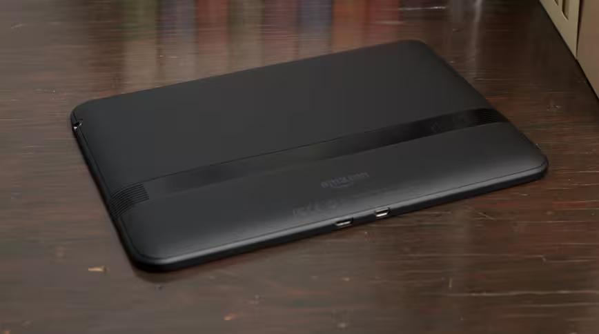
The buttons on the side of the device are silly and need to be rethought. The volume buttons are tiny and hard to find and the sleep/wake button (which has thankfully been repositioned from the bottom to the side) is nearly impossible to find without either peering at the edge or seeking along it with your finger. Coming from a company who nailed the idea of edge-buttons with the reading-focused Kindles, I’m disappointed. A bit of work here would go a long way.
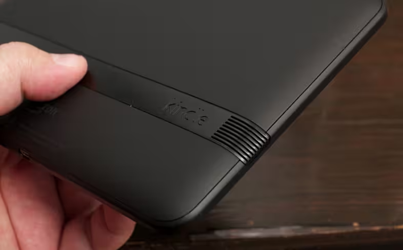
The speakers, however, are great. They’re loud, they sound fantastic and positioning them at opposite sides of the device really does give a much more stereo feel to the audio than the iPad’s poorly located bottom edge design. The positioning makes the best sense when you’re watching movies, something that you do in landscape. The speakers are not blocked by your normal hand grip and, in fact, are amplified by your cupped palms quite naturally. These are the richest, best sounding speakers I’ve listened to on any tablet.
I’m personally not a huge fan of the soft touch finish on the back of devices like tablets, as it tends to gather finger grease and can, over time, exhibit peeling. I can’t ding it too much as it also gives it a texture that is better than smooth plastic. My problems with the soft touch aren’t textural, so much as cosmetic, so just mark this one up to me whinging a tad.
The overall feeling, however, is one of solidity, care and quality. The Kindle Fire HD is a well made, durable tablet whose personality fades into inconsequence. It’s almost comically nondescript, with its black bezels, minimal branding and generic ports. Which is perfect for something made to be the perfect conduit for Amazon’s content.
Content Deliverance
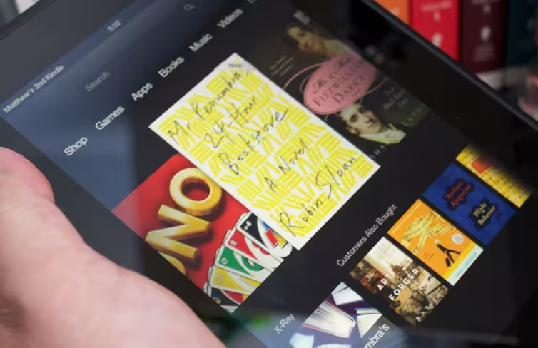
When I say that the Kindle Fire HD was built for Amazon customers, I mean that on several levels. Yes, it is the absolute best way to view Amazon content like ebooks, movies and TV Shows, for the reasons we have discussed. But the entire operating system, a fork of Android 4.x, is also designed to work as a simulacrum of Amazon’s website. Finish a book? You’ll get a screen that shows you similar titles and encourages you to share (with a purchase link) what you just read.
When you’re on the home screen, your recent items are displayed in the center in a smooth, pleasant to use carousel. Below those, changing for each item, is a list of possibly enticing purchases that you do not own. Its your own content, intertwined with content available for purchase on Amazon. It’s brilliant and a bit crass, and very, very Amazon.
And the homescreen ads, ow, they are a huge eyesore. Just pay the few bucks it takes to get rid of them, they’re so, so bad.
The result of all of this commercialization isn’t really one I had anticipated. I thought I would end up being irritated at the ads, but I came to ignore them quickly as I would any website. What it did do, however, is make the device feel a lot less personal. The ads and constant upselling make it feel more like a public terminal and less like your own tablet.
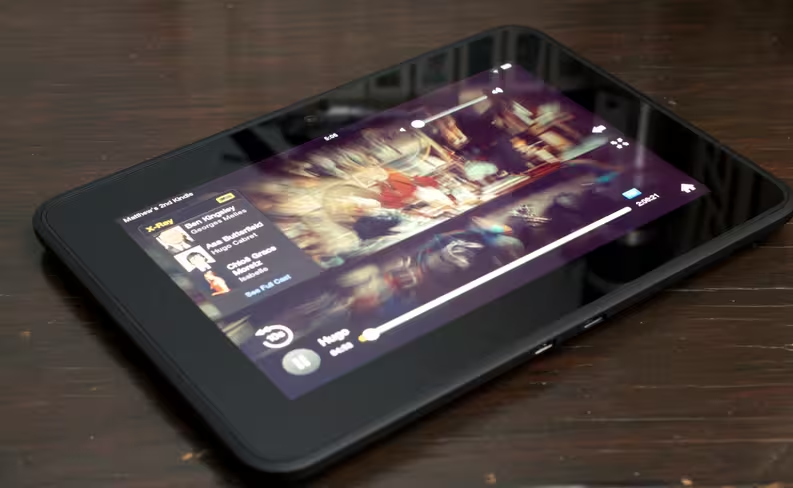
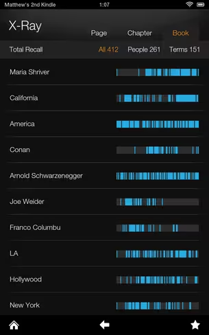
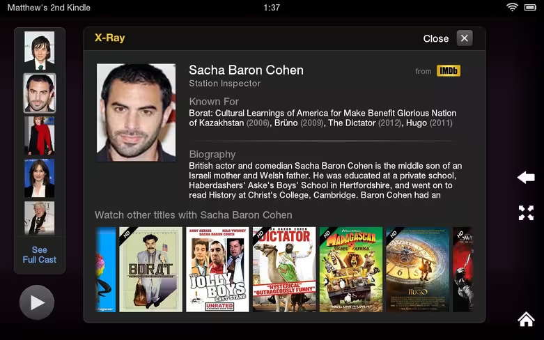
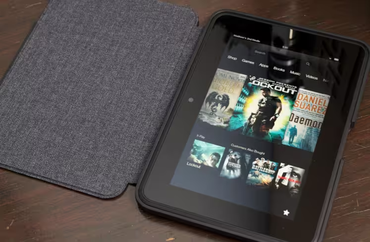
When it comes to actually displaying the content, Amazon has its act together. The X-ray feature that Amazon applies to its content is simply brilliant. There’s nothing like it on iOS and it’s a major advantage for those who have tons of Kindle books or movies hosted in Amazon’s cloud.
You can’t even check out the iTunes Extras features of Apple’s movies on the iPad, that experience should be far better. This is where Amazon’s ‘working backwards’ process shows just how well it works. If I’m a reader who loves books and has my content in the Kindle cloud, I can choose a book and explode it like a dismantled internal combustion engine and see its bones. The characters, the places, all laid out in a brilliant DNA-like interface. It’s very, very cool.
This experience is so, so good on books and movies and TV shows that it’s almost a shock when you hit the Amazon App Store and realize that it’s total crap. I mean, really, really bad. Do not buy this tablet to use good apps, there are so few on the store. Google Play’s tablet app situation is bad enough, but the Kindle Fire’s is a horror show.
Oh, and the silk web browser is laughably slow and clunky. Scrolling is poor, zooming is poor, and it renders most pages terribly as web designers have never bothered to recognize and render for it.
Country Non Grata
I’ve talked before about Amazon’s incredible weakness when it comes to international content. It still exists. Do not buy a Kindle Fire HD unless you’re familiar with what content that Amazon offers in your country and you’re comfortable with that being the case for what could easily be years yet. For a good overview of the raw numbers, you can check out this post by Graham Spencer at Macstories. You’ll see just how limited Amazon’s music, movie, TV and app offerings are in many countries.
But even then the raw numbers only tell part of the tale. Many popular albums and movies come first to iTunes and remain there for a period of exclusivity. Amazon’s app market is extremely poor because it cannot offer the Google Play store and it’s only available in 6 countries anyway. The international situation is slightly improved from last year, but not a lot better.
Protecting Its Pipeline
The Kindle Fire HD is an excellent tablet for Amazon customers, but it’s a far cry from a great tablet overall. This isn’t necessarily Amazon’s fault, as it knew exactly who it was building this tablet for. And you should as well.
We’re very close to a time when the specs of a particular tablet will cease to matter. The only thing that will matter is the ecosystem that is attached.
Even now, if your favorite aunt tells you that she’s purchased two dozen apps and 15 movies on Apple’s App Store and iTunes store, do you still recommend her a similarly outfitted Kindle Fire HD because it’s slightly cheaper than an iPad mini? Are you doing her any service by doing that?
That’s sort of the nubbin of advantage that Apple has in this brave new content world. In the end it’s about who will have access to the most content across ecosystems. That is what upsets the balance of power between the silos of Microsoft, Google, Apple and Amazon. Right now, Apple has an advantage because everyone wants to be on the iPad. It has the largest, most lucrative audience for content. In the future, who knows? But I doubt very much that we’ll be seeing anyone make buying choices based on specs unless they have a very specific need that must be filled.
The Kindle Fire HD is a pipeline for Amazon’s content, but it’s also its protector. It’s the pipe that allows the spice to flow even if Apple decides that the Amazon Video app is no longer welcome on the iPad, and Google cuts off Android at the knees and starts building its own revision. In that world, the Kindle Fire HD, Google Nexus tablets, iPad and yes, even the Surface, are the winners. It’s the mobile giants without content to shuttle that are in the dirt then. Samsung App Store anyone?
Bottom Line
The Kindle Fire HD is a very, very good tablet for people with a preference for Amazon content. It offers the best experience for Kindle books and Amazon movies and has an interface designed to front that content at all costs.
When Amazon decided to build the best tablet it could sell at cost, that gave it a 30% margin advantage on Apple (but not Google, though that’s another story) and I think it could have done better. But it will. Amazon has a willingness to play fast and loose with the rules of profit. It has a clearly focused idea of who its customers are and who it’s building its hardware for and it’s not making any excuses about it.
Those factors make Amazon a company to watch, and they make the Kindle Fire HD better than it should be. I’m very interested to see what’s next.
Get the TNW newsletter
Get the most important tech news in your inbox each week.

