Wojtek Borowicz, Community Evangelist at Estimote, freelance writer, Internet of Things enthusiast.
One of the greatest lies of software industry is the so-called intuitive interface. It’s the fad diet of IT world: everyone, from the behemoths of tech to hip startups in the Valley, claims they’ve nailed it, but you always end up with disappointment and frustration.
The future, however, is bright, as developers now have all the intelligence to deliver what the users need, when they need it. The answer lies in leveraging data, context and in a common mantra: less is more.
What does it mean to be “intuitive” anyway?
Merriam-Webster dictionary defines intuition as:
a natural ability or power that makes it possible to know something without any proof or evidence or a feeling that guides a person to act a certain way without fully understanding why.
It doesn’t sound like something that could drive the interaction between human and a machine.
Jeff Raskin, the father of Apple Macintosh and one of the pioneers of the idea that a personal computer can be a great addition to every household, already wrote that there is nothing intuitive about digital interfaces back in 1994. And yet software companies are trying to tell us that their solutions feel natural.
That their products don’t need understanding and knowledge. That they’re intuitive.
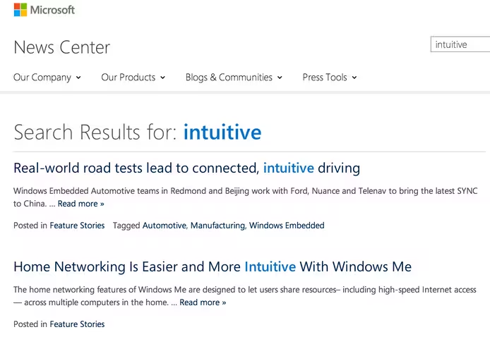
If you search for that word in Apple’s press center, you receive results about iOS 8, CarPlay, Safari and more. Look up intuitive on Google’s official blog, and you find over 30 different posts. Check Microsoft’s press center for the i-word and it presents you with stunning 89 pages of content!
We’re, of course, not limited to these three. Facebook, Oracle or basically any software name you can think of, have been touting intuitive interfaces for years.
Natural? Maybe. Intuitive? …meh
You might say that introduction of the computer mouse made navigating computer interface obvious (Raskin, mentioned above, would disagree) and that the advent of high-quality touchscreens has finally made using computers feel natural. But that’s a half-truth, and as such is strongly misleading.
Yes, over the years, the learning curve for human-computer interaction has decreased dramatically. We now have a generation of digital natives who grasp technology and software much faster. There are even digital immigrants who’ve learned how to handle apps and operating systems with ease: unsurprisingly, often tech aficionados or people working in startups and IT companies.
But it still doesn’t make anything about digital interfaces natural. Saying that computer systems have now become intuitive because young folks and people from Silicon Valley get them is like stating that credit default swaps are easy, because someone from Wall Street told you so.
Couple of weeks ago my grandmother called me. She uses her PC mainly for Skype, reading news and commenting on them. In her bedroom she has post-its with detailed instructions for each of those, in case she forgot one of the steps.
he reason for the call was simple: she couldn’t proceed with any of her favorite online activities, because internet didn’t work. All it took to fix the issue was re-establishing Wi-Fi connection. It requires exactly three clicks on her Windows 8 machine. It’s a matter of seconds… if you know what you’re supposed to do.
But my grandmother only Skypes and reads news, she doesn’t know which icon in the bottom-right corner is Wi-Fi. The fact that its looks change depending on the connection status doesn’t help with explaining it over the phone. She also doesn’t know which of the available networks is the one she’s supposed to connect to.
It doesn’t sound like much until you realize that being so accustomed to technology as some of us are today creates a language barrier. A switch icon to me is a grey rectangle to my grandmother.
And if the grandmother example sounds exaggerated to you, take a look at how your parents or even less computerized peers react, when apps and platforms require something beyond the few actions they’ve managed to memorize.
Get rid of user interfaces?
Golden Krishna is spot on when he writes that current interfaces are based upon a model that is inherently unnatural, inhumane, and has diminishing returns and that there is a better path: No UI.
Will we ever arrive at the point with no interface at all remains an open question. But one thing is for sure: we’re on the verge of a massive change.
The great paradigm shift of today’s UI is the reversal of directions in human-computer interaction. Up until now, we were looking at personal and mobile computers as directories.
This is changing. In the future, it will be the content reaching out to us, and giving quick, actionable hints.
As Intercom’s Paul Adams points out, apps as we know them, requiring full attention to browse through icons and menus, are on their way out. The interface of tomorrow will be dominated by cards, notifications and natural language communication.
We can already see it happening. Apple has introduced actionable notifications and suggested apps in iOS 8, making it easy to perform actions straight from the lock screen.
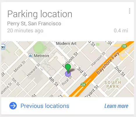
Google has taken it a step further with Google Now. This digital assistant is integrated with your Google Account and learns your habits. Google Now tries to understand user’s context, to display the right information in its cards. You unlock the phone and one look at the screen tells you that it’s going to rain today, there’s increased traffic on your way to the office, your eBay order has shipped and what’s the Champions League fixture for tonight.
It’s also worth noting that both Silicon Valley giants, along with their Seattle counterparts – Microsoft and Amazon – are pushing hard for development of speech recognition and natural language technologies – another key component of making machines more approachable.
But it’s not only the platform providers, like Apple and Google, who seek to minimize users’ reliance on interfaces. Spotify and Uber have recently announced a partnership, allowing people to play their Spotify playlists through Uber rides’ stereos with a touch of a button.
The future of interfaces (or lack thereof)
It’s not much of a longshot to envision a seamless transition from the music in your headphones to the car’s sound system as you enter your Uber, with no need to take phone out of the pocket at all. That’s a giant leap forward in reducing the friction from our encounters with machines, but we should go even further.
To execute this vision, apps and platforms need to leverage intelligence and understand context of the user. The easy part is harvesting all kinds of data we’re providing computer systems with. The hard thing? Structuring this data, making sense of it, and turning it into features that go beyond pushing actionable notifications to the lock screen.
The key is tailoring the experience for needs of the particular user. It requires knowledge about users almost on the level of intimacy, but didn’t we already give IT companies access to that?
Thanks to social API’s, they know who we like. Thanks to online and mobile shopping they know what we need and enjoy. Thanks to GPS, Wi-Fi and iBeacon, they know where we are and how much time have we spent here. Hell, they can even use big data to figure out when and where we’re having casual sex.
As creepy as it sounds, it’s a necessity, if we’re aiming to reduce the friction that interfaces create. Whether it’s right to trade off privacy for convenience is a different discussion.
To better understand the user, computers and software running on them will also have to understand what surrounds them – in the physical sense.
This is where Internet of Things kicks in. Benedict Evans is right when he states that app stores do not longer work for app discovery. What I expect to fit in this place is the physical world itself. The IoT era has already started and soon millions of people in the developed world will live in smart homes, drive smarts cars and work in smart offices. Data from all those connected devices, multitude of sensors and indoor location systems allows for a super-granular look into people’s habits.
It’s not just knowing you’re at work. It’s knowing what position you’re sitting in, when was your last break and that your VP of Sales is running late from a meeting downtown because of traffic, so you can cancel the conference room booking and go grab a cup of coffee anyway.
And the magical moment will be when you can reschedule the meeting with one click and turn on the coffee machine with another, without even leaving the lock screen.
Of course there will always remain a group of power users, or more accurately – power use cases, mostly related to solving problems and creating solutions (in as broad sense as possible). Those will demand full attention and mastering directory-based navigation, just as they do now. If you have to research an account and prepare term sheet, next-gen Google Now might help find the right information, but won’t close a deal for you.
Businesses have all the data and tools they need to create the new, context-based interfaces, and will only have more. Right now, we’re still far from reaching the magical moment, but we will get there when people responsible for designing and developing software will switch from building directories to delivering action items.
And whoever gets there first, may become the creator of first intuitive interface ever: no interface at all.
Read next: Machines are taking control of the world, so why stop them?
Get the TNW newsletter
Get the most important tech news in your inbox each week.


