
This post originally appeared on Owen’s personal blog.
I had an interesting experience this week when I tried to cancel my Spotify account. When you visit the cancellation page, you’re asked to give a reason about why you’re canceling.
Fair enough, but what caught me off guard is Spotify trying to trick you into staying subscribed.
Spotify uses a tactic where it makes the link for “stay premium” a big obvious button and the “cancel my account” button a small link to the right. Since you’re unlikely to read the button and just click on it (because a good interface would make the action button the right thing), I clicked the big green button and assumed I had cancelled.
I didn’t actually realize I had been tricked into staying subscribed until after I came back five minutes later. Here’s the interface in question.
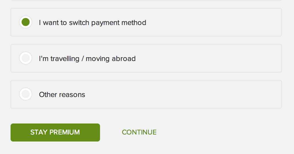
This is horrible on many levels, because it’s clearly the company trying to trick those who already want to leave into paying them more money. It’s not about retaining them so much as tricking them into thinking they’re no longer paying. Horrible and desperate.
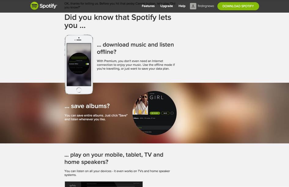
If you actually figure out what happened and click the correct button, you’re presented with a second screen that begs you to stay. This is customised based on what you click.
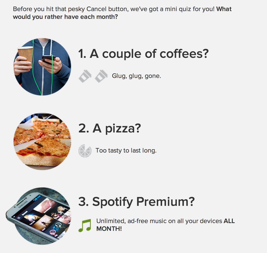
I found the one for “it’s too expensive” quite funny but it tries a little too hard (they don’t want to see what happens if I don’t get caffeine for a day). To me, it just seems like they’re trying to guilt me into staying subscribed.
This page, again, attempts to trick you into staying subscribed by using the same button technique from earlier.
It’s not uncommon for websites to beg you to stay – Facebook does it too by showing you pictures of your friends – but I’m not sure it’s really necessary when I’ve already decided to stop giving them money (and have already been tricked once). I’m sure this page converts a small percentage of users into staying, but I’m not sure it’s worth it.
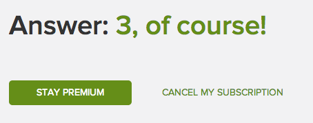
After you make it past this page, there’s a final confirmation to make sure you really want to cancel. This page actually has the buttons organized the opposite way around, just to confuse you even further.
It also has a song embedded (Jackson 5 – I want you back) to try and guilt you further into staying.

It’s funny how startups love good interface design, write about it and spend a lot of time talking about why they build great interfaces. But when it comes down to money and losing users, they are willing to build terrible interfaces that trick them into paying more.
This experience didn’t make me want to stay on Spotify – especially after I was tricked the first time – and made me quite bitter when I had to come back and cancel a second time.
If your startup respects your user’s intelligence enough, let them stop paying you in an easy manner. It’s fine to ask why, but don’t try to trick them using interface design that’s obviously misleading. That just means they won’t ever come back.
Read next: UX designers: Side drawer navigation could be costing you half your user engagement
Get the TNW newsletter
Get the most important tech news in your inbox each week.