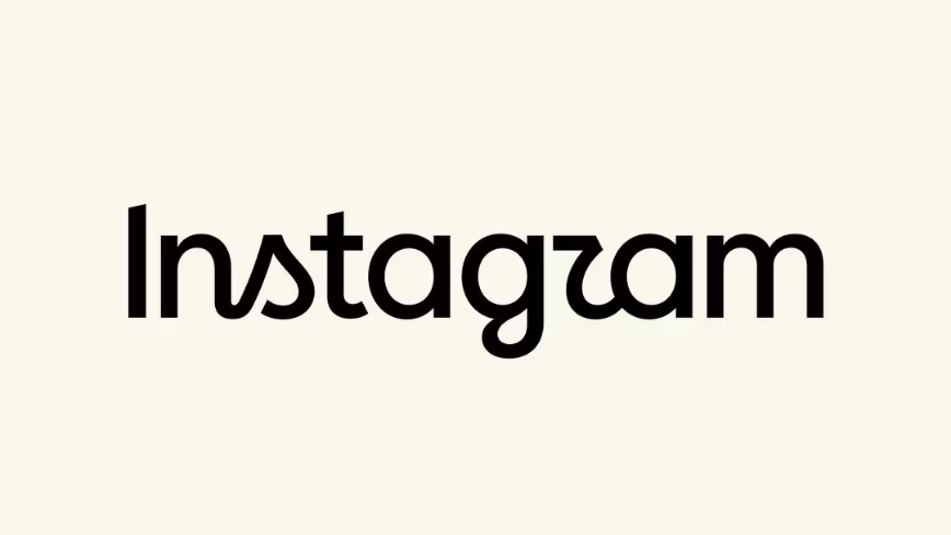
Instagram changed its wordmark on Thursday. A wordmark is the written name, the word “Instagram” as it appears at the top of the app.
It is not the icon. The pink and orange gradient square on your home screen is untouched.
The change itself is small. The new type carries cursive curves on the letters s, r and g, where the old wordmark ran cleaner.
What Adam Mosseri said it was for
Adam Mosseri called the result “sharper and more modern”, TechCrunch reported. The head of Instagram said it still referenced the original and kept things simple.
That is a careful sentence. It claims novelty and continuity at once, which is what every brand refresh claims.
The reaction split along predictable lines. Some users liked the fresher type. Others said the new r looks like a boat sail, or that the whole thing now reads as “Instagzam”.
Neither camp is wrong, which is roughly the point of a typeface argument.
The last time Instagram redrew itself, it meant something
Compare this with 2016. Instagram threw out the skeuomorphic brown camera with the rainbow stripe and replaced it with the flat gradient square that is still there.
That change was not decoration. The camera icon described an app for taking photographs, and by 2016 Instagram was no longer mainly that.
Dropping the camera was a public admission. The product had moved on from the thing its logo depicted. The change caused an enormous row, and then it stopped mattering within a month.
Ten years on, the app has moved again, further and faster. It is a video feed, a messaging tool and a shopping surface. Mosseri has said outright that the algorithm is now the central experience.
The company has kept rebuilding around that idea. It has reworked screen time and personalisation controls, and it keeps moving AI further into the feed.
So why touch only the letters
Here is the question worth asking. If the product has changed that much, why change the least load-bearing part of the identity?
One reading is that a wordmark refresh is cheap. It updates every touchpoint a company controls without asking a single user to relearn anything.
The other reading is that the icon is now too valuable to move. It sits on billions of home screens, and it is recognised at a size where the letters are invisible.
That recognition is an asset with no replacement cost anyone can calculate. People find the app by colour and shape, not by reading it, which is why the gradient survived a decade of product change.
The wordmark carries far less of that load. It appears in the app header, in marketing and in press material, and almost nobody navigates by it.
Meta declined to say whether a new app icon is coming. That non-answer is the most interesting line in the story.
What a rebrand is usually covering for
Brand refreshes tend to arrive alongside something else. They accompany a repositioning, a merger, a pivot, or a period when a company would like the conversation to be about how it looks.
Instagram has had a busy year on every front except typography. Meta pulled an AI image feature after a privacy backlash, and European regulators have made findings against addictive design on its platforms.
It is also in court. A Tennessee addiction trial is one of several proceedings over what the app does to young users.
None of that is caused by a font, and none of it is fixed by one. But it is the context a design change lands in, and readers notice the timing even when there is nothing to it.
The generous reading is simpler. Type ages. A wordmark drawn for 2016 screens looks slightly wrong on 2026 ones, and companies update these things on a schedule most people never see.
The part designers will actually argue about
The cursive curves are the substance. They gesture back at the original Instagram wordmark, which was a script face, without going all the way back to it.
That is a common move in brand work. Reach into your own archive and take one gesture rather than the whole thing. Done well it reads as heritage. Done badly it reads as nostalgia with no argument behind it.
The original script wordmark belonged to an app that wanted to look like a photo album. The company has spent a decade removing every other trace of that, so borrowing its curves back now is a choice worth noticing.
Whether these particular curves earn it is a matter of taste, and the boat-sail comments suggest the letterform is doing more work than intended at small sizes.
Legibility at thumbnail scale is the only objective test that matters here. Nobody can run it properly until the mark is everywhere.
There is a practical constraint behind the aesthetics too. A wordmark has to survive being rendered at 12 pixels high, in a language it was not drawn for, on a screen the designer never saw. Curves are the first thing to fail that test.
What would settle it
Two things, and both are checkable rather than aesthetic. The first is whether the app icon follows, because that is the change that would signal an actual repositioning rather than a tidy-up.
The second is whether the new wordmark shows up on Threads, on Meta AI surfaces and in the company’s hardware marketing. A typeface that travels across the family is a system. One that stays on Instagram is a paint job.
Until then, the honest summary is short. Instagram changed its font and left the thing you actually tap alone.
In 2016 the company used a logo change to announce what the app had become. This time it has said nothing at all, and when asked, it declined the chance to.
Get the TNW newsletter
Get the most important tech news in your inbox each week.
Also tagged with


