Instagram today updated its Android app with a clean, flat redesign and a slew of under the hood changes designed to make it faster and more responsive than ever before.
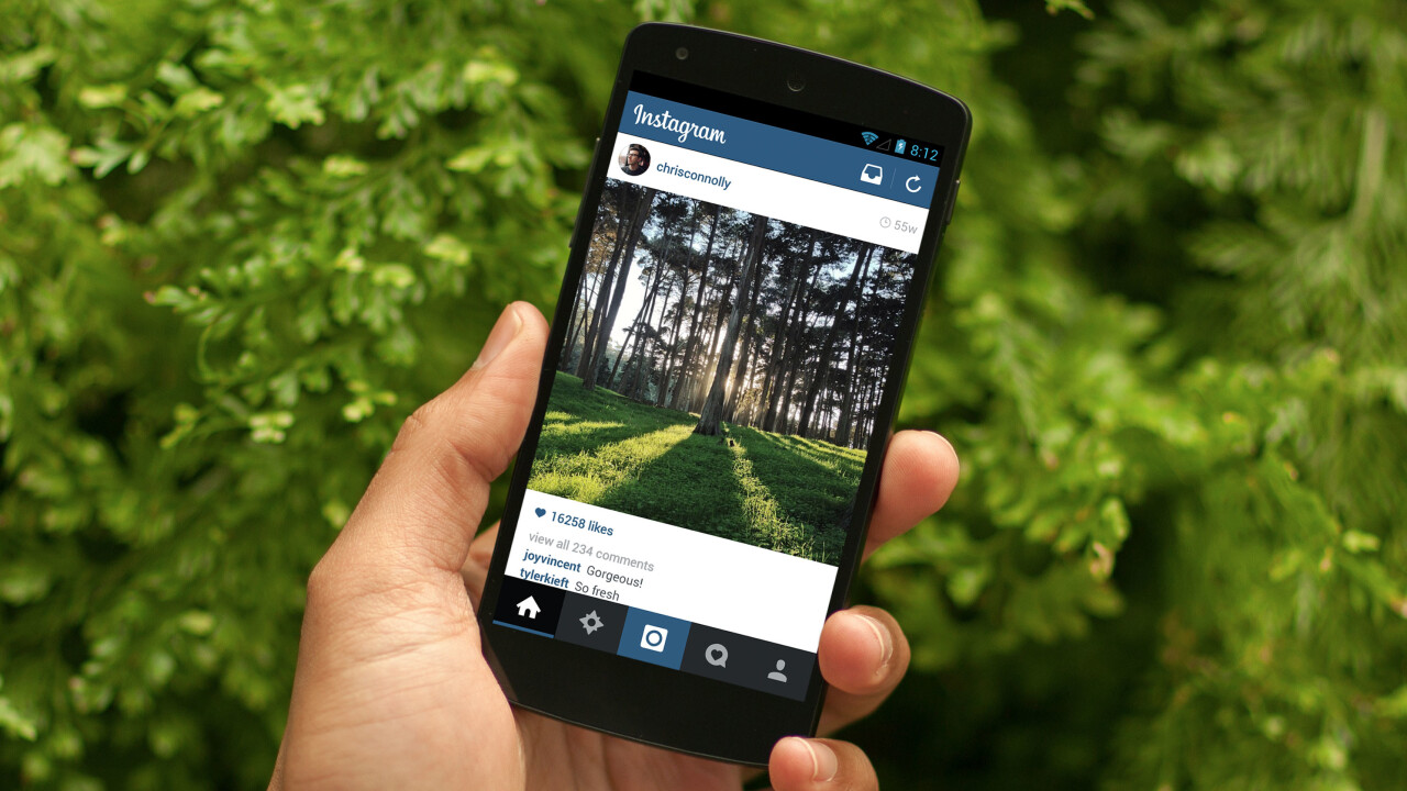
From the moment you open the app, it’s clear the Instagram team has taken a lot of time finessing the aesthetics. While the layout and placement of virtual buttons is the same, almost all of the assets have been flattened or tweaked. The banner no longer has a gradient in the background, and the Instagram logo is now pure white. The refresh and Instagram Direct icons have also been changed, and a lighter font has been brought in for the timestamps attached to each photo in the top right-hand corner.
The new visuals permeate through the navigation bar at the bottom of the screen too. All of the icons have been changed and perhaps most importantly, the Instagram logo in the center has been switched to the minimalist square and circle combo found in the Instagram for iOS app.
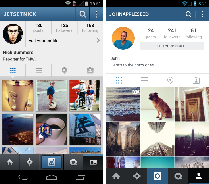
The Explore section has been trimmed to give photos even greater space on screen, while the mess of boxes and lines has thankfully been cleared from user profiles. All round, it’s a lighter, more beautiful design.
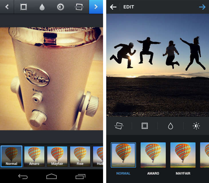
From a design standpoint the iOS and Android apps feel closer than ever before, but dig deeper and you’ll notice some differences. Text alignment at the top of the app isn’t consistent between the two and while editing, you can see four tiny lines splitting the various editing tools. They’re small details, but it shows the team hasn’t just cloned what it shipped for the iOS app.
The updated Android app is also faster. Instagram says profile pages should now load twice as fast. The overall app size has been halved too to optimize speed across the board. “In taking time to polish our designs, we’ve worked to make sure that Instagram feels native and at home on any Android device,” the company said. While it doesn’t offer anything in the way of new features, this is an important update that should appeal to all users.
➤ Instagram | Google Play
Get the TNW newsletter
Get the most important tech news in your inbox each week.


