Seven seconds. That’s all it takes for someone to form a first impression. That means you have less than one-ninth of a minute to show the world your shine.
The power of that first impression, at the right moment, with the right person, is immeasurable. It could lead to a new colleague, creative project or a beautiful relationship. By this time, you may be used to perfecting in-real-life first impressions with a smart smile, articulate introduction and concentrated eye contact. But how can you translate this to the digital world?
In today’s modern age, we live with one toe always dipped in the online world. The one where pictures cannot be torn up and maybe not-so flattering links persist our best SEO.
For what you do, there is always someone else on the Internet that looks like they’re doing it better. This is a world where our online identity is spread across dozens of constantly-changing social networks, making it almost impossible to ensure that your “first impression” is always in your control.
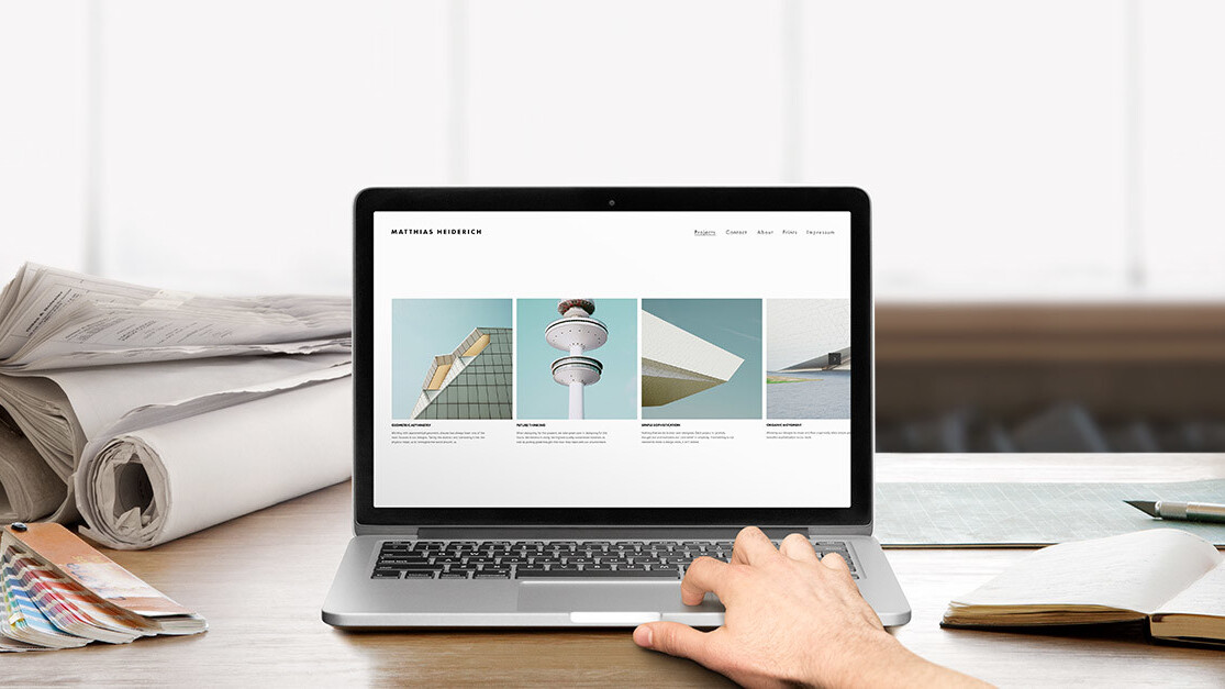
Fortunately, thanks to services like Squarespace, a publishing platform that allows anyone to easily create a beautiful online identity with elegant websites, blogs, portfolios, and e-commerce stores, taking charge of your online persona has never been easier.
Who? You!
Your website should claim an essential part of your life on the Internet, starting with, of course, your name. Particularly for freelancers and entrepreneurs, whether it be graphic design, consulting, photography or writing, your name is essential to your online identity, as it is also the mark you make on your final, tangible, readable and viewable products.
Owning your identity from the beginning cuts down on the incoherent reviews or old information (yes, sometimes those high school track meet results somehow still come up in the search) that could distract from that seven second first impression.
For the best results, include your name in the domain (AKA a vanity domain). If just your name is taken, add in the main purpose of your current actions, for example, www.MackensieSmithWriting.com (not a real site).
Plan ahead
Before you set out to create your website, make a blueprint. Type up a word document—sans bells and whistles—with an outline of what you would like to communicate. Think long and hard about what you want to showcase in a glass, decorated window of your skills, talents and services.
Avoid the resume trap of looking at the current curriculum vitae and copying the chronological listing of jobs. That is not intriguing enough to keep an interested client page clicking all the way to pursuing contact.
So what should you include on your personal website?
1. Start with a personal vision statement
What do you want to contribute? What’s your elevator pitch of all the beautiful and bold boiled down elements of history, travel, education, family and mistakes that make you, you?
Think of it as a newspaper subhead, extrinsic mantra and company tagline rolled into one. If you don’t want this as your website tagline, use it as a jumping off point for the critical information to include.
2. Highlight your top pieces of work
For Web designers, it could mean presenting your portfolio by showcasing your favorite projects. Photographers, no matter your subject – awe inspiring sunsets, delicious dishes, model perfection – utilize various presentation modes so you can Lightbox the illustrious and slideshow the best.
Plan to include a section with links or feeds to the social networks you want to connect with others on. Because each network on its own fails to fully capture your essence, combining them in one central location on your website is advantageous for owning the flow of how interested people view your information.
Remember, it is almost always better for a seeker of your personal story to find your “About” page on your website than that snarky tweet about cat videos.
3. Make it beautiful
The old adage of “a picture speaks a 1,000 words,” has only increased in word count through social media sites like Instagram and Snapchat. We are a visually oriented online society, which means the quality standards have been raised. Having excellent visuals to back up your website is a must.
Spend the time (and if necessary a little money for a fantastic photographer) to take true and telling photographs of you, your environment and what you want people to take away from seeing you, whether that be beautiful art, a building you designed or album covers.
Don’t worry if you don’t have high quality photography handy – there are resources available all over the Web ready for your use.
4. Get branded
After running the website by a few trusted confidants who know you well, and then a couple who do not, make the appropriate suggested edits and share your identity with the world.
Use your network to promote the site, posting a link to the site on your social media profiles. Link it as your main website on those social networks. Hyperlink your email signature name with the site and place the URL below the name for prominent display.
Send out an email to friends, family, colleagues and potential and previous clients with the announcement of the new site. Recommend that they pass it along to someone who should see it. Take the site offline by adding the URL to print collateral such as business cards.
Start small, keep it simple and grow your site as your online portfolio and professional career grows.
Interested in Squarespace? Use code THENEXTWEB for 10 percent off.Don’t miss: Designers’ dream giveaway: Win a Sony Alpha a5100, $300 in Moo supplies or a FiftyThree smart pencil
Get the TNW newsletter
Get the most important tech news in your inbox each week.
This is the first of a series on "The Guide to Your Online Portfolio," and has been brought to you by Squarespace. Create exceptional websites, blogs, portfolios and online stores.


