I love Helvetica. We all love Helvetica. It’s a wonderfully empty face: highly legible and without personality. It takes the form of whatever you wish, and has been a common default body font for years. Its de facto status makes so much sense, but I’m sick of it.
It’s not just Helvetica, either. I want to retire all of the core fonts of the web; Arial, Georgia, Times New Roman, etc. It’s not that these font families don’t deserve love — they do — but there’s something fundamentally wrong with excluding the tons and tons of fonts out there without giving them a chance.
Typography is only now getting some real love online, and I’m more eager than ever to see Web designers push the envelope with type like print designers do. Web typography is still an open frontier, and now’s the perfect time for designers with something to say. Why? Because fonts do a lot of talking.
Every font says something different, be it the elegance of Baskerville or the intelligence of Eames. Typefaces say so much, even in body type, so as Web designers we all have to learn more about what we’re saying.
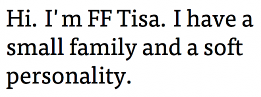
 As far as choices go, there are too many options to list. On TNW we use Proxima Nova (with a safeguard of Segoe UI and a number of fall-backs), Smashing Magazine uses Skolar Regular for intros, Coop uses Adelle, Type Connection uses FF Tisa, and so on. Plus, if you’re not able to pay for a service like Typekit or buy individual licenses for use with @font-face, designers have already proved that beautiful Web type can be achieved through free offerings like Google Fonts.
 Over time, we’ll probably see a new list of de-facto fonts pop up all over again (Proxima Nova will likely be on that list), but for now, I’m just itching for something fresh. It’s time experiment and push the envelope. We’ve waited long enough.
Check out our full Design and Dev channel for more inspiration. Also, you can exclusively view typography articles here.
Get the TNW newsletter
Get the most important tech news in your inbox each week.


