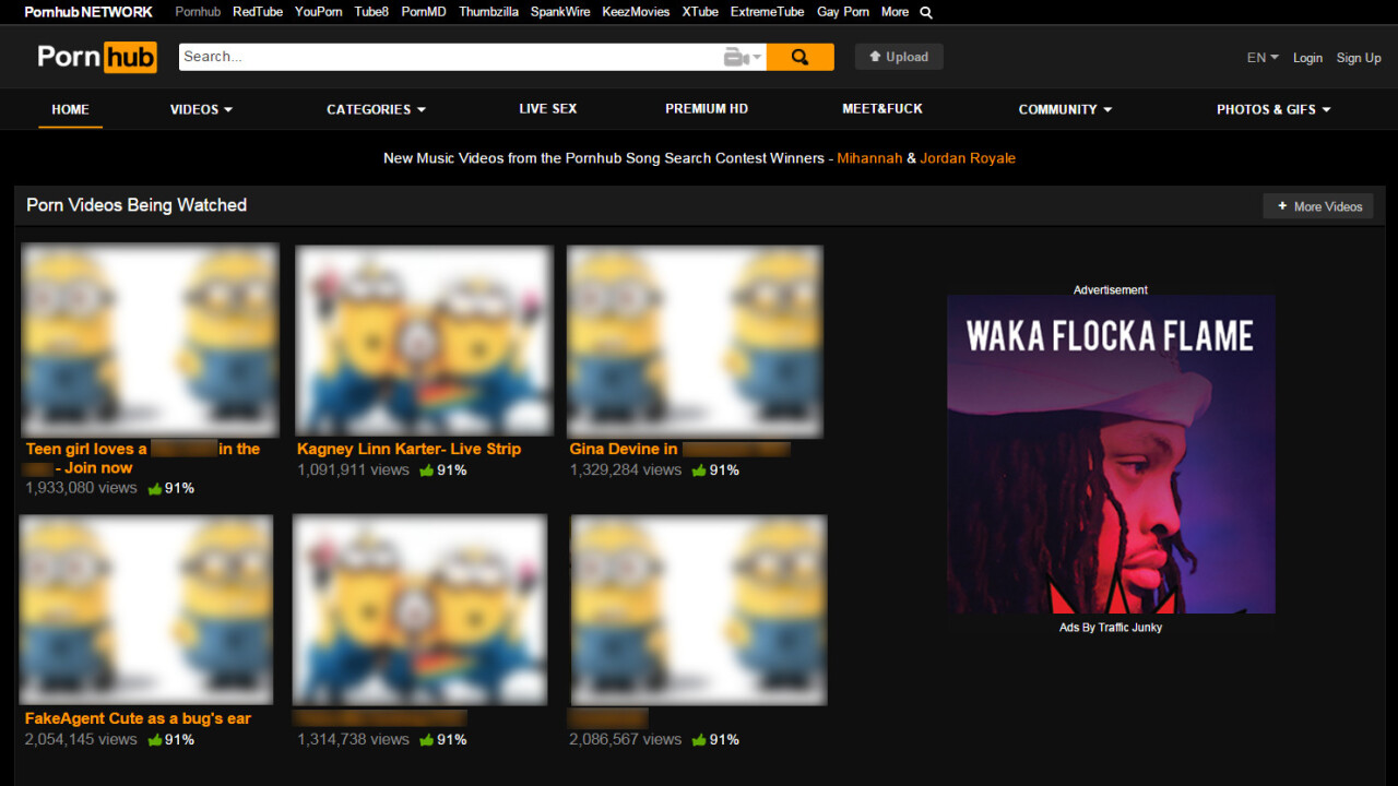
This is the point where you can stop pretending you’ve never heard of Pornhub. It’s the Facebook of the adult world, ubiquitous and all-conquering. Its brands deliver epic Web traffic, claiming 60 million unique users a day.
Note: From here on, all links in this post should be considered NSFW.

But despite those massive visitor numbers, Pornhub has never done an interview about the design philosophy behind its network. While you might assume it’s as easy as presenting visitors with an unending stream of hardcore material, it’s a lot more complicated.
Pornhub actually refers to two things – the eponymous website and the network of sites it belongs too. Beyond the title brand, the company runs RedTube, YouPorn, Tube8, PornMD, Spankwire, KeezMovies, XTube and ExtremeTube, along with experimental sites Thumbzilla, PornIQ and Peeperz. It also has gay versions of all its main brands.
Behind the public facing Pornhub persona lurks MindGeek, a global conglomerate headquartered in Luxembourg. The company is controversial with many performers and directors in the adult business uncomfortable with its near monopoly status. It’s not the only game in town, but it’s the most dominant (pun intended).
The spread – I’m going to stop flagging the puns now – of the company’s sites led me to start a conversation with Pornhub’s Vice President of Product Corey Price about why those different brands exist and how they affect the work of the designers at its Montreal HQ.
Here’s what I learned:
1. Pornhub sees itself as a competitor to YouTube and Vimeo
I came from working in online marketing. I didn’t come from ‘porn valley’. We all read The Next Web, TechCrunch, FastCompany, Wired etc.
We see ourselves as trying to bring the overall online philosophy to adult. We’ve really always focused on our competitors being YouTube and Vimeo. We think about providing the best user experience.
2. Each of the its porn sites has a history and its designers respect that
The Pornhub network is a product of fairly ruthless acquisitions. But while MindGeek does seem to share some qualities with the Borg (“Resistance as you know it is over. We will add your biological and technological distinctiveness to our own.”), it has learned to respect the heritage of brands it absorbs:
The history of a site influences the design. RedTube and YouPorn were Pornhub acquisitions. A lot of our design choices come from where the site was based and how it started out.
YouPorn was US-based and was always more ‘couple friendly’ and ‘female friendly.’ We have different content and ad rules on YouPorn.
We look at the history and especially the design history of a brand, but also the content and geographical focus. It’s important to us that they have unique identities.
Each site has its own managers and directors. Each one has a lead UX designer. There is a common pool of people but there are individuals thinking about the aesthetic. We made a constant effort not to copy each other.
To the casual observer Pornhub’s sites could appear to be pretty similar beneath the surface design differences, but that’s deceptive. Ask Price and he can rattle off the distinctions:
We think a lot about what distinguishes the brands. It’s a real challenge with the big three – YouPorn, RedTube and Pornhub are all ‘the YouTube of porn,’ so it can be hard to distinguish them. But we work hard to do that.
KeezMovies is more pornstar personality focused, while ExtremeTube is niche and about fetishes.
3. Its users hate change just as much as Facebook fans so iteration is key
In the beginning we’d overhaul sites when we acquired them, but that shocks and upsets existing communities. Now we try to slowly update and evolve them.
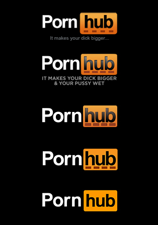
Pornhub hasn’t had a new site in six years, but each week something will change. It’s a slow evolution. We went from having a logo with a tagline to a flag logo to flat navigation.
Logos and colors have a huge impact on the direction we take. They in turn lead to some design functionality. Sites evolve over time, taking user feedback into account, but not being ruled by it.
4. People actually do share Pornhub content a lot
We don’t want or need sharing buttons for Facebook – people wouldn’t use them. But, for instance, Reddit has big adult sharing communities.

We have a GIF generator which gets used a lot for /r/nsfwgif and /r/pics. A lot of people see things they think are funny and share them on Twitter. Often it’s about the porn parodies.
5. Like any Web giant, it knows the value of experimentation
Just as Facebook, Twitter and others push tests and experiments to see how they’ll fare in terms of user-interaction, Pornhub’s developers and designers will create projects balanced on a notion that may or may not succeed.
Among them are PornMD (an adult search engine), PornIQ (which suggests playlists based on predefined choices) and Thumbzilla (Pornhub totally reimagined for mobile).
Price explains how ‘experimental’ projects come to life at the company:
With something like PornMD, we think about utility. We said: ‘Wouldn’t be really helpful for users to have a mega-search engine?’ We looked at the best in adult search and the best features in mainstream search.
We like to experiment a lot. The genesis of PornMD was funny. Someone came to us with the domain porn.md and we said: “That’s such a good name, we have to do something with that.” Then we said, why don’t we make a search engine that’s the Doctor of Porn.
PornIQ is an amazing service. I love it. It’s a really cool way to deliver content. It solves one of the biggest complaints we had which was that people didn’t know what to watch.
6. Feedback goes further than desperate dudes begging to be pornstars
Another easy assumption to make is that the feedback flowing in Pornhub’s direction is mainly misspelled requests to become act in a porno and weird love letters. But Price tells a different stories:
People flag up security issues and we get lots of good feature suggestions. We get hundreds and hundreds of emails a day. But yes, there’s also a lot of guys (and some girls) asking how to become a porn star.

If anything there’s probably more functional feedback from men than women. Our tagline used to be “PornHub: Make you dick bigger” and women emailed to tell us that left them out. Then we said “It makes your pussy wet,” which was only marginally better. Finally we dropped it altogether. We got a lot of complaints about the ‘Female Friendly’ category so we changed it to “Content for women.”
We tried to be very active on Reddit, Twitter and on email. A lot of people seem to have noticed the design work across PornHub. They see that we picked up on the design trends. Lots of people want to work here!
7. Filthbook: community matters even when its members often have their hands full

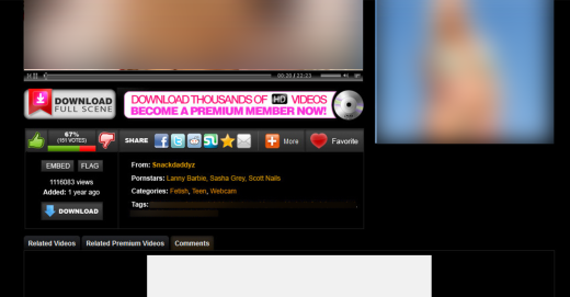
If you only make brief visits – obviously not that brief, no offence – to Pornhub’s sites, you probably haven’t noticed the seriously active community beneath the surface. There’s effectively an entire social network there with user profiles, friending and sharing even more user-generated content than you’d initially expect:
Most people aren’t interested or aware of the wider community. If you get into it, it’s almost like Facebook.
There are two types of people – those who want to interact and those who want to consume video. We worked really hard on Pornhub to create community functionality. Visitors want to see videos and the community wants the views.
It’s not that different from Reddit or Wikipedia, there’s mostly consumers and some producers. We have over a million unique accounts that log into Pornhub a month, but obviously we get 60 million visitors a day, so it’s a tiny fraction of them.
8. Europe doesn’t fap to the same crap as America
Pornhub’s different brands draw distinctly different audiences based on geography:
Pornhub is very US/UK now. YouPorn is big in continental Europe. RedTube is huge in South America.
9. When you design sites full of porn, you eventually stop seeing all those naked bodies
When you’re at the office and looking at the site, it’s work. After a few weeks, you end up looking at the templates or placement more than the actual content.
You see bugs and features, instead of the videos. But at home, using the sites as a visitor, it’s a different experience. We definitely encourage people who work here to use the sites at home.
10. A small team can achieve big…um…results
Despite working on a network with such huge traffic, the actual design team at Pornhub is relatively small:
In terms of UI/UX, we have around eight people working on that stuff. Obviously our front-end Web developers are also designers, same with the PHP and infrastructure guys.
Here’s the most surprising thing:
We have a two-person team that builds our Flash and HMTL5 player.
…and the least surprising:
Our biggest team is the content team.
It’s easy to roll your eyes publicly at Pornhub while furtively visiting in an private browser window, but Price and his team had one message they wanted to leave you with:
Our designers have all come from agencies and other big websites. We all come at this from a UI/UX perspective. Great design is really important to us.
So next time you’re doing ‘research,’ take a moment to appreciate all those little details beyond the more obvious distractions.
Come (hehe) join our Answers session tomorrow with the Pornhub team: Corey Price (VP), Brett Hall (Director of Product) and Alex Klein (Marketing Manager). Ask them whatever you want – for a friend, if that’s how you roll. Sign up here and ask away!
Get the TNW newsletter
Get the most important tech news in your inbox each week.


