Did you know TNW Conference has a track fully dedicated to exploring new design trends this year? Check out the full ‘Sprint’ program here.
Last week everyone was talking about Iowa. I usually wouldn’t bother covering the controversy here if not for two things. First of all, even though I currently live in Sopot, Poland, Iowa is a significant part of my life. Back in 1999, I finished high-school in Marion, IA (with not the best grades), and that was a life-changing time for me. A nerdy web-designer/developer, out in Iowa, trying to fit in, and mostly failing.
So I do feel connected to Iowa as it’s a part of who I am.
When I saw some leaked images from that infamous app, I realized that it’s yet another example of something I’ve been talking about A LOT…
Bad UI often means a bad product.
While the UX crowd wasn’t too pleased by my approach before, I still stand by it. There are edge cases in which a professional team of developers built a sophisticated app for pros. It can be poorly done on the front-end side and still do its job well.
Read: [We forced an actual designer to review our writers’ DIY article images]
But in most cases, UI is that one area of UX that is a dead giveaway of overall quality. You can’t really judge information architecture, flows, or successful, applied research in a product without knowing all about it.
A lousy UI we can recognize right away
It’s even more apparent with the Iowa app because it’s supposedly an official product. I know the political divide is quite big nowadays. Still, as both parties are primarily American, maybe they could, you know, use the US Web Design System in their official products?
It was created for a reason (and is quite good, actually). Sure, it’s for the “web,” but an app like that isn’t that complex that it couldn’t have been recreated using it.
What happened to “judge a book by its cover”?
Even if the people in charge of the Iowa Caucus are not “tech-savvy,” they probably use other, more refined apps daily. Don’t they see the difference? Really? Can you spot a rusted-over old Toyota next to a brand new Tesla and still say: “They’re both equally good.”
Some of the younger employees maybe even worked on some digital products (or around them) before. I can’t imagine the entire UX / UI / CX process being outsourced by a major political force to an IT firm without anyone to question the result.
So why was a product that looks like a functional demo even chosen? We’ll probably never know (or don’t want to know). I’ll try to go over what little screenshots of the app appeared and briefly annotate them. Lots of those problems are universal and are an easy way to judge a product. Sure — you can be wrong — but you likely won’t be.
Let’s check it out, shall we?
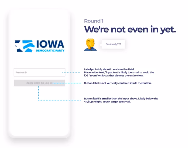
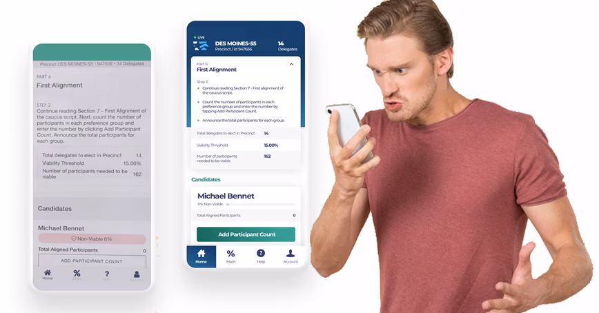
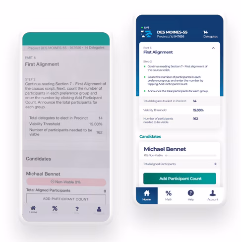
The image above is a good example. This is the login screen. Notice the “click here” phrasing that can be confusing on mobile devices (it’s an app after all). There are at least 3 problems with this very simple screen alone. We can, of course, talk about the alignment of the entire screen, or logo-to-form relation. But that’s not the point.
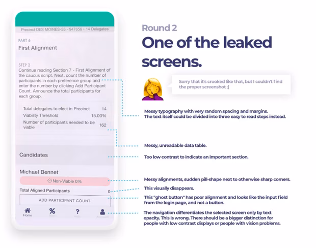
Even with low quality, in-perspective screenshots you can still see a lot of problems here. There are three different border radii (the data table, the pill-shaped pink indicator, and the button) in just one screen.
Nearly everything here is messy at first glance. Spacing can be too large and then suddenly too small in places. It seems like it has been put together randomly.
Ok, enough.
I don’t know the whole story here — obviously. And I’m not trying to bash an easy target for the sake of it. My point is that judging by just a couple of screenshots and someone with a good eye, maybe a lot of this could’ve been avoided. And if not, it’s still a good example.
Sure, the problem with the app wasn’t with its interface. But this interface (and its quality) shows there will be problems even before you test the app on “the night.” Judging a book by its cover may be hurtful but with digital products, it’s 9/10 times right. The goal of building apps of any kind is to make them the best possible quality. This is a lot of the things you can’t see like proper server infrastructure, security, privacy, fast load times and a lot more.
But it’s also the stuff you DO see. When you see a rusted car with crooked windows and squeaking metal would you assume its engine is in great shape?
This article was originally published on UX Collective by Michal Malewicz, a designer with over 20 years of experience in building digital products. CEO of the HYPE4 agency and author of the “Designing Interfaces” book.
Get the TNW newsletter
Get the most important tech news in your inbox each week.