In 2019, cybercrime cost businesses more than $2 trillion globally. With the influx of digital products, more and more people are reusing login credentials – the leading cause of data breaches. For too long, the user experience of password management has been ignored. It’s time for designers to rethink every aspect of password UX.
Much of our lives are digitally managed. There’s an app, website, or SaaS platform for nearly every aspect of the human experience, and they all require passwords. With so many accounts come problems.
According to passwordresearch.com, 80% of data breaches are traced to weak or reused login credentials, 61% of people use the same password for multiple accounts, and only 44% of users change passwords at least once per year.
That’s a lot of trust to place in online platforms. If one app is hacked, all accounts are vulnerable.

The present-day password situation is frightening. As designers, we might be tempted to concentrate on the visual appeal of login screens while ignoring how users actually create passwords. We might even think that passwords are developers’ responsibility.
Unfortunately, the password problem has a real business impact. Frustration during signup leads potential users to abandon the process altogether. Others forget the convoluted passwords they were forced to create and overrun customer support, wasting time, manpower, and money.
[Read:
A poorly considered password process has a negative domino effect on users and businesses alike. Is there anything designers can do to improve the situation?
How to improve password UX
There are a number of strategies that improve password UX, and they aren’t overly complex. As always, it’s important to have a picture of core users when planning a password experience. Aim to strike a balance between:
- Clear instructions
- Simple actions
- Long-term user security

Don’t use too many security rules
It ought to be easy to create a password. Forcing users to adhere to a long list of requirements causes friction in the signup process. It’s best to allow users to create whatever passwords they want, but if they choose something obvious like 12345, let them know that their personal information is vulnerable.
Tell users why secure passwords are important
No one likes to follow rules or instructions without context. Instead of impeding account creation, educate users about the dangers of identity theft and data attacks. Where possible, use real-world stats to drive the point home: “Did you know that a cybersecurity attack occurs every 39 seconds?”
Add the option to show/hide passwords
“Usability suffers when users type in passwords and the only feedback they get is a row of bullets. Typically, masking passwords doesn’t even increase security, but it does cost you business due to login failures.” –Jakob Nielsen
Allow users to see passwords by placing Show/Hide icons within password input fields. An eye that opens and closes when clicked is common, but depending on the product and users, it might be more effective to include a simple Show/Hide text toggle.
Some sites default to unmasked input fields. While this strategy is generally welcomed by users, it should be employed with a Hide option for less secure environments (cafes, offices, etc.).

Include a password strength meter
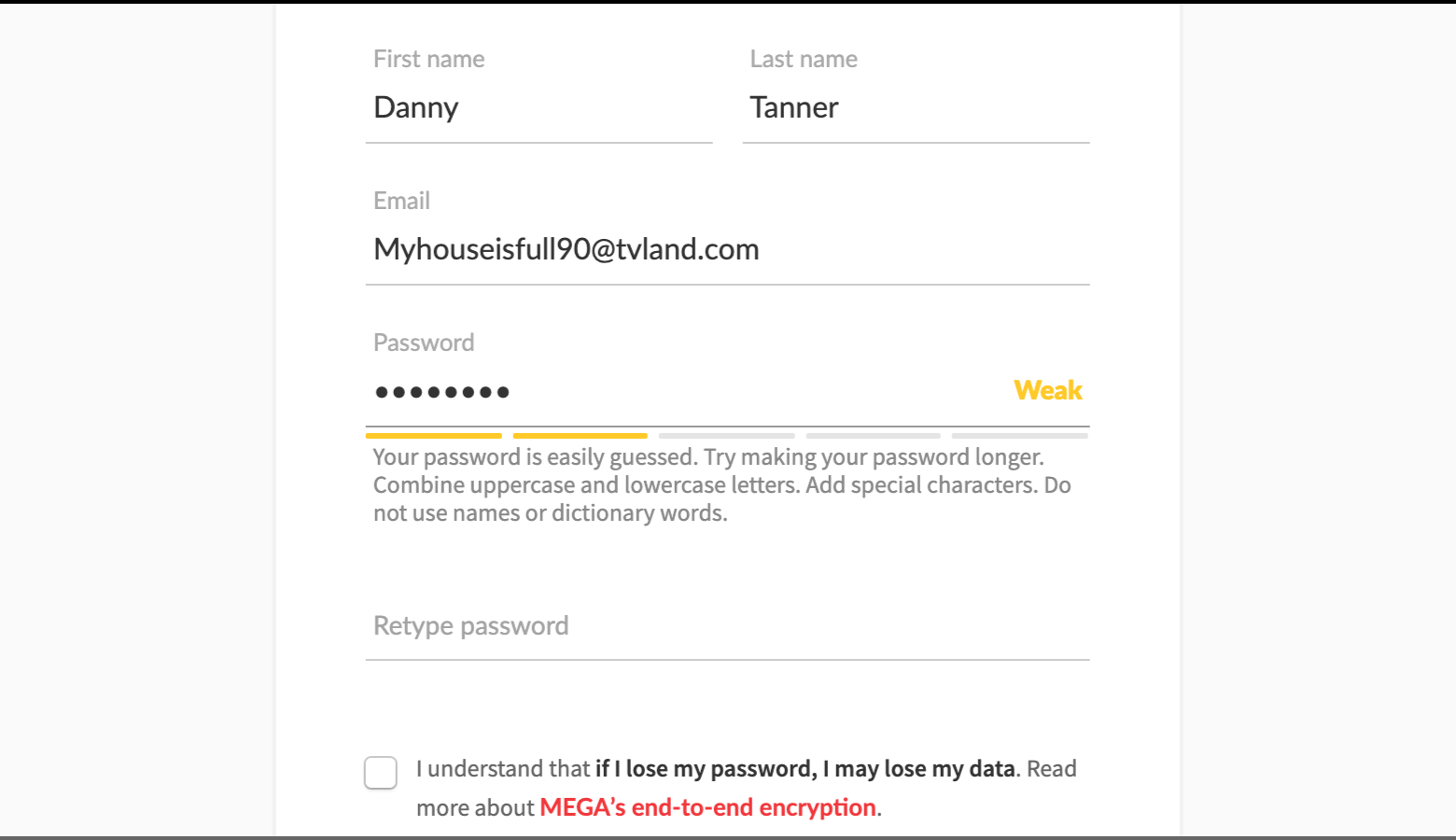
Password strength meters give real-time feedback and tell users how well passwords will withstand data attacks. Strength meters should be paired with thoughtful copy that communicates different levels of password effectiveness.
Weak, medium, and strong are helpful indicators, but copy needs to warn users of what’s at stake: “Your password leaves you exposed to data theft.”
Along with copy, consider what colors will make an impact, but remember that color has cultural significance.

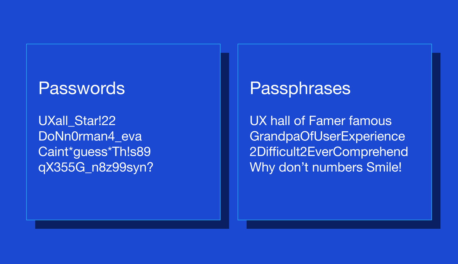
Switch to passphrases
Passphrases tend to be anywhere from eight to 16 characters, but they can be longer. The greater the length, the more likely it is that a passphrase can endure a brute force attack.
The appeal of passphrases is that they’re easy to remember. Instead of something weak and forgettable like myhouse5, a user might enter myhouseisawesomeandcozy.
For passphrases with four or more words, a high level of randomness isn’t needed, but users should be warned to avoid well-known word pairings (song lyrics, movie quotes, etc.).

Consider password alternatives
Passwords are a well-established paradigm, but they aren’t the only way to protect user data. Biometrics, physical hardware, and reimagined login processes are part of a tech industry push to make passwords a thing of the past.
Utilize single sign-on
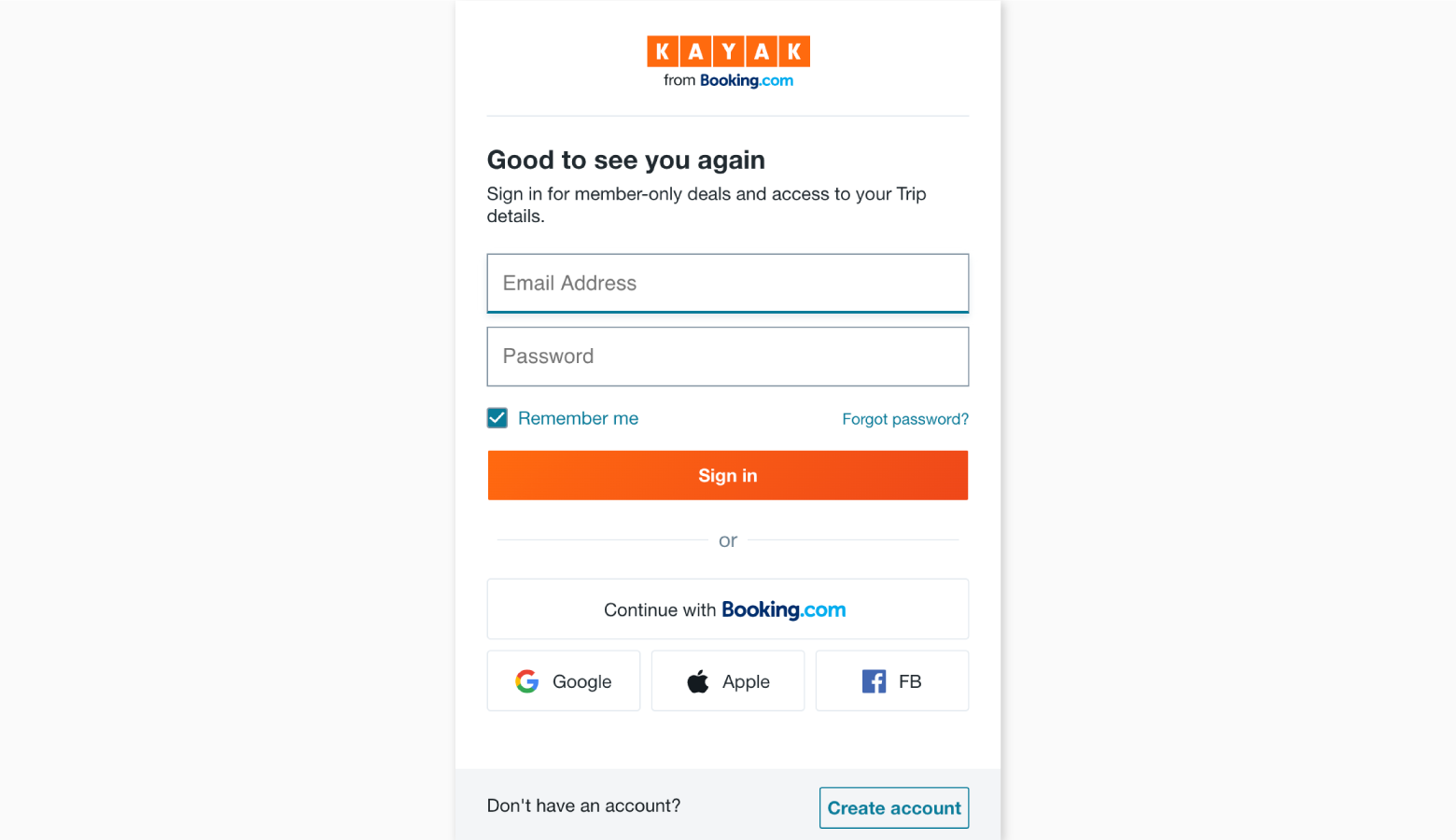
Single sign-on (SSO) is a strategy whereby users gain access to multiple products and services with one username and password. Sites and apps that use SSO rely on third parties (companies like Google, Facebook, and Apple) to verify user identities. All users have to do is grant access to their SSO accounts.
SSO prevents users from piling up passwords, increases onboarding speed, and allows businesses to benefit from the security infrastructure of larger companies.

Use fingerprints and face recognition
Many phones, laptops, and tablets are equipped with biometric technology that is easily integrated into the sign-on process. Rather than entering passwords, users simply touch or glance at their devices. Security increases because faces and fingerprints are difficult (though not impossible) to forge.
One drawback is that there are still devices without biometric capabilities, so designers should make other log in options available.
Allow passwordless sign-in
As long as users have smartphones and usernames, passwordless sign-in is a viable option. After entering usernames, users receive an onscreen message containing a PIN number. At the same time, a phone notification prompts users to select a matching PIN from a list of options. This process also works with fingerprints and face recognition.
Enable email login
Nearly everyone who uses digital products has an email address, and most people already use email for security measures like forgotten passwords and usernames. Why not go a step further?
Email login works by sending time-limited links to users’ inboxes. Slack and Medium have an email login feature called “Magic Link” that makes sign-on much more seamless.

Provide physical security keys
Within enterprise organizations and industries where security is of utmost importance (finance, healthcare, etc.), more companies are opting to use physical keys. These cryptographic cards plug into USB ports and automatically enter single-use passwords in application sign-on fields.
The tech is still developing, but it’s proven to:
- Make sign-in 4x faster
- Reduce support costs by 90%
- Virtually eradicate account takeovers
Additionally, companies like YubiKey are adding fingerprint recognition for increased protection. One obvious drawback is the risk of losing hardware. Even though lost keys can be disabled by administrators, account recovery is much more involved than pressing a “forgot password” button.

Simple and secure password UX
It’s no knock against users, but they aren’t the best at creating, remembering, or managing passwords, a fact that causes frustration and unnecessary UX friction. As designers, we shouldn’t settle for the status quo. We’re problem solvers, and there are multiple ways we can refine or completely rethink the password experience.
As long as there are digital accounts with sensitive data, we’ll need to design ways for users to verify that they are who they say they are. Perhaps there will come a day when passwords are obsolete, but until then, we ought to strive for password user experiences that are simple and secure for all parties.
So you’re interested in UX design? Then join our online event, TNW2020, to explore the latest trends and emerging best practices in product development.
The Toptal Design Blog is a hub for advanced design studies by professional designers in the Toptal network on all facets of digital design, ranging from detailed design tutorials to in-depth coverage of new design trends, tools, and techniques. You can read the original piece written by Mayank Sharma here. Follow the Toptal Design Blog on Twitter, Dribbble, Behance, LinkedIn, Facebook, and Instagram.
Get the TNW newsletter
Get the most important tech news in your inbox each week.


