Whether we readily admit it or not, we’re sensitive to fonts. It’s why Apple created its own San Francisco font for the Apple Watch, which is now rolling out to all of its platforms. That’s also why I changed the appearance of a favorite app, and stumbled onto a new favorite font.
It happened by accident, honestly. I wasn’t looking to change the font, only to see what the app had to offer beyond force-feeding me my social feed.
That app, Tweetbot, found its way to my iPhone as its refreshed desktop companion rolled out. I’d been looking for a better desktop Twitter client, and Tweetbot 2 was new (and on sale). I purchased the iOS app to keep things uniform across devices.
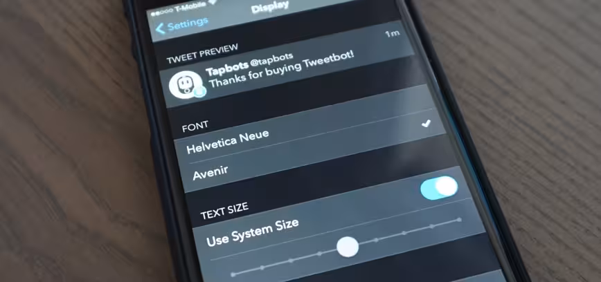
To see what it had to offer versus the stock Twitter app on iOS, I found I could change the font via the settings. I toggled from the stock Helvetica Neue to Avenir, and it was like having a brand new app.
Font, like any style choice, is subjective. For me, Avenir is lighter, fresher, and a bit classier. I find it much more readable than Helvetica Neue, too.
For the reasons I use Twitter, Avenir fits me better. It’s my newsfeed and info source moreover than a place I go for a laugh. Avenir changes the entire tone of Twitter for me; it personalizes the service to fit my (mostly) focussed use-case.
This isn’t the first time I’ve found myself swooning over a new font (I used to love Tahoma!). The interesting thing for me is how much I can — and can’t — use Avenir in my life.
If we compare apples to apples, the official Twitter iOS app will let me change my font size, but not the type. Most apps offer the same functionality; I can change basic features to meet accessibility requirements, but rarely the look and feel.
Avenir feels quite personal, and it’s interesting to me that the apps and services I use feel less so without it. Even Tweetbot for the desktop feels less inspired; it doesn’t have the same font-changing feature as its mobile counterpart.

So while a new favorite app led me to a cool font I hadn’t yet sampled, the rest of my digital world has left me hanging. I’ll give websites (and by virtue, my browser) a pass on letting me change fonts, but why would an app ignore fonts on such a large scale?
Tweetbot for iOS gives two options, which seems limited, but it’s literally twice as many options as most other apps on my phone give me.
I wish I had an answer for why many other apps don’t have the same attention to detail as Tweetbot. Though there are only two fonts, it’s clear those two were carefully chosen. It’s worth considering that Avenir’s inclusion in Tweetbot actually made me like it more than I might had I found it in Pages, where I do the bulk of my writing.
It may sound silly, but Avenir pleases me. Fonts can do that, apparently. I know that now, but it’s sad that I can’t find the font I like in more apps I use.
I really wish other developers would expose their apps to new fonts, if only to offer a touch of variety. If they do, I now hope it’s Avenir.
Read next: The science behind fonts (and how they make you feel)
Get the TNW newsletter
Get the most important tech news in your inbox each week.