Usabilla, a usability startup located in the heart of Amsterdam, has been studying the emotional pull of beauty brands with their own design software. After a comprehensive case study, the team has managed to shed some light on how beauty companies use color, emotion, trust and social responsibility to pull at our heart strings.
This is important for two reasons. For one, it’s a lesson on how to market and present yourself (or your startup) for success. Second, it reveals some of the more deceptive, manipulative techniques for making tons of money — These companies are selling happiness, beauty, success, attractiveness, desire, self-esteem, relationships and sex…and we’re buying it.
Getting Attention
Every brand serves a purpose and has a target audience. To rope that audience in, companies must draw attention and maintain it. They do this by showing off.
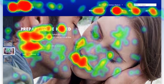
Cosmetics companies exist to make you more beautiful, and Usabilla notes that “Nivea promotes soft, smooth, and kissable skin,” while “Olay calls out skin improvement and anti-aging effects.” Once the purpose and goals are defined, the image has to reflect it.

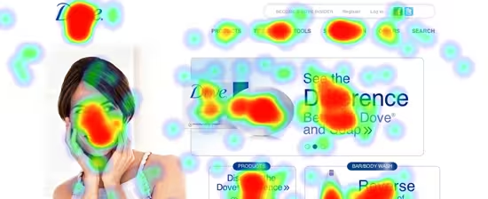
Heat map shows eye catching areas, selected via user testing.
From a design point of view, companies like Nivea know exactly how to turn these successful ideas into a site that boosts profits. It’s a testament to turning your concept into an actionable result.
Copywriting and beautiful photographs aside, Usabilla’s study found that test participants actually looked for certain color combination rather than the logo or brand name. All in all, this shows just how much power color has for any brand.

Dove’s color scheme of blue and white indicate freshness, cleanness, and youth.
Gaining Trust
For almost all brands, Usabilla study participants agreed that “a professional and characteristic website and a familiar logo are very appealing and trust building.”

Users were asked to select areas that grabbed their interest the most.
What’s more telling is the ability social responsibility has to influence users. Here’s a snippet from various participants:
- “Social mission means they strive to do something good” [Dove]
- “I like Clinique because they don’t perform animal tests on their products”
- “Their use of natural additives, such as bamboo, makes me think they are committed to using natural resources.” [Garnier]
The major point here is that emotion can build a brand. These companies sell much more than just their products.
Are tech companies taking advantage of too? In some ways, yes. Facebook pitches connecting with friends (even if you don’t have any) and Apple sells a stress free, seamless experience that isn’t always possible.
From an even more aggressive point of view, beauty companies are simply creating problems (e.g.: beauty standards) and then charging us to solve them. This is not unlike many tech companies, which manage to make users feel that slightly older products aren’t good enough.
Morals…
The goal here is to find the balance, and the public and press need to help keep companies in check. Top beauty brands like Dove, Nivea, Axe and Garnier use emotions to sell products because it works.
In the case of the beauty industry, encouraging inner beauty is much better than highlighting unrealistic, photoshopped women (check out Fotoshop by Adobe). Promising sexiness is, of course, misleading, but isn’t the worst thing in the world. The question is: How far should these companies go? Or, what can we learn from them?
➤ Case Study: The Emotional Pull of Beauty Brands via Usabilla
More Usabilla coverage: Usabilla releases test templates to help you perfect your UX and Usabilla Discover launches and is much more than “Pinterest for designers” [Invites].
Get the TNW newsletter
Get the most important tech news in your inbox each week.


