I lugged around a three-shelf bookcase from IKEA through multiple years of moves, through three different states. Despite the fact that these bookcases often go for as little as $10 or for free on Craigslist, I could never bring myself to sell mine for that low a price.
I knew this affection for a particle-board, wonky bookcase didn’t make any rational sense. Then I learned about the IKEA effect, where you assign more value to products that you’ve had a hand in creating.
If you’ve ever had the pain and pleasure of putting together IKEA furniture, you also know that almost ridiculous sense of pride when you finish assembling the ümlauted thing. That this creation came into being by the grace of your sweat and a tiny allen key can be supremely satisfying, so much so that even though you and a hundred people in your neighborhood have that same exact table, you value yours almost laughably highly.
It turns out this surprising phenomenon can play a pivotal role in your customer onboarding and activation. Here’s why.
Why You Love Your Own Work
People were actually willing to pay more for products that they’d built themselves.
When Dan Ariely, Michael Norton, and Daniel Mochon studied the IKEA effect, they had people assemble things like plain old IKEA storage boxes and origami creatures. Even when it came to cardboard boxes, people became attached to their work simply because of their own efforts.
The researchers explain:
labor alone can be sufficient to induce greater liking for the fruits of one’s labor: even constructing a standardized bureau, an arduous, solitary task, can lead people to overvalue their (often poorly constructed) creations.
In fact, when participants who had built the IKEA boxes were asked to bid on their creations, they were willing to pay 63 percent more than non-builders.
The IKEA effect can be so strong that people value their DIY creations on par with that of masters. The researchers asked both study participants and origami experts to construct paper frog and cranes. Apparently these study participants didn’t have a knack for the art of origami, as non-builders this time “saw the amateurish creations as nearly worthless crumpled paper.”
Meanwhile, the builders valued their own creations almost five times higher than non-builders, about on par with the price that non-builders were willing to pay for the expertly crafted origami.
What’s driving the IKEA effect? We have a basic human desire to feel effective and competent, able to make something happen. Increasing those feelings boosts the value of our work in our eyes.
A Solution to the Blank Slate Problem
Is the first impression your new users get an unwelcoming blank slate in your app? Consider the very similar problem of a writer facing the blank page. The bare, chiding emptiness induces paralysis (hello writer’s block!) and a hurried escape into procrastinatory reaches of the Internet. It’s no wonder that when people sign up, see a blank slate, get overwhelmed, and never return.
“Ignoring the blank slate stage is one of the biggest mistakes you can make,” as the veritable experts at Basecamp explain. They continue:
Unfortunately, the customer decides if an application is worthy at this blank slate stage — the stage when there’s the least amount of information, design, and content on which to judge the overall usefulness of the application. When you fail to design an adequate blank slate, people don’t know what they are missing because everything is missing.
Without innards to give your product or app shape and meaning for people, there’s little to compel.
Here’s where the IKEA effect comes in. Increase a new user’s commitment by putting them to work. Instead of dumping them onto an empty page and telling them what to do, this is your opportunity to show them, as Patrick McKenzie puts it “a vision of the future they’ll have if they’re using the software, ideally a vision more focused on them than just focused on your software” — by having them participate.
This doesn’t require real data or content. Weave sample and educational content into your product by default to encourage people to spend time and effort to perform small tasks. As Ariely and his colleagues confirmed in a follow-up study, competence plays a “crucial role … in creating consumer interest in self-created products and in making their efforts feel rewarding.”
How to Put New Users to Work
Sometimes companies do this confusing dance when it comes to onboarding, hesitating to ask too much of newcomers for fear of turning them off but also wanting them to return.
The IKEA effect is powerful enough so that it kicks in even for creations that aren’t “unique, customized, or fun to build.” And as any learner knows, the difference between reading about something and actually doing it is the key unlocking a meaningful sense of competence and investment. The context you need to arrive at that point is real-world practice.
Don’t let people’s tendencies towards consumption over creation doom your product. Rather than cramming all your tips in a list of instructions or a guided tour that people speed-click through without truly comprehending, give them material to work with and manipulate to increase their sense of competence, which leads to increased commitment.
First, provide sample data, pre-filled defaults, and editable templates to help make your app feel animated with content and connections, and alive to users. Then use email triggers, prompts, and guidance to get people to interact with that content — even if it’s just to move a card around on a board or reply to an email. This helps to lower the fear and frustration of dealing with a new product while increasing capabilities.
Here’s how three companies employ the IKEA effect in their onboarding process inside their app and by using the trigger action of activation and onboarding emails.
Wistia
Wistia helps people be awesome at video marketing, but to take advantage of their marketing and analytic tools, you need a video.
The tool is set up so that you can’t do anything until you confirm you email address. Once you click on your activation email and finish setting up your account by entering a password, you can get started by creating your first project.
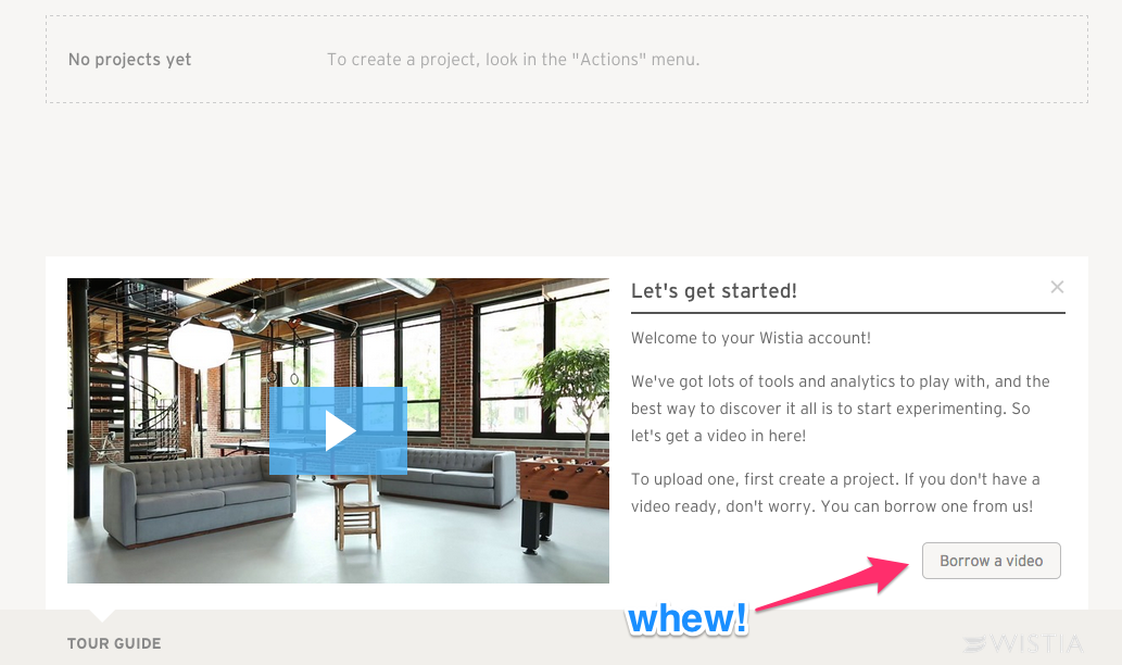
The problem is: what if you don’t have any videos ready to upload? You’d be left with a sad, blank page with only a “no projects yet” message. Instead, Wistia kickstarts the IKEA effect by giving you the option to borrow a video.
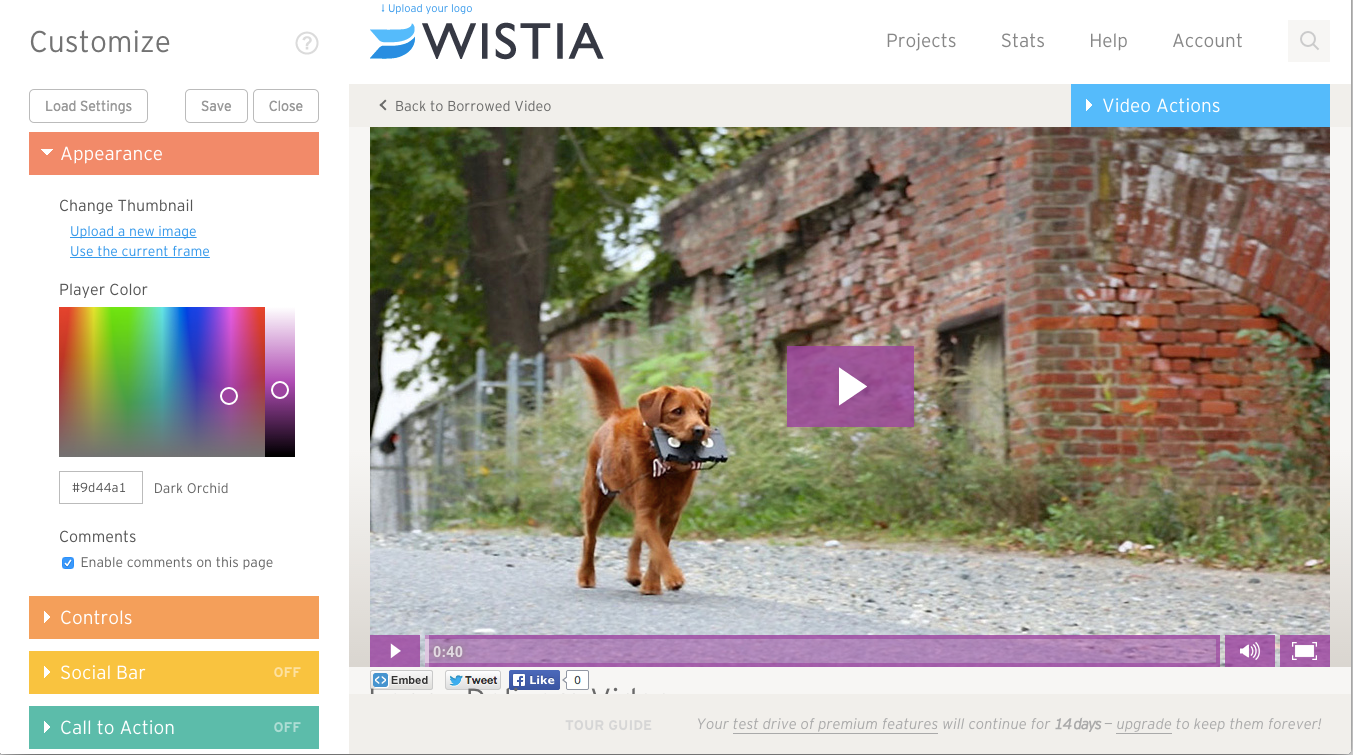
Having a cute video with Lenny the dog to customize and share gets you immediately into using the tool, creating your own version of content while giving Wistia the opportunity to guide you along the way.
Having a cute video with Lenny the dog to customize and share gets you immediately into using the tool, creating your own version of content while giving Wistia the opportunity to guide you along the way.
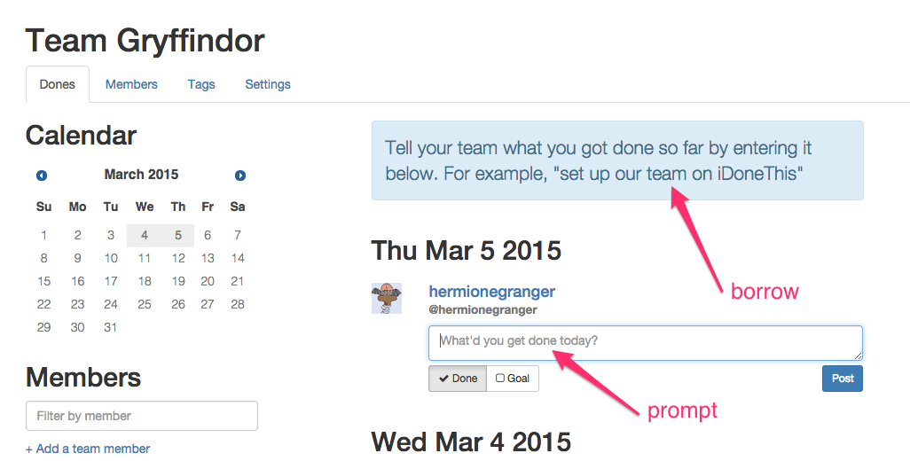
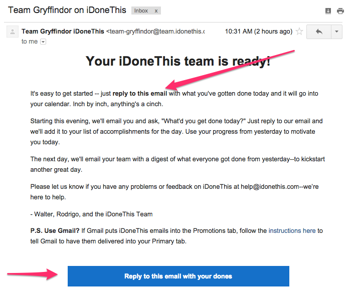
Even if you don’t stick around the website after setting up your account, a team confirmation email also encourages you to make an entry right away:
All you have to do is reply to the email with the response to the question, “What’d you get done today?”. That reply gets entered, the blankness is no more, and the new user gets to see how to use the tool.
Basecamp
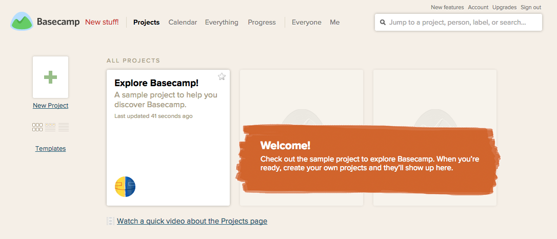
True to their word, Basecamp designed a helpful, interactive “blank” slate by providing a sample project into their project management app.
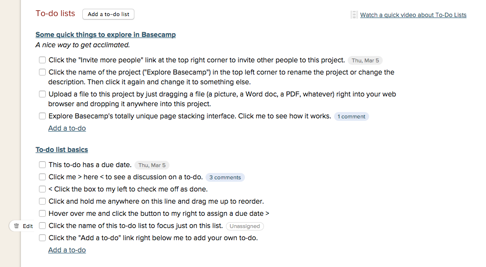
Pre-filled content such as comments, files, and due dates here performs double-duty to show you what a project-in-progress actually looks like while providing instructions and tips.
This allows you to explore the product to perform tasks with the sample data at your own pace, without forcing you through a guided tour.
The IKEA effect can help new users break away from their inertia to give your product a real go by increasing their rewarding sense of competence, and as a result, boosting their investment.
Remember, the IKEA effect breaks down if the labor isn’t productive. In order for the link between your work and the positive feelings of liking and investment to happen, the task must be successfully completed. So putting the IKEA effect into practice is also a valuable exercise in itself for product creators. It makes you think about what success means from the customer’s perspective and whether you can deliver that vision of the future, even with borrowed or sample data.
New users’ fleeting interest and attention seem to be a persistent thorn that causes many to exclaim, “but if only I could get people back to actually try the app!” But your job neither ends after pushing out a product nor after you get somebody to sign up. It includes getting someone to care about what they can do with your product.
Your turn! Have you seen the IKEA effect in action? Share your response or any thoughts with us in the comments!
Read Next: Relive your Ikea nightmares with the Höme Improvisåtion furniture assembly game
Image credit: Shutterstock
This post first appeared on Customer.io
Get the TNW newsletter
Get the most important tech news in your inbox each week.


