This is an important and hard truth that most authors avoid:
Readers will judge you and your book based on your author photo.
Is that fair? Maybe not. Is it reality? Absolutely (and you probably do it with books, as well).
Why do people do this? It’s mostly unconscious, and evolved as a way for humans to quickly assess threats, opportunities and determine relative social status of a new person to know how to deal interact with them. A deep discussion of this topic is far beyond the scope of this piece, but basically, it evolved because it works. There is a ton of research and science on this, and most of it falls under what is called signaling theory. If you really want to dive into it, here’s a good place to start.
Because everyone is like this (and most of don’t even realize it), you need to really pay attention to your author photo, and make sure you do it right. In this piece, I’m going to walk you through exactly how to do that.
But first, I’ll show several you examples of author photos, both good and bad, and break them down for you. Then I’ll give you one key guiding rule for author photos (or any profile photos, like here on LinkedIn), a broad set of rules and guidelines you can use to create your own great looking author photo.
Joanna Penn

This is a classic author photo. This signals warmth and openness.Joanna has a broad, authentic smile in her face, you can almost see her enthusiasm and joy. By making the photo black and white, and cropped closely to her head, she focuses you on the things she wants you to know about her–she’s positive, optimistic, and encouraging.
This makes sense; Joanna writes a lot of books for authors about writing, publishing and marketing. She is a teacher, and this photo signals both trust and warmth.
Lisa Cartwright

This is not a good author photo at all. First of all, it’s tilted to the side in a weird angle. Second, it’s poorly color corrected, and dark. Third, the smile seems forced and awkward.
These are all poor signals. Your first unconscious thought is something along the lines of, “Why is not on center?” This picture signals unprofessionalism, amateurishness, and lack of emotional connection.
Michael Lewis

This picture could be in the dictionary for “classic high-status author photo.” He is smiling authentically with his eyes and has a head tilt, which signals both warmth and interest. His arms are crossed and his shirt is unbuttoned, which signals casualness and comfort. He has a tasteful shirt, his hair is cut in a modern style, and both signal professionalism but also comfort.
This picture tells a very clear story: this is a person who has done a lot in his life and is very comfortable with himself and his work.
Giff Constable

This is not good at all. He has a parted, flat hair style, his smile is toothy and goofy, and his shirt is distracting and visually unappealing. He’s frail and has a thin neck and is slightly hunched over in a way that accentuates that aspect. The background of the photo is pure white, giving a jarring feel to his appearance, as if he is coming out of the screen.
Understand that I am NOT making fun of how he was born. Everything I commented on (and most of the things that people judge you on) are things he can control. He can control his hairstyle, his shirt, his posture, his smile, and the background of the photo.
This pictures sends several negative signals, the main one being that he has no aesthetic or professional taste. The fact that he did not take any time or spend any energy on his appearance at all, or if he did, he is so socially unskilled that he did this bad of a job, is generally a very negative signal.
But not always. We’ll talk more about this later, but if you are writing a book for specific tribe, in this case very “nerdy” engineers, and you want to signal to them that you are part of their tribe, this author photo actually does that. But it automatically repels anyone that does not identify directly with you.
Eric Ries

Compare this photo the one above; it’s the complete opposite. Physically, Eric and Giff are very similar. But the photos feel totally different, don’t they?
Look at the signals: Eric has a fashionable hair style, his glasses are contemporary, his smile is authentic (but not toothy and goofy), he’s not slumping or accentuating any negative physical aspects of his appearance. His shirt is stylish without being ostentatious, and perhaps most important, look at the background. It is bottom lit and color shifting, which gives it a modern feel that is reminiscent of technology and the future.
Eric’s audience is the same basic one as Giff’s, but Eric’s photo sends totally different signals. Eric is still appealing to a serious technical audience, but he is not unappealing to a mainstream audience. In fact, this photo displays a very sophisticated understanding of how he is trying to position himself: a serious technical insider, but not a socially awkward nerd.
Patrick Lencioni

This is a very traditional business professional style author photo. Everything about this photo says that this man is an American business executive: solid, stable, trustworthy, and part of the establishment. The suit is tailored, dark, expensive and tasteful. His wedding ring is clearly showing. His hair is graying, combed but not stiff, and his smile is there, but not too excited or awkward. He is sitting in front of whiteboard that he has clearly given a presentation on.
This makes sense. Patrick’s entire market is traditional corporate America, and this picture speaks directly to them, telling them that even though he has some new ideas, he is still one of them.
Jay Papasan

Jay has a different version of the business professional author photo, where he is signaling that he’s a legitimate businessman, but younger and more modern. He is wearing a suit that is dark and tasteful, but he has no tie, and his top button is undone. The background is green and environmental, another code for openness.
Andrii Sedniev

There are a lot of problems here. Start with the tie; it has poorly matched colors, it’s off center, and it’s clearly cheap. Then look at the shirt. The collar is not even tucked into his jacket. The tailoring of both jacket and shirt are clearly off the rack, and furthermore, the material for both shirt and jacket appear to be shiny, which is generally a signal for cheap.
His haircut is a slightly grown-out buzz cut, which not only signals youth and inexperience, it also signals sloppiness. His smile is forced and uncomfortable.
Everything about this photo says “amateur.” Just by looking at the photos, you can tell that Patrick and Jay are serious, established professionals, and that Andrii is not.
Mona Patel

This is an example of a great author photo (for men or women). Look at the signals, all saying the same basic things, telling a coherent story about her taste, and her warmth and her ability:
- She is sitting in a very design-forward chair, and this signals great aesthetic.
- The shot is in an empty warehouse-style loft, which signals a specific design sensibility, one that is modern and minimalist.
- It’s aligned down a corridor, with pillars showing in the background in a symmetrical way, while she is slightly off center, giving her the perspective. This signals a deep understanding of modern design principles.
- She is dressed in a classic and perfectly tailored outfit, with very stylish leather boots. This signals both excellent personal taste and business conservatism all at once.
- She’s looking away from the camera and smiling warmly, as if she’s casually talking to someone in the background, signalling warmth and approachability.
- She’s very pretty, which this photo both hides and accentuates. She hides it by dressing in a traditionally male outfit (button-down shirt and black pants), but she accentuates it by tailoring the outfit to make it feminine and leaving an extra button open.
- The photo is black and white, which signals functionality and classic sense.
Just think about how this photo makes you feel. You’re attracted to her and drawn in by her warmth and smile, but not in a sexual way. You know she’s fashionable and has great aesthetics, and you can see her design style. But the picture is not of a self-indulgent fashion dilettante, so you take her seriously as an intelligent, professional CEO.
Photos are much harder for serious female CEOs than they are for men (for many reasons), and Mona walked that line perfectly (disclosure: Mona is a client of Book In A Box, where I am the CEO).
Harshajyoti Das

This is not an example of a bad author photo per se, but rather a very bad decision.
This first problem is that there are two people in the photo. Unless the book is authored by both of them, this is the first bad decision.
This picture signals a specific set of topics. If the author were writing books about kayaking, or water sports, or adventure, or anything related to the picture, this might be a good picture.
Unfortunately, this is an unknown author who writes generic marketing books. What is someone looking for credibility and authority in marketing going to think when they see this picture? That they should trust this author’s skills … because they kayak?
Johnny Truant
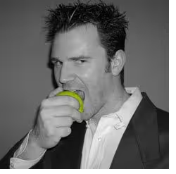
This is another example of a very specific decision, except this is probably a good one. Through the look — eating the apple, and the unkempt but still fashionable clothes — this author photo signals that the author fits the model of a slightly naughty bad boy writer.
Since this author, Johnny Truant, writes funny serial fiction (one series is called Fat Vampire), this is a great decision. His material is edgy, tongue in cheek and fun, and his author photo tells his audience, “I’m the type of person who would write that type of book.”
Consistent in signals and material, and thus a good decision. Whereas, if Johnny were writing a book on nursing home consulting, this would be a bad set of signals to send.
Two Pictures Of The Same Author
Patrick Vlaskovits
Bad
Good

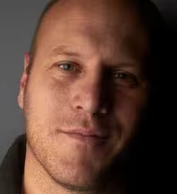
In this case, the author has two different photos. The first is too dark, there is no smile, and it is poorly cropped. In the second, it is well cropped, he has a good smile, and he is dressed in professional but casual clothes.
Like we said before, part of the “bad” versus “good” decision is about what signals you are trying to send to whom. If Patrick were an essayist and social commentator, perhaps the first photo would work. That picture signals intellectualism, self-seriousness and pensive thought.
But that’s not what his books are about, nor the audience he is trying to signal to. His books are about entrepreneurship, branding and start-ups. To speak to that audience, you are better off being optimistic, positive and warm–which the second picture signals.
James Altucher
Bad

Good
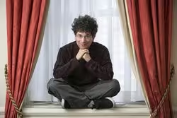
This is not so much a case of different pictures being good for different purposes, but a case of one picture being objectively worse than the other.
The first picture makes James look a disjointed crazy person. His glasses are off center, his hair is disheveled, he is a ratty white T-shirt, and the picture appears to be a random candid. James was actually using this as his author photo when he came to us.
I immediately asked his wife Claudia to take a picture that was professional looking but still reflected the quirkiness and weird genius that people love about him. She took the second picture, which is wonderful. He’s dressed in dark and fashionable clothes and is set against a pleasant background, all of which signal competence and professionalism.
But he’s also signaling quirkiness and humor: sitting cross-legged, retaining his trademark curly fro, and with a mischievous smile. It reflects who James is, while still signaling that he’s serious and professional and has taste.
The Author Photo Rule That Rules Them All
Here’s the thing that makes author photos so hard to give advice about: There is not one “right” way to do it. Like I talked about above, the “right” way all depends on what you’re trying to achieve. But there is one overarching rule that you need to sear into your brain when it comes to author photos (or any profile photo):
Know what you want to signal to what audience, and make sure you signal it properly.
This is the key to everything. The author photo for a CEO of a Fortune 500 company should be totally different from the author photo for an up-and-coming comedian. Why? Because they are signalling different things to different groups.
Generally speaking, the CEO’s author photo should signal professionalism, effectiveness, reliability and trust. The comedian’s photo could be wacky, pensive, goofy or even serious, all depending on his comedic style and what he wanted to signal.
Here is how you make sure you’re taking the right author (or profile) photo.
The Two Questions To Ensure You Have A Good Author Photo
What am I trying to say with my picture?
Know this very clearly; you say just as much with your appearance as you do with your words. Clearly words are more important in a book, but people judge books and judge you by what you look like.
The good news is that, within reason, it is much easier to construct the image you want in a still photo. You can emphasize whatever traits or part of your appearance you want, and you can also minimize any physical limitations that would be difficult to minimize in person; height, for example.
You can look serious or silly, professional or pretentious, positive or pessimistic, it’s really up to you. But you cannot have them all at once. You must make specific decisions about what you want to signal to the world through that picture. Decide that to yourself consciously, because once you do that, you’ll be able to know the basic things that should and should not be in your picture.
Who am I trying to say it to?
You need to know exactly who your audience is. Why is that? Well, so much of signaling is about telling a certain group of people that you are one of them, or you are a type that they know. This means you must know the basic mindset and associations of that group, so you can make sure they see what you are trying to say.
For example, if you are trying to signal to corporations that you are a competent and reliable professional, then you must understand that they see the conventional Western suit as a key signal of not just competence, but membership in their tribe. Suits tell them that you are one of them. The best examples above are Patrick Lencioni and Jay Papasan.
Whereas, if you want to signal to the tech and start-up community, then wearing a suit sends the opposite signal; they see suits as a sign of being out of touch. If you want them to see you as competent and tech minded, you want a picture like Eric Ries. He’s telling them that he is one of them.
The importance of understanding this cannot be overstated. Remember, signaling is not just about what you are signaling, it’s also about what other people are seeing, and what other people see depends almost entirely on what group they are part of and identify with.
Having a cutting-edge look in one field means you will excluded in others, so know who you are trying to signal to and what signals they respond to.
How Take Your Author Photo
Hire A Pro
Unless you are a very good photographer, I HIGHLY recommend you go to a photography studio and get your photo professionally done. There is no substitute for the skills of a professional photographer. And as an added benefit, they will tend to be honest with you and make sure your photo sends the signals you want it to send, whereas you or a friend might fool yourself.
Some Places to Hire a Pro
Model Mayhem [Free to $500+]
Obviously, a database of models is a magnet for photographers, and Model Mayhem has a directory specifically for finding photographers. The best part: There’s a Time-for-Print option where newer photographers will photograph you for free. If you want to learn more about that option, read this article on How to Get Professional Portraits Taken For Free.
GigSalad [Prices Vary]
GigSalad is like Craigslist for booking services for events or productions. If you search “Headshot Photography,” you’ll get a list of dozens of photographers in your city who specialize in the exact kind of pictures you need.
How To Take A Photo Yourself
If you can’t or won’t hire a good photographer, then you’ll have to do this yourself. That’s not impossible, but it can be a pain. I know it seems easy and obvious to do a good photo, but getting it right is actually much harder than you realize. If you insist on doing this yourself, we recommend learning a few things about lighting and photography first.
How to Take Professional Headshot with an iPhone
Although we don’t necessarily recommend using an iPhone, this is the best article on the Internet explaining everything you need to know to take a pro headshot, including lighting, equipment, common problems, locations and editing.
Tons more information than you could possibly consume on photography, portraits and cameras. If you want to dive deeper into any part of the process, this is a good place to start, specifically their article on How to Take the Perfect Headshot.
Read Next: Take better photos, learn better techniques with these great photography deals
Image credit: Shutterstock
This post appeared on Book in a Box.
Get the TNW newsletter
Get the most important tech news in your inbox each week.

