Gestures are the new clicks.
Every app, game or tool you open on your phone must includes a swipe, tap or pinch to function. These gestures are the secret to making great mobile apps work. And there’s a lot that goes into it.
With clicks, designers and developers really only had to think about where they wanted the action to appear on the screen. With gestures, you have to consider the type of physical action, its location on the screen, and whether users can intuitively find and touch it.
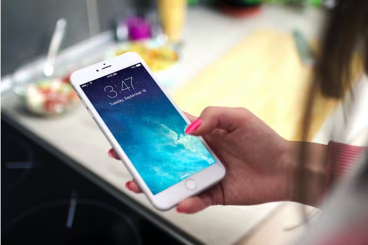
Gestures can help pave the way for more beautiful interfaces because many of these actions can be hidden within the interface. Gestures enable speed in user action and are a comfortable way for users to interact with devices of varying shapes and sizes.
With that, let’s dive deep into successful gesture techniques as expressed by some of today’s popular apps.
Primer on Common Gestures
Gestures are any physical movement by the user to activate a specific control within the design.
As described in Mobile Design Trends 2015 & 2016 by UXPin, gestures are primarily hand movements, but can also include shaking, tilting or moving the device.
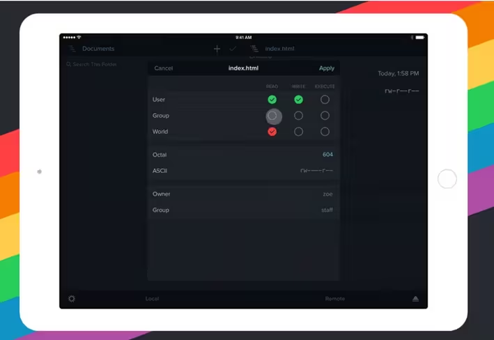
Photo credit: Transmit
The definitive guide on gestures, created by Craig Villamor, Dan Willis, and Luke Wroblewski, details dozens of actions and how they work. The guide was compiled from a study of people using mobile devices and performing specific tasks.
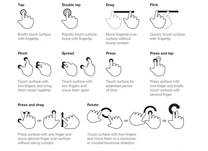
Photo credit: Touch Gesture Reference Guide. Creative Commons.
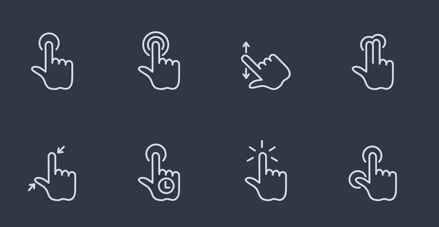
These are some of the most common user gestures:
- Tap: Touch surface briefly
- Double tap: Touch surface with two quick motions (often to zoom)
- Drag: Move along surface without breaking contact
- Pinch/spread: Touch surface with two fingers to move in (pinch) or out (spread)
- Press: Touch surface and hold
- Flick: Scrolls quickly
Each of these gestures needs to be within reach for the user as well. And we needn’t be afraid of gestures now that larger phones seem to be selling more and more. One thing to keep in mind when designing for gestures is thumb placement — something that’s known as the “thumb zone.” And while it’s not always the case, most of us hold our phones with one hand and use one thumb to navigate. The most common actions happen with a thumb movement – that’s about how much space you have to work with across the device.
The size of “buttons,” for lack of a better description of gesture-based controls, is vitally important. Each button needs to be large enough to activate with ease, regardless of finger size. (Many designers often reference this as the “fat finger” rule.)
According to this rule, gesture targets should be at least 44 points wide and tall (our own experiment showed that 30 points is the absolute minimum). With bigger screens, the fat finger rule expands to 70 points, which also makes thumb reach that much easier. Moreover, buttons and swipe gestures are designed to fill entire portions of the screen, such as a button that can be touched anywhere across the design, from left to right.
Connect Gestures and Animation
Gestures are invariably linked to animations in mobile design. Animation is the primary way that user interfaces signal users to complete an action or task.
The five primary functions of animation, from the free e-book “Interaction Design and Complex Animations” include:
- Animated notifications
- Revealing information
- Highlighting content
- Collapsing forms and menus
- Scrolling
Think of how many of these animations you use in the apps you touch daily…Here’s a short case study using the Dark Sky weather app.
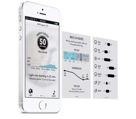
Photo credit: Dark Sky
Dark Sky uses tiny gestures and animations throughout the app to create an enjoyable user experience that extends beyond how warm or cool the day might be.
- Animated notifications: Is it going to rain today? A light animation shows when the rain is expected to fall while another shows how heavy the precipitation will be. A simple swipe will get you more details.
- Revealing information: Tap-based gestures will allow you to expand the daily weather forecasts so you can see detailed hourly information.
- Highlighting content: The app has multiple screens, which you can access with a swipe left or right.
- Collapsing forms and menus: You also can collapse elements so that you can see additional information. For instance, you can take the menu at the top, collapse the current view and change location.
- Scrolling: The globe in the radar view spins on a realistic axis so you can look at the weather anywhere in the world. Scroll left to right on the slider at the bottom of the screen to change the time as well.
Animations and gestures go hand-in-hand (pun fully intended). Without animations, users wouldn’t have feedback informing them if they’ve successfully completed a gestural action. So it’s good to get in the mindset of thinking of gestures as complementary elements rather than separate ones.
Of course, with new technologies, how we get feedback from gestures will change. For instance …
Apple and 3D Touch
Gestures are so important that the major mobile platforms — Apple and Andriod — have developer guidelines for them. Meanwhile,
Apple introduced a new type of gesture control with the release of the iPhone 6s in late 2015 called 3D Touch.
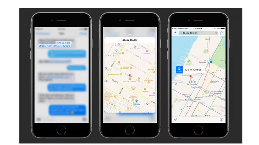
Photo credit: Apple
Apple’s 3D Touch — what’s also been previously called Force Touch — takes gestures to the next level. The device will sense the amount of pressure on the screen and relates that to gestures such as tap, swipe and pinch. The major difference in this gesture functionality is part of the layered interface, where pressure prompts a preview action before you actually go on to the next screen.
In the map example above from Apple, someone sends you an address via text. It shows as a link — press lightly and the location pops up. When you remove pressure, the pop up disappears. But it you apply even more pressure, the full location link opens in a map. There’s even a physical “bump” of feedback. This is the perfect example of how elements across apps should work seamlessly as a single gesture-based interface.
This intuitive use of gestures perfectly meets user expectations because it works with little or no explanation.
In addition to new features, Apple iOS Human Interface Guidelines set rules for thinking about gestures and how to use them.
- Avoid associating different actions with standard gestures.
- Avoid creating custom gestures that invoke the same actions as standard gestures.
- Use complex gestures as shortcuts to expedite a task, not as the only way to perform it.
- Avoid defining new gestures unless your app is a game.
- In a regular environment, consider using multi-finger gestures.
While this will change how we interact with our iPhones, there certainly will be a period of adjustment. So it’s best to take that into consideration when designing 3D touch gestures because the same gesture won’t apply to older phones.
Material Design Refines Gesture Actions
While Apple is working to help us think differently about how gestures make things work, Google is clarifying the mechanics and actions associated with them. In the ever-evolving Material Design documentation, Google outlines the exact details of how these actions should work.
The guidelines go a long way to create a set of rules for actions to simplify usage. One of the common flaws of gestures is that the same action accomplishes multiple things. The documentation thoroughly explains how to use each gesture as a toggle so that you can have them do multiple things.
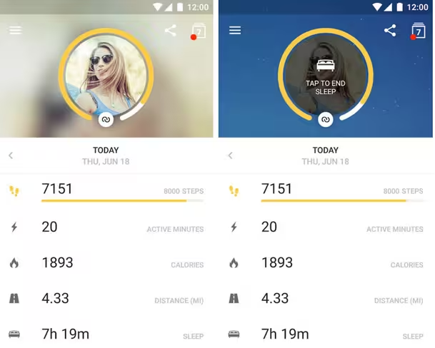
Photo credit: Runtastic
When it comes to gestures, Material Design covers these three: drag, swipe and fling.
- Drag is a more controlled gesture used in conjunction with a touch target.
- Swipe is a speedy gesture that doesn’t require a touch target.
- Fling has no touch target at all and is a snappier gesture.
These common gestures also incorporate velocity as a critical component. Depending on the speed, an action taken with these gestures may or may not be reversible.
Here’s how that breaks down:
- A swipe becomes a fling of the finger based on ending velocity and whether the element has crossed a point past which an action can be undone.
- A drag maintains contact with an element, so reversing the direction of the gesture will drag the element back.
- A fling moves at a faster speed and removes contact with the element, preventing an action from being undone.
Complex Gestures
More and more gestures are breaking the “one action equals one reaction” pattern and stringing multiple gestures together.
The result is a complex gesture. The technique is most-commonly used in gaming, but has begun to extend to other apps.
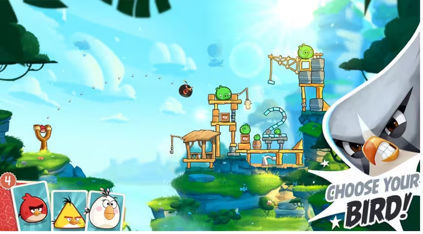
Photo credit: Angry Birds
Complex gestures include three levels of interaction to complete a task.
- Initiation: Initial contact to start an action, such as a press or tap.
- Continuation: Apply multiple gestures in a specific sequence, such as tapping in a specific pattern or multiple drags across the screen to make something happen.
- Termination: End of gesture as contact with the screen is ended.
Think about this usage in the popular game, Angry Birds. To toss a bird to destroy an object, you must complete the following complex gesture:
- Tap, hold and move the bird on the screen to position it for the right trajectory
- Release your finger to toss the bird towards the object.
Clever Gestures Are More Than Actions
Clever gestures do more than perform a task or complete an action. As explained in Interaction Design Best Practices, they should also delight users. They may also serve as a teaching tool.
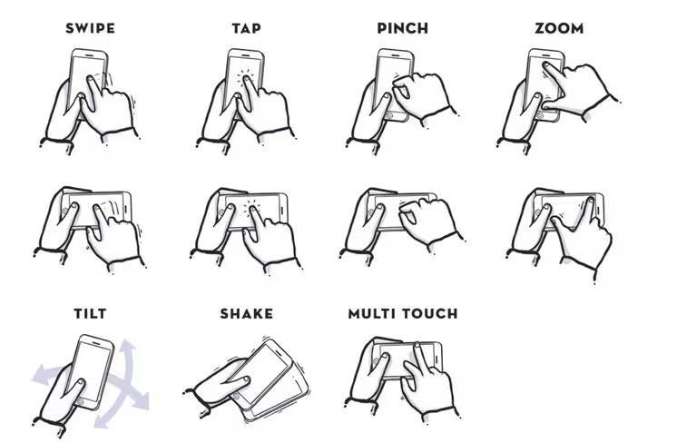
Photo credit: Julian Burford
The best gesture-based interfaces take into account all the ways a user might hold a device:
- Vertically with one hand (could be left or right)
- Vertically with both hands
- Horizontally with on hand (left or right)
- Horizontally with both hands
- With no hands at all (use it laying on a table)
Once you know what users are going to do with your app, how will they know what to do with it? How do you teach them to use gestures effectively? This is more important that it might sound. While common gestures all start with the same actions, the reaction is often different based on the app.
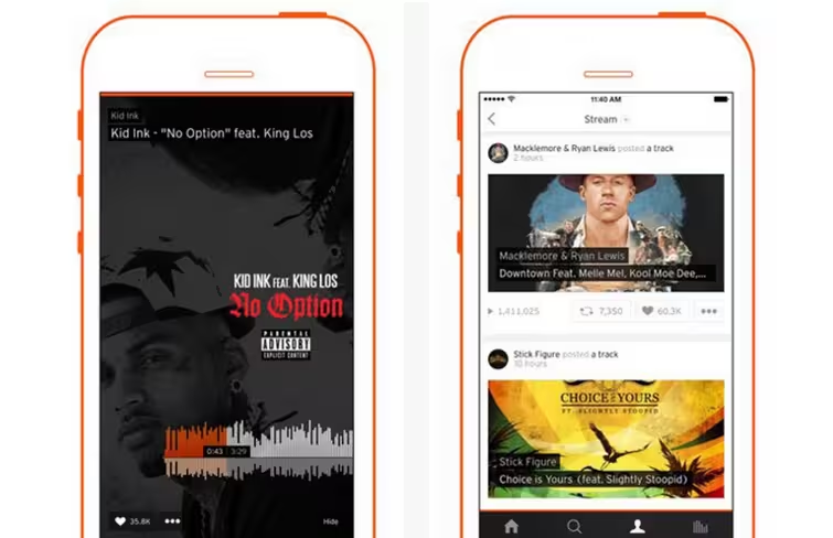
Photo credit: Soundcloud
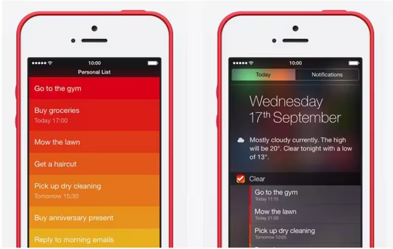
Photo credit: Clear
Let’s compare the two examples above.
Soundcloud and Clear both use the same gestures to perform different actions within the apps. Both use taps and swipes. In Soundcloud, gestures help users play and explore music (a tap can open a song or playlist and a swipe helps you explore new things). Clear uses taps and swipes to add and check off items from your to-do list.
The gestures are common and similar in the scope of using taps and swipes to complete actions, but the specific actions themselves are quite different.
The key is that these actions happen pretty seamlessly for users because of simple visual signifiers. The card-based interface of Soundcloud is instantly understood thanks to its popularity, which means no explanation is required for the tap and swipe gestures. Clear’s unorthodox rectangular layers creates a sense of modularity, hinting that each rectangle can be swiped away as if it were a sheet of paper.
Finally, when thinking about gestures, it is important to be aware of gesture overload. Too many gestures can be overwhelming. Remember to keep gestures simple, consistent and easy to use.
What’s Next?
So where do gestures go from here?
Gestures are beginning to reach their potential. While most gestures are fingertip-based, physical usage is likely to expand in ways we can’t imagine yet. Gestures will also start to integrate more fully with other design trends.
Most of the gestures we see right now are actions performed on top of static design. With the emergence of video and even more animation in the background, gestures will layer more and more animation.
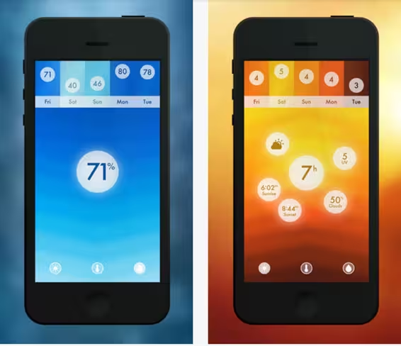
Photo credit: Haze
The Haze weather app is already doing this. The app has beautiful layers of colored animation that relate to temperature. There are also plenty of gesture-related controls, from a top-down slide-out to simple swipe actions. The overall effect is visual stunning and highly functional.
Gestures will better link apps to one another. For example, drag-and-drop actions between different apps.
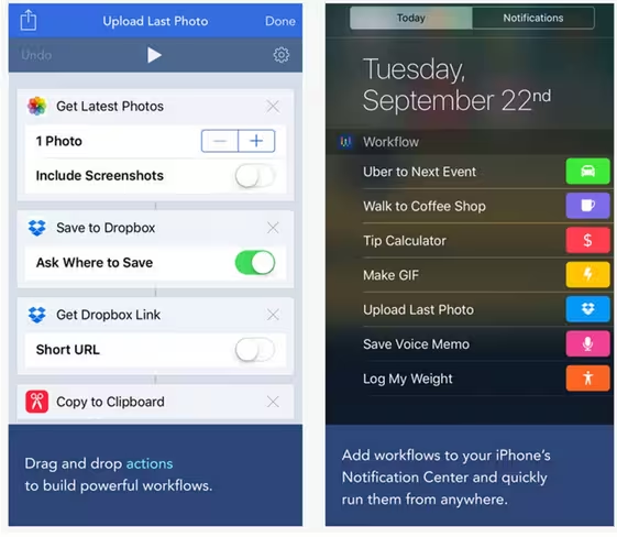
Photo credit: Workflow
Workflow is an iOS app that is already demonstrating this functionality. You can ctake action between apps with drag-and-drop tools (tap and drag). The automated tools are clever and are completely rooted in animation, gesturing and functionality.
When it comes to wearables, gestures will expand to include physical events.. Swing your arm to send a text or flick your wrist to send a call to voicemail. It’s very likely that physical actions beyond the touch of a finger will start to dictate how gestures work for other types of devices.
Takeaways
There’s no way to design a mobile app without thinking about gestures. These tiny touches are an integral part of the design process and will continue to influence how we design for users.
The secret, though, is the same as with approaching any other design project: new gestures must be intuitive in order for users to embrace them. Do this well and you’ll have an app that works well and has a higher likelihood of adoption.
For more useful mobile design techniques, check out the free guide Mobile Design Trends 2015 & 2016 by UXPin. 79 examples of outstanding mobile design from companies like Slack, Tinder, Waze, and others are deconstructed into simple design techniques. The book also includes 61 useful resources for mobile design.
Get the TNW newsletter
Get the most important tech news in your inbox each week.


