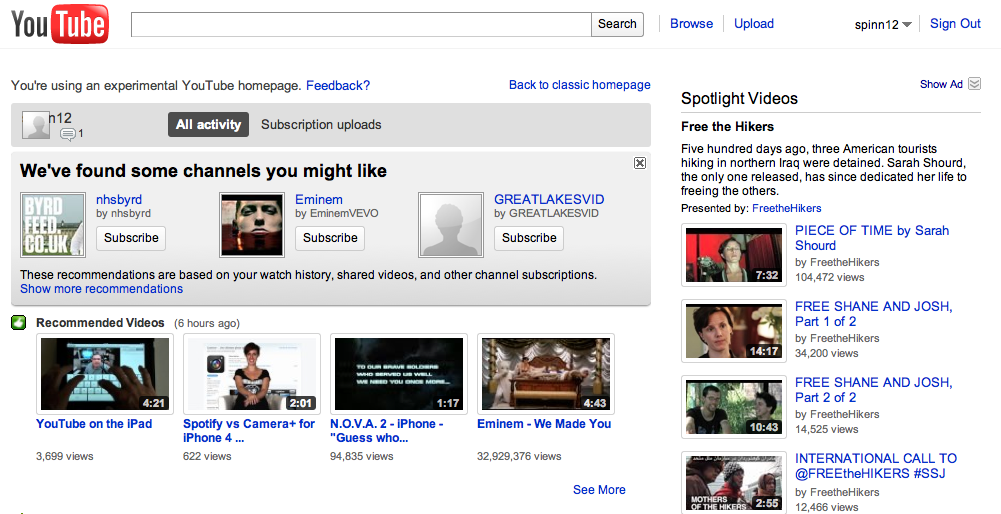
 In case you missed our post about it, YouTube has been experimenting with an idea for a new homepage. It’s a more centralized version, focusing on making sure that you don’t miss anything, but don’t see the things that you’d rather miss.
Want to take a look at the new version? All you need to do is head over to this link to get it enabled: http://www.youtube.com/homepage_experiment Just click the “Go For It” button and you’ll be in new homepage heaven.
Of course, there’s a whole list of explanation about what YouTube is doing, but what you really care about is how it looks, right?
As you can see, the new layout is a lot more central. It has recommended videos, channels you might like and even shows your own uploads right on the homepage. Give it a shot. Chances are that you’re going to dig it. If you don’t? There’s a well-displayed link right at the top to give your feedback.
Get the TNW newsletter
Get the most important tech news in your inbox each week.


