Jerry Cao is a UX content strategist at UXPin — the wireframing and prototyping app. For practical advice on design collaboration in large companies, download the free e-book Design Collaboration in the Enterprise: Building the Foundation of Brilliance.
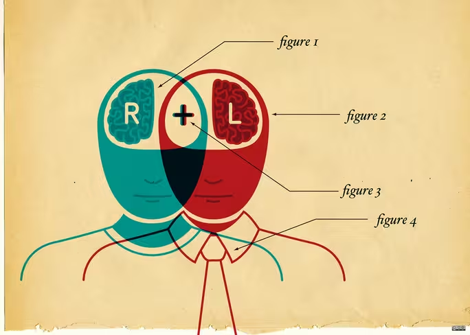
Collaboration is about enhancing each other’s work and creating a harmony. It’s following a smart plan to avoid confusion and waste. Collaboration is creating something greater as a group than would be possible for an individual.
Design collaboration in large companies can be difficult because you might try to force rigid protocols into the creative design process (which is naturally free-flowing).
After all, everyone’s a design critic. But not everyone can be a designer.
Photo credit: “Is the traditional business world at war with creativity?” Open Source.com. Creative Commons 2.0.
This article is obviously written linearly, but feel free to apply the processes in whatever order makes the most sense. In some cases, you’ll likely apply them multiple times – for example, collaborating on user research before project kickoff, and periodically as you iterate the product design.
To get started, let’s discuss a few tips for building a more collaborative culture at large organizations. In this piece, we’ll discuss the importance of inclusion, how to keep the designer ego in check, how to give and receive feedback, and how collaboration nourishes design thinking.
Welcome everyone to the design process
One reason concepts like “collaboration” or “teamwork” get a bad reputation is because we’ve all experienced dead weight or nightmare egos. But does that mean certain people should be excluded from teams? If so, who is excluded, and on what criteria?
When we talk about inclusion and allowing everyone to participate, we draw a line in the sand which makes a world of difference: we make no promise to incorporate everyone’s idea. We avoid design by committee at all costs because, well, it just doesn’t work.
Photo Credit: “Bored Room”. Brett Jordan via Compfight. Creative Commons 2.0.
While anyone may contribute or make a suggestion, the product design lead must have the final say. Committees do not equal design collaboration. Committees give everyone equal status and responsibility, which destroys accountability. Collaboration – as we see it – has a centralized leader. We encourage giving everyone a voice, but not bending to everyone’s will.
With this in mind, why not include everyone? Why not give everyone the chance to speak up and share their thoughts, as long as clear expectations are set? If someone has a bad idea, listen respectfully, then clearly defend your standpoint with reason and logic. Maybe at the next meeting they’ll have the best idea anyone’s heard yet.
Regarding our all inclusive meetings, we have a couple ground rules:
- Don’t take hostages – No one is required to participate, we simply give them the chance to if they’d like. The more you convince people their opinion is valued, they less they feel like a hostage to the process. You’ll likely hear their opinion at some point, so it’s better to get surprises up-front rather than three iterations deep in prototyping.
- Don’t leave anyone behind – When we say include everyone, we mean everyone. It doesn’t matter how insignificant their role or how new they are, the best ideas can come from the unlikeliest of places. And remember, there’s no risk, so why not increase your chances of getting a good idea by increasing brainpower?
For example, at UXPin, we involve everyone in the company in new feature kickoffs.
Once a quarter, we conduct a two-hour company-wide strategy meeting in which employees – all of them – are invited to discuss product design ideas. The sketches and tasks are recorded in Asana and visited weekly by our entire product design team to prioritize the best ideas (as well as add new ones of their own). Everyone knows, however, that while they are a contributor, they are not always the decisionmaker.
Sometimes it’s best to hear opinions from those who aren’t as familiar with the process.
Fresh eyes might have a specialized or new insight that experienced minds might overlook. Developers can add a whole new level to cognitive walkthroughs, but only if they’re invited.
If you’re conducting a benchmark study, why not have testers and visual designers do it together? And during paper prototyping sessions, invite marketers so that everyone can understand the design from the perspective of market viability.
Photo Credit: jeanbaptisteparis. Creative Commons 2.0
All-inclusive collaboration is by no means just our idea. Companies older and bigger than ours have been doing it since before we started.
One of the most famous is Vice, who discussed their process in a post for Fast Co. Create’s blog. Every week Vice holds a production meeting in which the members of the company’s different channels – music, food, etc. – get together to discuss ways to work together. Whether at this weekly meetings or casually in the office hallways, employees are allowed time for projects that interest them, even if that’s not what they were hired to do.
For a company valued at $2.5 billion (2014), this can’t be a practice that’s all that bad.
Build Empathy, Not Ego
Design, which lies at the crossroads of art and science, is an extremely powerful ego booster.
When we design, we feel clever and creative at the same time. We build, we create, we play god. And we usually feel great responsibility for the final product. Because a product and its design are inseparable, we feel almost a sense of parental responsibility.
This intense bond, however, also creates a dangerous trap.
Ego prevents you from creating a great product, because it will emotionally isolate you from the team. Like we described in Design Collaboration for Enterprises, the stronger your personal connection to the product (“this is mine”), the weaker your connection to the team (“this is ours”).
Photo Credit: “Pride”. Ivan. Creative Commons 2.0.
That’s not to say don’t be passionate about your work. By all means, expend as much creative energy as you can in making the best product possible and defending the right decisions.
The difference between passionate work and ego-driven work is how much the end product reflects on your self-worth. Not only will controlling ego make you more relaxed about your work, it will also make you a better designer.
This is easier said than done, especially for such an ego-driven species as humans. Below we’ve listed a few pointers for keeping that voice in your head only in your head.
1. Accept that design serves business needs
Yes, art is involved, and designers are a form of artist. But there’s more at play here.
Art serves the individual, whereas design serves any number of external goals, from selling cloud CRM solutions to promoting a city council candidate – not the whimsy of the creator, in other words.
Photo Credit: “Building an open source business”. OpenSource.com. Creative Commons 2.0.
The ideals of the designer – personal styles and personal opinions on aesthetics – are secondary to the business needs of the product. Because wants and needs are two separate realms, it’s common to question decisions from other team members (especially non-designers). But it always helps to start by first questioning your own assumptions.
Good design doesn’t call attention to itself, it simply presents choices to the user in a way that helps them best accomplish their goals. Great UX designers understand that it’s not about the best idea, but about the right idea.
2. Rely on user data for a clearer truth
Business goals decide the destination. User requirements steers the ship.
User research and testing is so powerful because it counteracts opinion with science. Of course, there is still some subjectivity in the interpretation of the results, but at least the raw data will help everyone arrive at a more objective truth.
Photo Credit: UserTesting.com
As discussed in The Guide to Usability Testing, let the user stand in between your ego and the stakeholders. In fact, we built usability testing directly into UXPin to encourage designers to constantly evaluate their work from a task completion point of view.
You may think an infinite scroll is best for increasing time on site, but the usability testing might show users bouncing after a minute or two. A good design, then, could still be the designer’s second choice. But what makes it a good design isn’t just what the creator thinks of it, but also what the user thinks.
3. Focus on empathetic design
Egotistical design satisfies yourself. Empathetic design satisfies the users.
Empathetic design balances user needs with stakeholder needs. The end users – best represented through realistic personas – should be the primary concern: their opinion certainly tips the scale. But empathetic design is also acknowledging that you’re part of a team, it’s not just your name going on the final product, so others also have the right to contribute.
Let’s assume that you have the most expertise of your team – that alone is not enough. You also need to be a facilitator and an advocate. An “expert opinion” will not get you as far as knowing your users, and facilitating a better understanding of them with stakeholders. This works in the designer’s favor, because you can share common ground with others by focusing on users together.
Go out and conduct interviews in the user’s natural environment. Watch how users solve problems, and if they create any workarounds. Create empathy maps. To really put yourself in the minds of users, you can even try designing in the environment which users will interact most with your product.
Photo Credit: “Sketchy Empathy Map Template”. Zak Greant. Creative Commons 2.0.
Treat empathy like a skill, then practice and develop it. The more empathetic you are, the better of a UX designer you will be.
To learn more about immersive empathetic design, check out this great piece on Smashing Magazine in which designer Pete Smart tried to solve 50 design problems in 50 days.
Master The Art of Critique
How well can you take criticism? How tactfully can you give it? We have a handy guide on giving feedback.
There’s no doubt that critique and feedback is vital to improving any design, no matter how personal it may feel at times. The art of critique is a two-way street and, harping on our points from the last section, the only way to navigate it is through empathy and understanding.
Photo credit: “Have an opinion. Elaborate.” See-ming Lee. Creative Commons 2.0.
We all know that what people say and what they actually mean can be completely different. More difficult, perhaps, is then translating that feedback into something that makes sense on screen. So how can you better decode the subjectivity?
1. Treat feedback as negotiation
When you’re on the receiving end of feedback, it can feel like a one-way ordeal. The other person tells you their thoughts, you digest it, then make the changes you feel necessary.
Instead, treat the person’s feedback as only the starting point of the discussion. Regardless of how prescriptive their feedback, remember that it is still just an opinion. Feedback sessions should always be two-way, and you should feel equally empowered to critique their feedback.
Photo credit: How Design
As described in the Ultimate Guide to Prototyping, set yourself up for success by designing just the right level of fidelity. If you create a high fidelity prototype as the first iteration, it will be hard to convince stakeholders not to comment on visual design details when you really want their thoughts on page flow.
Once you present the design, make sure the first question you ask isn’t too open-ended. For example, when we tag people in our design comments in UXPin, we avoid questions like “What do you think?”. Those questions open you up to all sorts of dreaded responses like “I don’t like it,” or perhaps worse, deceptive acceptances like “Sure, looks ok.”
For the most productive negotiation, explain the context of the design, then ask questions that focus on the objective like “Do you feel the vibrant use of color is engaging for our older audience?”
To learn more about responding logically to emotional feedback, check out Andrew Follett’s advice on Smashing Magazine.
2. Phrasing and Framing
How feedback is expressed separates constructive criticism from personal insult.
The best feedback clarifies the problem instead of prescribing solutions. Before the feedback session, state this point to help keep personal opinions on a leash and yield more practical results.
For example, an appropriate piece of criticism would be, “It’s not clear where I should go to generate a quote” whereas a comment like “How about a larger call-to-action?” is certainly well-intentioned, but far too tactical when the discussion should be strategic.
Photo credit: ZURB
If someone provides you feedback that’s focused on the solution, ask follow-up questions until you dig into the real problem. In the above scenario, you could ask the critic “What would the larger CTA solve? Why does that matter to our users, and what goal does that accomplish?”
On a related note, you can also challenge feedback with three questions to make the person elaborate, as first suggested by Dustin Curtis. If their feedback really was unwarranted, they will falter when answering. If it was valid, their answers will point you further towards the right solution.
3. Respect Facts
Opinions can be argued and disputed all night, but facts cannot. Whenever possible, refer back to facts, whether usability research, user data, or design principles. As we’ve previously established, never forget that design is much more than art.
The line between art and science is easily blurred since design requires creativity and interpretation.
To help non-designers understand the validity of your arguments, try to explain the science behind the design. For example, as we described in Web UI Design for the Human Eye, Gestalt principles provide well-documented arguments on how people naturally interpret design patterns.
Foster Collaboration Through Design Thinking
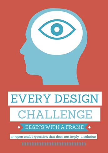
Design thinking is an ideology regarding product development that centers around people and their needs, as opposed to just the current business climate. The process begins with finding a need in the customer, instead of following a single innovator’s vision.
Photo credit: “Every Design Challenge”. Jo Quinlan. Creative Commons 2.0.
As Silicon Valley veteran Steve Blank explains on his blog, design thinking is even more suitable in larger companies who have greater resources for user research. Because design thinking is people-centric, it also helps to involve different departments for a diversity of interpretation and ideas.
This can be done any number of ways, such as sketching sessions, workshops, and design tools accessible to multiple teams. We’ve already mentioned the all-inclusive periodic ideation sessions practiced by Vice (and ourselves). This doesn’t necessarily have to be artistic, the idea is that a visual medium can accomplish some feats that verbalizing cannot:
- Documentation – Ideas become physical and documented. In a creative dry spell, you can simply go through the backlog of ideas to see if the problem hadn’t already been examined (maybe even solved) months earlier.
- Clarity – It can be nerve-wracking sharing your idea to higher-ups, and sometimes employees can’t articulate exactly what they mean. Having a separate medium in which they can take their time to flesh out their ideas may help them express themselves.
In fact, we encourage everyone at our company (not just designers) to contribute to this visual inventory of ideas. We create a project named the “Design Bin,” in our design app and anyone with access can upload a sketch, draw a quick wireframe, or create a prototype. For organization, we follow a strict naming convention so that the product team knows if ideas are for our app or website. At any point, other employees can sift through the material and maybe find the right inspiration.
Takeaway
Especially for large companies, collaboration can be an advantage over your competition – but only if its used properly. We’ll spare you the sappy quotes about teamwork and get right to the heart of the matter: collaboration is good for business. A team working together accomplishes more than a team following one person’s orders.
That is the very purpose of design collaboration: it’s not about manpower, it’s about the diversity of strengths and ideas.
For more advice on collaboration without compromise, download the free e-book Design Collaboration in the Enterprise: Building the Foundation for Brilliance. Learn the techniques to building collaboration into your existing processes based on best practices from top companies like Amazon, Hubspot, and Venmo.
Read Next: How to design websites that mirror how our eyes work
Get the TNW newsletter
Get the most important tech news in your inbox each week.

