When you’re a massive international news organization, revamping your flagship platform is only part of the story. Adapting and consolidating operations to stay relevant in an ever-changing media landscape is the order of the day.
A key part to that story is obviously understanding what it is your readers like, what they actually read and what they really should know about. The Guardian, to help it achieve those goals, has built its own in-house analytics engine called Ophan. It’s a bit like Chartbeat or Parsely, or many other analytics platforms at its core.
Behind the scenes, it publishes about a quarter of a billion events per day and typically the lag before something shows up on the dashboard is somewhere between three to five seconds. But it hasn’t always been such a powerhouse.
The project grew out of a hack day, but the team couldn’t bring themselves to turn it off at the end of the weekend. So they just left it on, running in the background. Three months later, The Guardian’s director of architecture, Graham Tackley, decided to devote some real time and attention to what it could achieve. Tackley and Chris Moran, The Guardian’s digital audience editor, quickly saw that by measuring site data more closely, the organization as a whole could potentially benefit.
“It’s like understanding how journalism works digitally […] the ideal is that we should all understand that. And that eventually kind of codified into the idea of democratizing that data within The Guardian. All of those sub-editors that were working without guidance, essentially. We wanted them to be able to see it for themselves,” Moran said.

The 💜 of EU tech
The latest rumblings from the EU tech scene, a story from our wise ol' founder Boris, and some questionable AI art. It's free, every week, in your inbox. Sign up now!

When it was ready, they opened it up to the whole company, to anyone that could potentially benefit from additional data insight. Since switching it on, Ophan has gone from zero to more than 950 monthly active users within the organization, Moran exlained.
The key thing about that organic growth [is that] you don’t get 950 people [to use a tool like Ophan] by buying in a tool and going through some massive training process,” Moran said. “The way you get that is by making the tool useful to the individuals within this building, so everything it has grown into has been as a direct result of within editorial and beyond – but very much focused around editorial and people saying ‘I’ve got this problem, could Ophan help with this?'”
The answer to ‘why do we need Ophan?’ isn’t ‘because data,’ it’s because it can help us do our editorial jobs, even if that’s just as simple as showing some section editors that they might be wasting their time micro-managing the front page and should instead be focusing on an article level on how to move people along to other pieces of content. That in itself helps them prioritize their time.
A frequently cited concern by editorial when talking about data is the fear that if you only pander to readers and a wider audience, you end up with content that falls somewhere between asinine and anodyne. However, perhaps unsurprisingly, Moran disagrees.
Page views are much maligned, people say why use page views because it just leads to clickbait – but actually, if what you’re trying to do is judge how well you’ve promoted a piece of content, it’s really effective. It’s not necessarily a sign of quality – as long as we all understand that, that’s fine – but it can tell you whether something is working.
The thought here is that if ‘page views’ is a useful metric in its own right, it somewhat removes it from the advertising process – clicks for feedback, rather than to drive revenue. Moran explains that while there’s no commercial aspect to his job at all. “We basically work on the principal that if we get our excellent journalism in front of the widest possible audience for each piece, that’s probably going to have a good commercial benefit – and surely that’s also an editorial aim?”
Beyond basics
Ophan isn’t just tracking page views. It’s also looking at things like median attention time, using the same sort of methodology as Upworthy or Chartbeat, to find out where users are engaging with each page. This goes some way to arguing against pure page view measurements, as the team can see whether they’re just clicks or whether people are actually engaging with the article. And what does ‘engagement’ consist of here?
“The way it works is that there has to be evidence you’re actively doing something on the page – it has to be in the foreground tab, and you have to be moving the mouse or scrolling, or clicking, or doing something like that,” Tackley said. “Every time you do that, the timer starts for five seconds.”
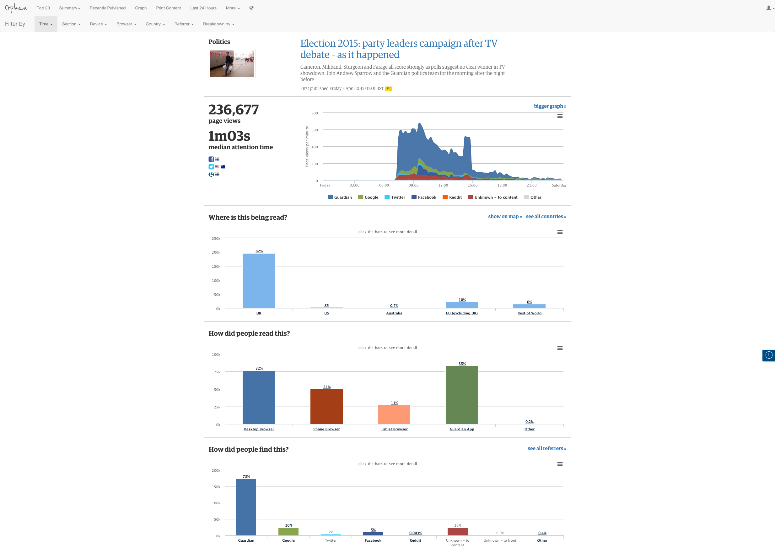
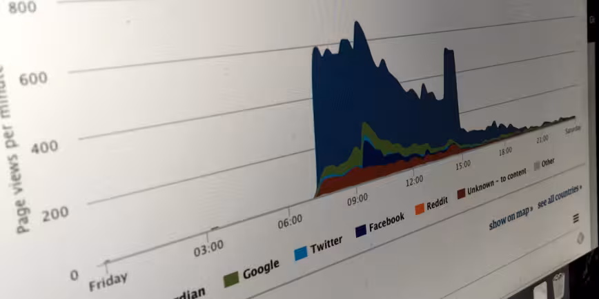
The median attention time detail of Ophan is split in terms of dispersal. It’s in 10-second chunks, and visitors are color-coded depending on how long they stayed on a page. People who left before 10 seconds are widely classed as ‘bounce’. This data can give an indication of how any particular piece of content is resonating with the audience, but different formats perform differently. A live blog behaves very differently than a regular article because people are refreshing it, so the attention time tends to get dragged down. They also tend to be pretty long in comparison to regular written content.
By looking at these figures, section heads, editors and journalists can see, broadly speaking, how long any article should take to read, how many people went beyond that and what the median attention time was.
What this doesn’t mean, however, is that there’s a magic formula for working out optimum article length, Moran says.
One of the reasons I worry about attention time as a metric around editorial content – particularly as an indicator of quality – because that’s a really tempting thing to do, to go ‘right, if we aggregate this data, we can find out the peak length of an article,’ but I just think that’s nuts. If people worry about page views as a metric leading to clickbait, attention time leading to you curtailing or lengthening your articles, I think is much, much more dangerous when you talk about editorial content.
There’s obviously a lot of buzz around attention time and various other things – at a macro level, it makes sense that if you have a lot of quality journalism, you’d expect people to spend more [time] on your site. But it’s also a very slippery metric…we’re learning what you can’t do at an article level is assume that time spent on page is a clear indication of quality, because it’s affected by so many other things.
The ‘Russell Brand’ effect
For anyone that works in publishing and has any understanding of the internet and social, it’s going to come as little surprise to hear that just dumping a URL onto the internet and hoping people find it isn’t a very good strategy. It needs promotion, and much of that is via social channels like Twitter and Facebook, as well as Google Search.
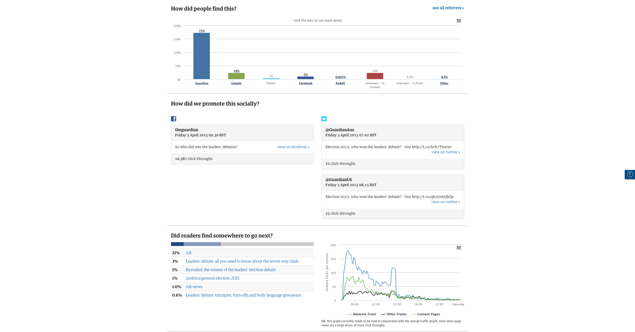
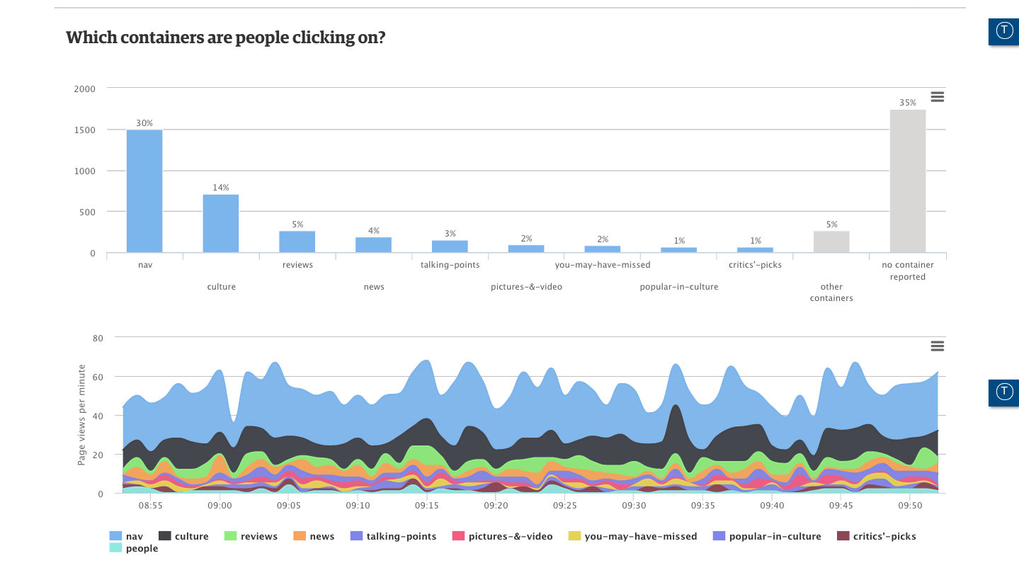
As such, Ophan has a whole bunch of icons and shortcuts indicating exactly where any one piece of content has already been promoted. If something hasn’t been, journalists and editors are encouraged to hassle Moran and his team.
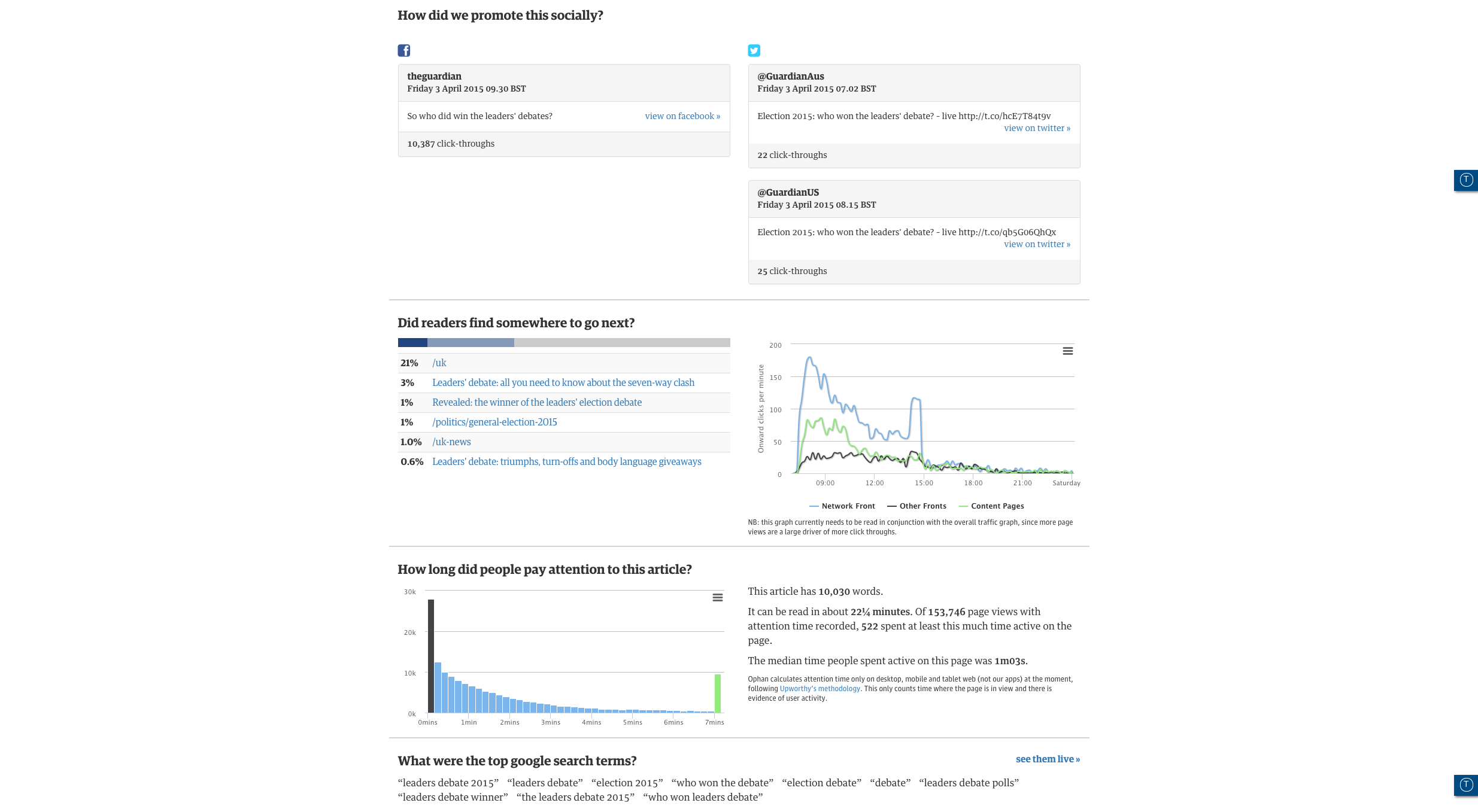
“You can’t actually identify by subject what does badly, broadly speaking,” he explained. “The one thing those pieces that do badly have in common is that we haven’t promoted them. When you’re doing 500 pieces a day, it’s really easy for bits to slip through the cracks. If you’re the journalist who’s interested in it, or the sub-editor, or the editor, you can immediately get a sense of whether or not we’ve pushed this piece of content.”
One thing that doesn’t work, however, is teasers on social media. Moran has a serious distaste for social media ‘gurus’ who advise the use of them.
“It’s absolute horse shit. Every single time you use a teaser on social media is that you might get high click through, but it’s very unlikely as people don’t have the time, but what you definitely get is immediate bounce,” he said.
“The problem is people see Russell Brand going ‘I done this’ or ‘this is interesting’, and they all go ‘it got 500,000 retweets’ and everyone gets very excited, but Russell himself doesn’t know how many people bounced off that fucking article. Also Russell Brand is Russell Brand, he’s not a newspaper,” he added.
Exploratory data
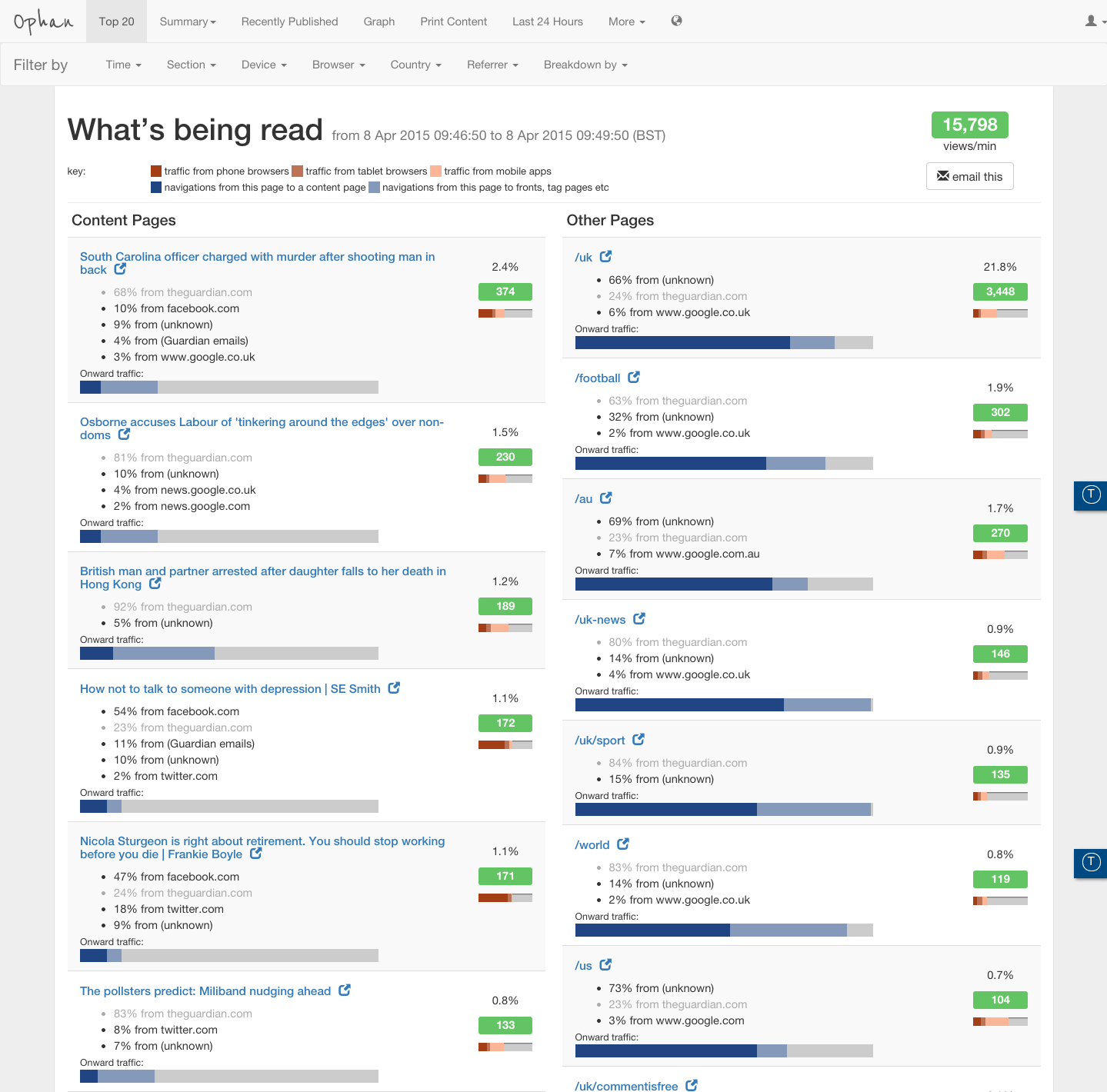
Ophan provides the team with a level of granularity that turns it from analytics reporting into an exploratory tool. A nice example of this is a piece around the Nigerian elections it ran a couple of weeks ago. By looking at the data, the team could see that 35 percent of the total views came from within Nigeria, which is validating for the journalist and editor working on the piece.
More than that though, it also threw up an interesting data set from an unknown device type – it turned out to be a mobile browser that peculiarly specific to Nigeria.
“Fundamentally, if we’re looking at expanding into other territories, that kind of information is really, really useful to us,” Moran said.
That kind of data exploration helps the team understand the relationship between all its different channels too, including social and search.
“Unknown [traffic] really interests me because there’s a lot of rubbish about it on Twitter. People, really, really intelligent, well-qualified, respected people talking only about dark social – because it’s a wacky term,” Moran said. “The simple fact is: social is clearly important in it and Facebook definitely, a bit… but search is a huge part of this, and anyone who’s not talking about search when they’re talking about unknown doesn’t know what they’re talking about.”
An assumption too far
While based around data and analysis, Ophan is essentially designed to be an insight machine, in the right hands. Perhaps controversially though, this means that Moran thinks that it should be used to inform editorial judgement and what gets produced. Obviously, some people worry that this could lead to impaired judgement.
The interesting thing about that is that it assumes a couple of things. The first is that operating in total ignorance is good and will always lead to the right decision; I know personally just from watching the data versus that process that this is very much not the case.
Secondly, it assumes that the data is in control of you, you’re not in control of the data. The point of this is, and the reason it’s not automating into all of our various processes, is that we want human beings between the data and editorial. We want to be data-informed, not data-led. There are times when the data will tell us something, or confirm something we might already know and we might very well ignore it.
He continues, arguing that being informed by the data can actually lead to higher quality journalism. Writing about Justin Bieber isn’t the recipe for success you might think it to be.
One of the reasons behind that, if you look at the data, is that you’re probably talking about a lot of Google traffic, if you’re thinking about scale, and Justin Bieber is one of the most competitive search terms in the world, with a lot of places like TMZ who have much, much bigger domain authority around it. So it’s quite useful just to burst myths like that.
“We’ve consistently shown on Facebook that our core journalism around social ills, politics and everything else works really nicely on Facebook, on a mass platform,” Ophan’s architect Tackley, added. “That’s real journalism, real articles, not listicles. If we just trusted those lazy myths, we’d never try pushing that kind of content out.”
Part of the battle seems to be to understand what the data is actually telling you; there are a whole lot of different metrics you could look at, but if you don’t fully understand what you’re seeing, it’s easy to miss the real implications.
For example, page views per visit are often measured to give an indication of loyalty, but if you improve your article page so that you link better, your page views per visit should rightly go down; people find things quicker because they don’t have to navigate to a different section to find something else to read.
The future of news?
Loyalty is something pretty high on the agenda for Tackley and Moran. Right now, Ophan’s not really very good at measuring it.
“There’s some vague approximation to it in there, but we need to do a better job of understanding whether this is someone who’s coming back to this article or series every week, or is it someone who’s just coming in for the first time etc. Having some indication of that in an understandable way that you can action [would have value]. I don’t know how to do that, but we’ll figure it out,” Tackley said.
One of the other big things that the pair are excited about is tracking video, both on-site and off-site.
“The offsite is really critical for the future,” Moran said. “We know that natively we can embed a video in Facebook and the reach will be huge compared to, say, on-site. Everybody knows this, but how do you compare that success to something like a piece that gets 10 times fewer plays on-site but that carries a pre-run, for example? That’s really difficult.”
With humble beginnings at a hack day, and now 950 monthly users within the organization and the power to inform the international news operation, Ophan has clearly demonstrated that the future of The Guardian is a data-driven one.
Data-informed. I mean, data-informed.
With that comes an editorial responsibility to resist the temptation to cover topics in ever decreasing circles. Indeed, if Tackley and Moran are correct, Ophan’s value comes in allowing exploratory promotion of content, as well as the potential to experiment with the editorial agenda.
Get the TNW newsletter
Get the most important tech news in your inbox each week.