In Web design and usability testing, there is no “it just happens” phenomena while studying user interaction. There is always a scientific or psychological explanation that answers the question – “what motivates a visitor to take action?”.
Only recently there has occurred a surge in the number of Web publishers using advanced techniques (like eye tracking, on site surveys, heatmap and scroll-map click tracking, among others) to help them better infer user motivation – what factor compels them to sign up OR scroll to the bottom of the content OR fill in a form. Once you can understand that, it becomes fairly easy to optimize user engagement to help them get the best possible value out of your business offering.
Now one of the most difficult and time consuming tasks for website owners is to understand user behavior in a way that it gives them the knowledge to enable an increase of clicks on links. Why? Because a click on a link demonstrates a user’s interest since it’s the only way to continue their engagement with a website.
Keeping this problem in mind – below I’ve shared a list of pointers that can help website owners get more clicks on their links by using principles of science (Path of Least Effort, Serial Position Effect, Paradox of Choice, Emotional Triggers) and design (User Experience, Content Structure, Anchor Text & Link Placement).
Let’s begin with…
Path of Least Effort
On your website, if you want to convert a visitor into an email subscriber or a lead to a customer then you have to remove all distractions and potential springboards which could make them bounce. Essentially, you want to set them on a path of least effort.
“The path of least resistance describes a physical or metaphorical pathway that describes the least resistance to motion or action. Following the path of least resistance has its advantages; it takes much less effort to accomplish things.” – Damien Howell Physical Therapy
In such cases, resistance is used as a metaphor to describe emotional conundrums like confrontation or opposition.
Taking this one step further – the human mind also looks for options or actions that are easiest to spot without putting any extra effort (like reading the text exhaustively or having to scroll the page).
Takeaway – Your primary call to action links/buttons must be easy to locate on a page.
Serial Position Effect
You’ll notice that when you have to memorize or recall whole ten digit mobile phone numbers – you’ll always remember the beginning and (maybe) the last two digits. Hardly anyone recollects the middle digits. This behavior is not random at all and is called the Serial Position Effect, discovered by German psychologist Hermann Ebbinghaus through tests that he conducted on himself.
The serial position effect is explained through its two parts – Primacy and Recency.
Primacy effect is the human tendency to recall items in the beginning of the list more quickly and accurately. This happens because the first items have less competition from other items in the list, for the brain’s limited memory capacity.
The Recency effect also receives part of this position advantage; it being that the last items on the list are also recalled better by the brain. Items in the middle of the list have the least recollection value.
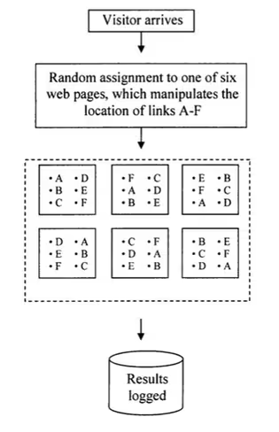
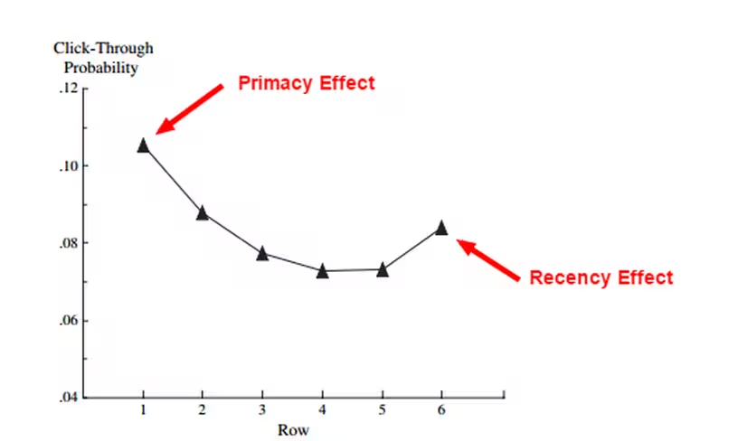
A study conducted by Hofacker and Murphy (2005) on a southeastern U.S. hospitality website, found that the upper location, at 9.2 percent, was the most clicked location (Primacy effect) followed by the lower location, at 7.7 percent (Recency Effect). The worst performing link position was middle of the content.
Here’s the test procedure illustration (it was run over a period of 10 weeks with 1,641 visitors) –

And here’s the graph showing the test results –

Takeaway – Links placed higher up or in the beginning of the page tend to get more clicks.
User Experience (UX) and how it affects link selection
Before conducting usability testing or running engagement trials to see what encourages a user to click on your link, you need to understand some UX principles.
- Make your content scannable. An extensive research by NN group, utilizing eye-tracking, found that majority of the people rarely read exhaustively on the internet and instead prefer to skip the text.
- Therefore, it is wise to create short paragraphs, highlight the important content with bold and use bullet points. Also, use the right amount of images to illustrate the point you’re making. This way it will stick longer in the reader’s mind.
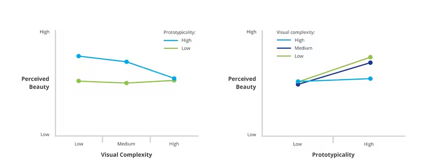
- In matters of ‘Design’, always keep things simple. Javier Bargas Avila, Senior User Experience Researcher at YouTube UX Research, led a study in 2012 that found that users love simple and familiar designs. The study even states that visitors take as little as 17 to 50 milliseconds to pass a judgement based on gut feeling, on whether they want to stay on a website or bounce.
The graphs below essentially show that users perceive a website’s design to be poor if the visual complexity is too high.

Recent research has shown that negative product expectation leads to negative interaction – something which you definitely don’t want.
Typography affects people’s perception of what is good or bad. Experiments conducted by Kevin Larson (Microsoft) & Rosalind Picard (MIT) showed that when a passage is typographically well segmented and aesthetically pleasing, readers are more engrossed in consuming it and therefore are more likely to click on a link that is placed within it.
Takeaway – On your website, incorporate a simple design with structured scannable content and a visually pleasing font.
Science of choice
In his wildly popular book Paradox of Choice, Barry Schwartz counsels that given the abundance of choices available to consumers during shopping, they invariably end up unsatisfied and unhappy due to being unable to make a purchase decision.
Which is why eliminating consumer choices can greatly reduce their stress and facilitate swift buying decisions.
As Tyler Durden says in Fight Club –
Barry goes on to say that the best example of this phenomena is the myriad of choices we have on cable television. Viewers have so many choices that they end up just switching channels incessantly instead of calmly seeing sticking to one; a classic example of analysis paralysis.
In a popular study from 2000, psychologists Sheena Iyengar and Mark Lepper conducted an experiment using jam.
They empirically proved that given the option of choosing among smaller and larger assortment of jams, consumers showed more interest in the latter.
However when the time arrived to purchase or choose just one flavor, they were ten times more likely to carry out the transaction when only six flavors of jam were presented to them instead of the larger assortment of 24 flavors.
Takeaway
Limit the number of links to get people to actually click. In other words, a user should never cross the ‘choice overload’ threshold.
Emotional Triggers (featuring ‘Dopamine’)
It is critical that website owners understand that there is a rational and functional human being behind each click. Users will only be encouraged to follow through with a click on the link if his/her fundamental gut feeling and senses tell him/her to trust your website.
Trust is the cement that will build your relationship with your audience better than any value proposition, discount or freebies.
Users click on links because they are interested. You have piqued their senses and now they are in an information/value seeking mode.
And do you know what everyone seeks at the end of this quest of finding information? An expectation to be rewarded, to be psyched, to be excited.
And which chemical is in charge of this behavior? Dopamine.
“Dopamine is a neurotransmitter that helps control the brain’s reward and pleasure centers. Dopamine also helps regulate movement and emotional responses, and it enables us not only to see rewards, but to take action to move toward them.” – Psychology Study
Consider this – whenever you go to watch a movie to the cinema, there’s a scene which makes your eyes go wide, your pulse race and your mind ecstatic – that’s dopamine working right there for you.
But it only lasts so long and then you’re back to a neutral emotional state.
What does dopamine have to do with getting users to click on your links? Write your content and headlines using words and sentences that trigger emotional responses, effectively releasing dopamine.
This does not mean that you start flooding your emails, newsletters and touch points with an information overload. An information overload means that the brain has to work more to assimilate and comprehend the incoming info which then gives way to stress.
Takeaway – Treat your anchor text like an elevator pitch – short and highlighting the benefit (of the information in the page that it is linked out to).
Anchor Text and Placement of links
The boorish “click here”
Let’s get this straight, if you’re phrasing most of your anchor text simply as “click here” then you’re just being lazy or plain naive. “Here” in “click here” inspires no confidence because it does not denote where the anchor text will send you. If someone was scanning such content, they wouldn’t be able to understand the context of “click here” and what it entails. Below is an example –

Furthermore, a user’s confusion will be fueled even more once he sees so many “here”.
So what is the ideal anchor text and its placement?
Based on an amazing article from Smashing Magazine titled ‘Why Your Links Should Never Say “Click Here”’ by Anthony T –
- Anchor text should contain nouns so that the reader can visualize the information that it links out to.
- Proper nouns are even better because they are quite simple to understand and represent unique elements.
- It’s a good practice to avoid verbs because they represent “work/effort” and are generally not suited to convey a single idea solidly.
- It’s advisable to always place the link at the end of a sentence so as to remove the dilemma of clicking on the link or finishing the end of the sentence. Essentially we want to streamline the process of link clicks by making it a natural reaction for users.
- You can also dabble with curiosity and informational triggers like for e.g. “pet care tips”. This might ring well with a niche audience.
- Build a business relationship based on trust and repeat customers. Never oversell. Never underdeliver.
- Build your website’s vision on designing a natural flow of content that redirects to the right information.
Takeaway – Embrace the use of nouns in the anchor text and place the links at the end of the sentences.
Read Next – The 5 Pillars of Visual Hierarchy in Web Design
Image Courtesy: Smashing Magazine, Google Research, Sad Movie Quotes (gif)
Get the TNW newsletter
Get the most important tech news in your inbox each week.


