What happens if you make software too difficult to use? Probably the same thing that happens if you never made it at all — no one uses it.
It’s easy to get users to adapt to familiar concepts like drag-and-drop, but what if you made something totally new? You need a creative user onboarding process, like the one Microsoft used back in 1992 and the others I’m going to look at in this post.
The Software User Onboarding Process
I already talked about concierge onboarding, so this time I’m going to look at the total opposite — a style known as low-touch user onboarding. It’s not always possible to work with every customer, especially if you’re distributing software on a massive scale like Microsoft Windows, so writing onboarding into your product is a necessity.
James Hunt‘s excellent article on Mental Floss reveals the true purpose of Minesweeper, Microsoft Solitaire, FreeCell and Hearts: a gamified way to teach users concepts vital to success using Windows 3.1.
Let’s take a look at exactly how they did it.
Minesweeper
What better way to tempt interaction than a gray 8×8 grid, a smiley face and implied explosions?
Before the internet, Minesweeper was surely the biggest office time-suck and responsible for more wasted hours than any other single factor. Users did, however, learn a valuable lesson.
You see, Minesweeper wasn’t created to be fun. It was designed to help users transition from the command line to the mouse and ease into the new graphical user interface offered by Windows 3.1.
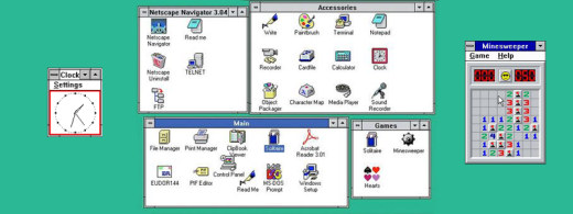
If you’ve spent hours of your life playing Minesweeper, there’s no need to feel bad about it. Chances are, it helped you learn to right-click.
Microsoft Solitaire
With Solitaire dating back to the 1700s, Microsoft used it as a familiar setting to teach users something that it’s hard to imagine not doing now — drag-and-drop.
Microsoft knew perfectly well that teaching mouse skill as an obvious tutorial would not go down well with users. Especially command-line snobs, ready to roll their eyes at the graphical excesses of anything other than the terminal.
This is why they rolled it into an addictively simple game most people already knew how to play.
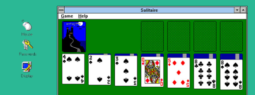
Why are modern apps so easy to use? Probably because we learned the mechanics from games like Solitaire (see Hearthstone for an example of a modern game with a virtual deck of cards). The same goes for Trello which uses the same drag-and-drop system and has an added bonus of being similar to a wall full of sticky notes (something I’m actually too young to know about, but might have been popular at some point).
Hearts
Hearts was introduced with Windows for Workgroups 3.1 in 1992 — the first network-ready version of Windows. It’s no coincidence that Hearts could be played against players on other computers through the magic of LAN, and introducing it in the first networked Windows was the perfect way to secretly prepare users for office Counter Strike LAN parties (just kidding, I think).
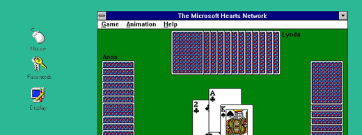
What Microsoft was really doing was showing users that it is possible for their computers to send and receive data, and getting them used to the idea of setting up networks. When it finally came down to doing some serious work, the lessons learned in Hearts would be put to good use.
Enough about genius games; how have companies applied these digitally-archaic ideas to modern apps? Has Microsoft tricked them, too? To find out, I signed up for a bunch of apps and tried to see where they were tricking me into doing the worst thing of all – actually learning something!
Slack: A Modern Low-Touch Success Story
Microsoft really got creative with its user onboarding process because it didn’t have much choice; the limited capabilities of Windows 3.1 forced creativity. Today apps aren’t forced to be creative because of limited options, but because of market saturation. The total amount of apps on the Apple store alone totals over 1.5 million. While not all of them need onboarding of any kind, it’s the ones which combine great functionality with ease-of-use that succeed.
A remarkable example of low-touch onboarding is Slack‘s robotic greeter and orientation specialist, Slackbot.
While we’ve still got Microsoft on the brain, a good comparison with Slackbot would be Clippy, the overly enthusiastic paperclip/help document and something I would have really paid more attention to if I knew I’d be writing this article 18 years later.
Anyway, since Samuel Hulick has already outdone anyone in the field of Slack onboarding analysis, I thought I’d talk a little more about Slackbot since he seemed to be lost for words.
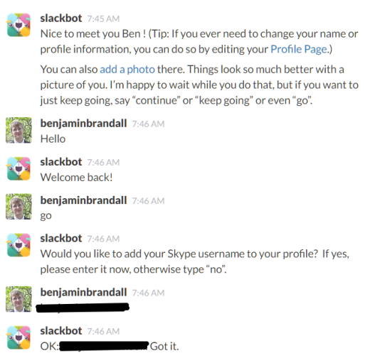
This is the first conversation you have on Slack. Certainly more fun than profile setup pages (which are the biggest bores since confirmation emails), and has filled our Slack directory up with information — a great help when I joined the company.
Slackbot’s assistance doesn’t end there. And, like most software now, the only limit is the amount of thought you want to put into getting it set up. For example, when new employees are looking for resources, Slackbot could be programmed to fetch them:

Slackbot is a fine example of a placeholder on an otherwise blank slate. For users starting up Slack for the first time, it demonstrates:
- Notifications
- How to read direct messages
- How to send direct messages
- How to add details to your profile
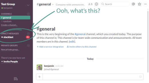
And all the while it’s just letting us think we’re chatting to a nice, friendly robot when we’re actually learning things. Nice try, Slack. You won’t get me that easily.
Gamification of the User Onboarding Process: One Step Past Microsoft
While Microsoft used real games as components of their secret user onboarding scheme, for the rest of us without an operating system to call our own, gamification will have to do.
And it’s not a bad option either — eLearningIndustry cites an increase by 9 percent in retention when software has elements of gamification. This could be because users learn 14 percent more skills and 11 percent more facts in the process.
Yu-Kai Chou has written an awesome article about gamification in onboarding, and is one of the authorities on the topic. As someone who has played more than enough video games for one lifetime, gamification is fascinating to me.
Here are some elements to consider when gamifying your software’s onboarding experience.
Step-by-step tutorials
Remember when software used to come with a Biblical user manual so densely written you were scared to touch the software? Thankfully, that’s changed. Software companies usually offer the user guide as a when-needed reference instead of the only way to learn.
This is basic stuff, and even apps without gamified onboarding do this. An example of a great step-by-step tutorial is Duolingo, a language learning app that doesn’t limit gamification to the onboarding process.
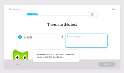
The owl helper here is another thing that conjured up memories of Clippy. Narrative is an important part of gamification, as is meeting goals. The blue progress bar will be familiar to anyone who has played games where you level up, commonly RPGs like World of Warcraft, Final Fantasy or Skyrim.
What happens when we get to the end of it?
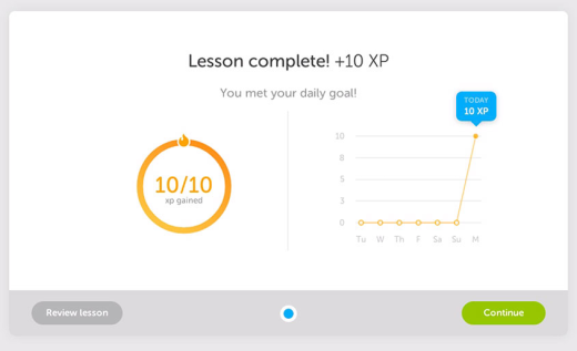
Just look at that enthusiastic title, sharply-increasing graph, and pleasingly-perfect circle. Duolingo has already made you feel successful using its product, all while teaching you how to use it in a fun way.
Early win-states
Remember how easy the first level of games used to be? To use World of Warcraft as an example, you go from level 1 to level 2 within the first 5 minutes of playing the game. This instant gratification makes users feel good, and encourages them to stick around and keep paying that subscription money even when it might take a whole day (or 5) to level up later on down the line.

What kinds of early win-states can software designers build into their onboarding process?
When we talk about early win-states from the perspective of software, we usually call it an ‘Aha! moment‘. The interesting thing about Aha! moments is that they are often decided upon by the designer, not the user. (We decide when you say Aha!). Software uses early win-states to train you to use it and condition you into repeating what makes you feel good and what ensures you get the best use out of their product.
When you do something fundamental to the idea behind an app or proven to be a driving factor behind retention, you’ll be rewarded. It’s simple positive reinforcement.
A subtle way of doing this is with a checklist. At Process Street, we know checklists are brilliant at motivating people to act. Evernote uses a 5-point checklist to ‘help you remember everything’:
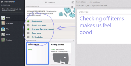
I don’t know about you, but a list with a few items left unchecked makes me nervous. The thought of having that checklist sticking around and bugging me to complete it is enough for me to succumb to the 5 things Evernote thinks I need to do to become a successful user. Well done, Evernote.
Identity creation
When you start playing a video game for the first time, one of the first steps is usually character creation. At the most basic level, it’s naming the save file, at the most complex you’ll get to customize every aspect of your character’s appearance, voice and even history.
The same goes for software, especially those with social aspects. The whole point of Slackbot was profile creation, which is a tactic to increase retention by getting you personally involved with it before you do anything else.
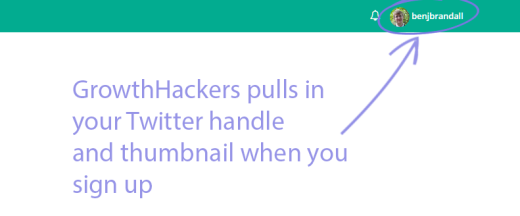
To make you feel more at home, some apps or sites like GrowthHackers pre-populate your profile by bringing in your details from Twitter, Facebook or wherever you signed up through — Sean Ellis knows what’s up.
According to Yu-kai Chou, “just like how IKEA makes people attached to their furnitures by having customers build the furnitures themselves”. So that’s why they do it…
When Was the Last Time It Was Fun to Learn Software?
Even though business software is used for ‘serious’ tasks, that doesn’t mean it has to be a drag.
According to Susanna Halonen writing for Happyologist:
“When you’re having fun, you boost your positive emotions which activate the learning centres in your brain. That means you are connecting with more of the brain power you have and hence you’ll be more alert in noticing new things and learning through them”.
If that doesn’t sound like an effective way to program users into becoming successful with your product, I don’t know what does.
Does your product engage users with gamification? What kinds of effect has this had on your retention?
Let me know in the comments. +10xp to you if you do.
Read Next: Microsoft is testing advertising suggested apps in Windows 10’s Start menu
Image credit: Shutterstock
This post first appeared on ProcessStreet.
Get the TNW newsletter
Get the most important tech news in your inbox each week.


