Do you have a strong logo or a weak one?
While a dancer may ask herself, “I wonder what Michael Jackson would think of my dance moves?” or a boxer may ask himself, “I wonder what Muhammad Ali would think of my right hook?”, a designer would ask, “What would Paul Rand think of my logo?”
By the end of this read, you will know confidently whether Paul Rand would approve or disapprove of your logo.
The Legend
Paul Rand was an American art director and graphic designer, best known for his corporate logo designs, including the logos for IBM, UPS, Enron, Morningstar, Inc., Westinghouse, ABC, and Steve Jobs’ NeXT.
In fact, when Steve Jobs hired Paul Rand to design the NeXT Computers logo, he hired him for $100,000. To Jobs distaste, Rand said he would provide only one iteration.
[Steve Jobs] asked him if he would come up with a few options, and he said, “No, I will solve your problem for you and you will pay me. You don’t have to use the solution. If you want options go talk to other people.”
Rand came up with a 100-page brochure detailing the brand, including the precise angle used for the logo (28°) and a new company name, NeXT.
The foundational criteria for this logo test is based on a something Paul Rand said that changed the world of logo design:
The principal role of a logo is to identify, and simplicity is its means… Its effectiveness depends on distinctiveness, visibility, adaptability, memorability, universality, and timelessness.
The 7-Step-Paul-Rand-Logo-Test uses the descriptors above to assess a logo. The steps flow like this:
- Is it distinctive?
- Is it visible?
- Is it adaptable?
- Is it memorable?
- Is it universal?
- Is it timeless?
- Then, when you have said “yes” to everything above, ask this final question: is it simple?
For each step except for the last one, rate on a scale from 1 to 10. For the last step of simplicity, rate on a scale from 1 to 15. This mathematically gives weight to what is most important in a logo. A score of 75 is perfect, and anything below a 60 is discardable.
Guinea Pig
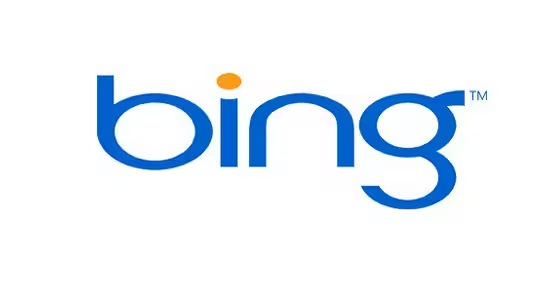
The best way to see how this assessment works is to use an example. Let’s use the former logo of Bing, Microsoft’s Internet search engine.
The Bing logo above was discontinued and upgraded in September of 2013 for obvious reasons. Let’s take the seven steps and apply them to this logo to find out why.
1. Is It Distinctive?
Distinctive means unique and different from everything else. It stands out among the crowd and isn’t easily confused with others.
In our example, the Bing logo uses a youthful, common blue color — 80 percent of all logos are blue. The typography suggests openness and breadth — good for a search engine, but it is plain and flat which is not going to work if they want to stand out as a competitor of Google.
Because there’s no artwork to supplement the wordmark, a LOT of pressure is put on just the words to convey meaning. But nothing is unique about the lettering. Yes, the wide letters use lots of white space, but the letters seem smushed together, especially around the base of the “i”.
The loop of the “g” is cut off suddenly, which feels cold and incomplete.
If the ear of the “g” (the small stroke flaring off the top right) were any thinner it would look like a bald man’s head with a wild hair sticking up, which makes me think of age (i.e., Microsoft?).
3/10
2. Is It Visible?
Visible means noticeable or easily seen. Because it takes up a generous amount of space, its visibility is high. However, most designers begin crafting a logo in black and white for optimal visibility independent of color. But the deep yellow dot of the “i” is lost when this logo is put in black and white — losing the personal, intimate touch the “i” provides. Always make sure your logo looks good in both black and white.
6/10
3. Is It Adaptable?
Adaptability means that it works across numerous applications — on a t-shirt, on a cup, online, on a truck, on a road sign. You get the idea.
In our example, the Bing logo has enough built-in white space for it to look identifiable on nearly everything. The only strike against it is that it would have trouble fitting into a square — or any instance where vertical slenderness is needed.
The text is egregiously scaled horizontally, leaving no alternative to fit into a box, such as a favicon or a mobile app icon. Perhaps, isolating the “b” would work in a box but this would significantly lower its distinctiveness score even more because the “b” is so plain.
5/10
4. Is It Memorable?
The goal of a logo is to be unforgettable — so that when a person feels the need your business solves, your logo comes to immediately mind. You can test this with word association. Word associating is an exercise where you think of the first word that comes to mind when you hear or see something. Word associate with the following logos:
Here’s what I got, respectively: beer, chips, and car. Do the logos use the words: ‘beer’, ‘chips’, and ‘car’? Nope. They don’t need to, because they are easily recognizable, memorable logos.
In our example, I do not get “search engine” from looking at the Bing logo. It’s interesting to see how they fixed this with the new Bing logo, which we’ll talk about in a minute.
The Bing logo’s flatness and lack of emotion make it difficult to remember.
2/10
5. Is It Universal?
When universal logo carries a consistent meaning to a diverse range of people. This is possibly the most difficult part in creating a logo because everyone is different. How do great, global brands accomplish this?
Google uses color.
Apple uses a staple, worldwide fruit and a neutral color.
Note: the Apple logo doesn’t even need words to be identified, creating a heavenly universality score.
As a search engine, the Bing logo needed to demonstrate both power and complexity but not at the cost of approachability (everyone needs to feel comfortable to use a search engine). The design accomplishes approachability through plainness but communicates nothing about robust power and depth of knowledge.
4/10
6. Is It Timeless?
The biggest principles to remember when crafting a timeless logo is do not use the “hottest” colors, “flashiest” fonts, or “coolest” styles. Fads change like the weather, but the sun always comes up, and the sky is always blue.Find the strong core of your design and trim off the extra embellishments. Minimalism is the art of saying more by saying less.
The antiquated Bing logo does alright with avoiding flashiness and short-term sparkle, but its overdone roundness is the opposite of cutting edge.
6/10
7. The Holy-Grail Question: Is It Simple?
Paul Rand said that a logo should epitomize minimalism.
“A logo cannot survive unless it is designed with the utmost simplicity and restraint.”
The first six steps of the Paul-Rand-Logo-Test involve adding and creating standout qualities in your design so that it is unique, durable, memorable, etc. But this last step is about stripping out and reducing extraneous detail to unveil a pure and playful end-product.
Here are two practical measures you can take to ensure your logo is designed with simplicity:
- Shrink it down and then blow it up. The appearance and design of a strong logo will be legible and pleasing regardless of its size.
- Draw it by hand in ten seconds with a pencil. If you can do this easily, then you have a simple logo.
Because simplicity is the crown of the six qualities above, it is rated on a scale from 1 to 15 to account for its critical importance. A highly distinct and creative logo may lose points because it is distinct and creative at the expense of simplicity. A good example of a simple logo is the Nike swoosh:
The $15 billion company is identified by a solid “tick” that says: victory, athletic shoes, and Greek goddess. Many consider it to be the greatest logo of all time.
The Bing logo makes up little ground in this area. While it suffers in offering anything striking or incisive, it does provide a simple essence. But be careful: over-simplicity can come across as thoughtless and boring!
To find the balance between an intuitively simple logo and thoughtlessly boring one, analyze the story of the brand and work backwards from there.Who are the main characters? What are their strengths? What is the conflict they overcome? What does the happy ending look like? Engineer these concepts into a image and then begin reducing from there until you reach the core elements.
10/15
Total
Adding up the scores for the Bing logo, we get:
- Distinctive 3
- Visible 6
- Adaptable 5
- Memorable 2
- Universal 4
- Timeless 6
- Simple (out of 15) 10
Total: 36
A 36 explains why Microsoft was okay with releasing it to the public — it was decent enough to work with but not strong enough to last.
The New Bing Logo
In September 2013, Microsoft introduced the new Bing logo with dramatic improvements.
A couple notes about what was done right with this logo:
- The loop of the “g” is a smile (something that transcends cultural barriers).
- The addition of the strikingly bold icon allows the type to relax and breathe.
- It is embedded with subtleties (such as the top slant of the “b”) based upon a “searchlight” story.
Like most logos, Bing’s new logo is not perfect: it would struggle with the black and white test and the word “bing” by itself is middling at best.
However, design is never going to be perfect, but that doesn’t mean, as designers, we shouldn’t strive to be.
The Paul-Rand-Logo-Test can be applied to any logo. You saw how it was applied to the Bing logo; now it’s your turn to try it out and tally your scores. Do you have a strong logo or a weak one?
Read Next: The basics of branding: How to make your business iconic
Image credit: Shutterstock
Get the TNW newsletter
Get the most important tech news in your inbox each week.

