I have always been envious of some professionals that with their know-how may have an impact on day-to-day life. Think about a plumber, a dentist, or a chef: their skills and qualifications are nice perks to have, not only at work.
As a Data Scientist and Software Engineer, the advantages are usually less tangible; yes, I know how to deal with technology, but my job usually leans towards the business sector, so it’s a bit harder to find intriguing family-sized use cases.
When my wife and I decided to purchase our new home in Dublin, I immediately saw the opportunity of making myself useful!
Data below are not coming from scraping, and have been generated using this script.
High demand, low offer
To understand on what ground I needed to move, it’s useful to have an overview of my personal experience with the real estate market in Dublin. I must admit that, as buyers, it has not been easy to tackle: the market is super high demand (thanks to the great Irish economic performance in recent years), and housing is incredibly expensive; a report from Eurostat shows that Ireland had the highest housing costs in 2019 compared to the EU (77% over EU average).
The consequences of this chart?
- Very few houses for our budget, even fewer in high demand areas of the city (i.e. not-completely-messy-commute).
- The quality of second-hand houses is sometimes quite poor, as owners have little economic interest in renovating before selling. Houses on sale, often have poor energy ratings, poor plumbing, and poor electrical systems — translation: buyers need to add some renovation costs to the already high purchase price.
- Sales are based on a bid system and almost every time the bids go over the initial asking price. As far as I understood this is not true for new buildings, but they were way over budget, so we didn’t explore that segment at all.
I can imagine that many people around the world could relate to this, as the situation is probably similar in many big cities.
Like everyone that is hunting for a property, we wanted to find the perfect house, in the perfect place, at an affordable price. Let’s see how Data Science helped our search!
Data cravings
Any Data Science project requires some data collection step, and for this particular application, I was looking for some sort of source containing all the properties available on the market. For Ireland these means two types of websites:
- Those of every single real estate agency
- Aggregators
Both are super useful tools, and they make life of sellers and buyers a lot easier. Unfortunately, the UI and the filtering capabilities that they provide are not always the most efficient methods to extract information and do comparisons between properties; some questions that are difficult to answer with Google-like search engines:
- How long will my commute take?
- How many properties are there in a specific area? — With classic websites, it’s possible to compare city districts, but those usually cover multiple squared kilometers, which is not granular enough to understand, for example, if the offer on a specific road is too-high-to-be-good. Most websites provide maps, but those are less informative than they could be.
- How many amenities are available around the house?
- Given a set of properties, what is the average asking price?
- For how long has a property been listed? This information, if available, might be unreliable, as the Estate Agent could have deleted and re-created the listing.
Reorganizing the UI in a more buyer-friendly fashion (plus some data enhancements), made our whole house hunting experience much smoother, and allowed us to uncover some very interesting insights.
From the idea to the tool
Basic data
The first step was writing a scraper to collect some basic information:
- The property raw address
- The current asking price
- The link to the web page of the property
- Basic characteristics, like the number of rooms, the number of bathrooms, the energy rating
- Number of views for the house listing (if available)
- The type of the house — House? Apartment? New Building?
That was pretty much all the data I could get from the web. To extract more insightful knowledge I needed to enhance this dataset.
Enhancing the data
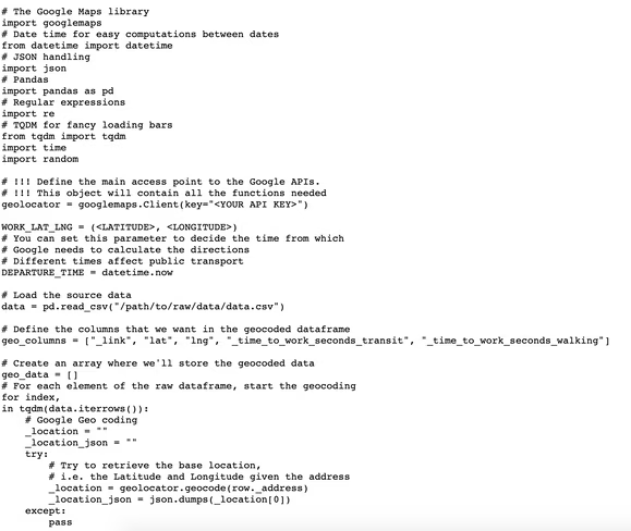
When it comes to a house my main selling point is the easy commute, and for me “easy commute” means a door-to-door time lower than or equal to 50 minutes. To calculate that, I decided to use the Google Cloud Platform:
- With the Geocoding API, I retrieved the latitude and longitude coordinates using the property address.
- With the Directions API, I calculated the Walking and Public Transport door-to-door distance between the house position and the work location. (Note: biking time is approximately 1/3 of the walking time)
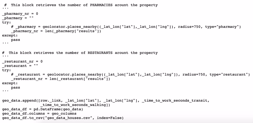
- With the Places API, I retrieved the amenities around each property (in particular we were interested in Pharmacies, Supermarkets, and Restaurants). Note: Places APIs are very expensive; with a DB of 4,000 houses, you’d need to do 12,000 requests to get three types of amenity. For this reason I removed these data from my final dashboard.
Besides geographical information, another interesting question I had was: how long has the property been on the market? If owners have been trying to sell the property for too long, it’s not a positive signal: there might be something wrong with the area or with the house itself, or the asking price could be too high.
On the other side, if a property has just been placed on sale, you need to take into account that the owners won’t go sale agreed on the first offer they get. Unfortunately, this information is quite easy to conceal or “craft.” With some basic Machine Learning, I estimated this quantity by simply using the views of the listing with some other features.
Finally, I enhanced the dataset with some utility fields to make the filtering easier (e.g. adding a column with the price range).
Google Data Studio
Once I was satisfied with my enhanced dataset, I wanted to create a powerful dashboard. The data visualization tool I choose for the task is Google Data Studio. This software has some cons (e.g. it has very very limited capabilities), but some pros are that it’s free, it’s web-based and it can read data coming from Google Sheets. What follows is a diagram the summarizes the entire workflow.
Some implementation details (before the fun stuff)
To be honest, the implementation has been quite easy, and there is really nothing new or special: just a bunch of scripts to collect the data and some basic Pandas transformations. The only parts that might be worth highlighting, are the interaction with the Google APIs and the estimation of the time the property spent on the market.
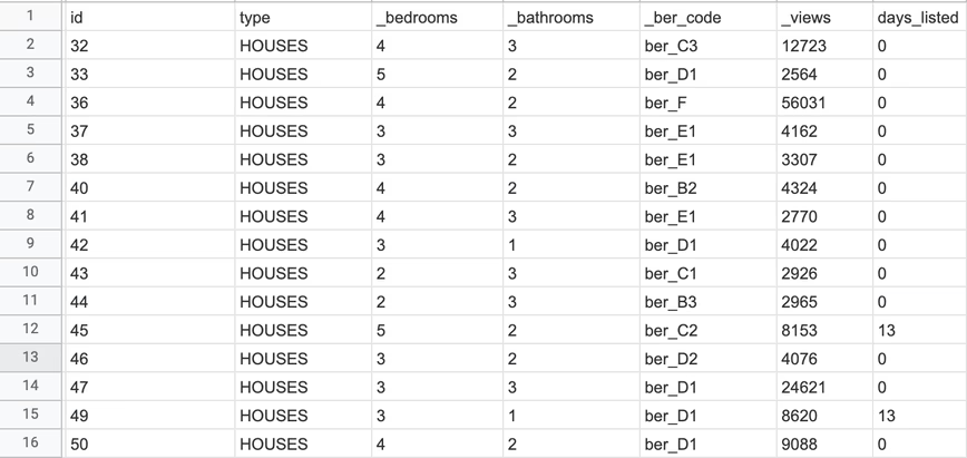
Data below are not coming from scraping, and have been generated using this script.
Let’s have a look at the raw data:
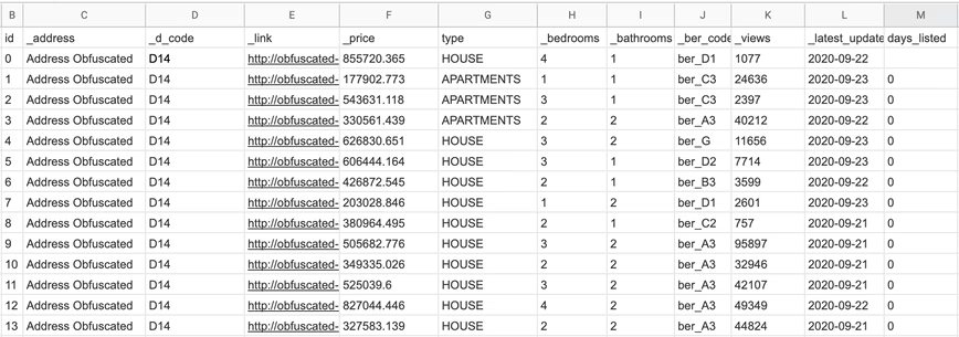
As I anticipated, the file contains the following columns:
id: An identifier for the listing_address: The address of the property_d_code: The Dublin Area Code. Each Dublin area is identified by a code in the formatD<number>. When the<number>is even, the address is located on the south of the Liffey (the river that cuts the city), while if the number is odd, the address is located on the north side of the river._link: The link to the original page where the listing has been retrieved._price: The property asking price in Euro.type: The property type (HOUSES,APARTMENTS,NEW HOUSES)._bedrooms: Number of bedrooms._bathrooms: Number of bathrooms._ber_code: A code that identifies the energy rating, the closer to the letter A, the better the energy rating._views: The views obtained by the listing (if available)._latest_update: When the listing has been updated or created (if available).days_listed: This is a calculated field and it’s the difference between the date I collected the data and the_last_updatecolumn.
Address geocoding
The idea is to put this stuff on a map and enable the power of geolocalized data. To do so, let’s see how to get latitude and longitude using Google API.
If you want to try this, you’ll need a Google Cloud Platform account and you may want to follow the guide to get an API key and to enable the appropriate API. As I wrote earlier, for this project I used the Geocoding APIs, the Directions API, and the Places API (so you will need to enable these specific API when you create the API key). Below the snippet to interact with the Cloud platform.

Estimating the time-on-market
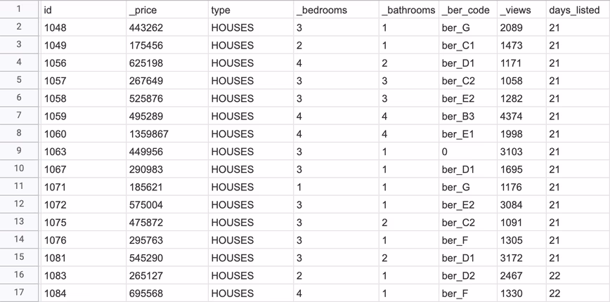
Let’s focus on the data below:
As you can see in this sample, the number of views associated with the properties are not reflected in the number of days the listing has been live: for example the house with id=47 has ~25k views, but apparently has been listed the exact date I downloaded the data.
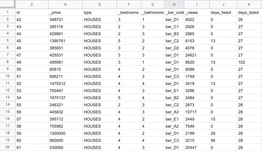
This issue is not present for all the properties, though; in the sample below, the number of views is more consistent with the days listed:
How can we exploit the knowledge above? Easy: we can use the second dataset as the training set for a model, that then we can apply to the first dataset!
I tried two approaches:
- Take the “consistent” dataset and calculate the average views per day, I then applied that average to the “unknown” dataset. This solution is not completely unreasonable, but it has the problem that all the houses are placed in the same bucket: it is likely that a house worth 10M Euro could have fewer views per day, as that budget is reserved for a small niche of people.
- Training a Random Forest model on the second dataset and apply it to the first.
The results need to be read very carefully, knowing that the new column will be a rough approximation of the real values: I used them as a starting point for digging a bit more on properties where something seemed odd.
The analysis
Ladies and Gentlemen: the final dashboard. If you want to play around with it just follow this link.
Note: Google Data Studio would allow embedding reports on Medium (as you can see in this other article I wrote). Unfortunately the Google Maps module does not work when embedding in an article, so I needed to fall back to screenshots.
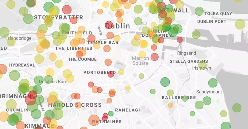
The map is the most important element of the dashboard. The bubbles color depends on the house/apartment price and the coloring only considers the visible properties (those matching the filters on the top right corner); the size indicates the distance from work: the smaller the bubble the shortest the commute.
The charts aim to analyze how the asking price changes depending on some characteristics (e.g. the building type or the number of rooms); the scatter plot, tries to put in relation the commute vs the asking price.
Finally, a table with the raw data (DL RF stands for “Days Listed Random Forest”).
Insights
Let’s dive into the actual analysis to see what insights we can extract from the dashboard.
The dataset contains about 4,000 houses and apartments: of course we cannot organize a viewing for each one of them, so our task is to identify a subset of records that has to contain one or more properties on which we would like to bid.
First, we need to refine our search criteria. As an example, suppose that we want to match these characteristics:
- Property Type: House
- Number of Bedrooms: 3
- Time to Work: less than 60 minutes
- BER rating: A, B, C, or D
- Price: from 250k to 540k Euro
Let’s apply all the filters but the one on the price, and let’s look at the map (only filtering out what’s worth more than 1M and less than 200k Euro).
In general, the asking price on the South of the Liffey is much higher than what is requested on the North, with some exceptions on the South-West area. Even above the Liffey the “external areas,” i.e. North-East and North-West, seem to be less expensive than the “pure North,” One of the reasons is that the main tram line in Dublin (the LUAS), crosses the city from North to South on a straight line (there is another LUAS that goes from West to East, but it doesn’t reach all the business districts).
Note that I am doing these considerations with a simple visual inspection; a more rigorous approach would require verifying the correlation between house price and distance from public transport routes, but we are not interested in proving that relation.
The situation becomes even more interesting if we filter according to our budget (recall that the map below shows 3 bedroom houses granting a commute shorter than 60 minutes, and the map below only adds the filter on asking price):
Let’s take a step back. We have a general idea of the areas we can afford, but we still need to deal with the most difficult part: compromises! Do we want to do a more budget-friendly search? Or we want to look at the best house we can possibly buy with our hard-earned savings? Unfortunately, this is not part of a data science analysis, but it’s an actual business (and very personal) decision.
Let’s say we choose the latter: we want to prefer the house or area quality to a lower price.
If that is the objective, I would say we need to look at the following:
- Houses that are not in a cluster — An house that is isolated on the map, may indicate that there are not many offers in the area, hence maybe owners are not willing to sell very easily.
- Houses located in an “expensive” cluster — If all the other properties around the house are expensive, it might be an indicator that the location is in high demand. I’ll just leave it here as a side note, but we could quantify this phenomenon by using the Spatial Auto-correlation (for example calculating the Moran’s I).
Even if the first option seems very appealing, we need to consider that if a property has a very low price compared to the surrounding area, there could be some kind of catch with the property itself (e.g. small rooms, very high renovation costs). For this reason, we will continue the analysis focusing on the second category, which I think it’s the most promising given our “business goal.”
Let’s analyze more in-depth what the area below has to offer:
We already reduced our options from 4,000 elements to less than 200, what we need to do now is partitioning the points a little bit better, and compare the clusters.
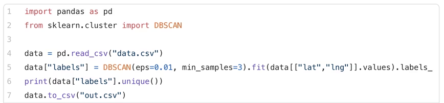
Automating the cluster search won’t add too much to this analysis, but let’s apply DBSCAN anyway; we choose DBSCAN because some groupings might be non-globular (e.g. k-means would not work properly on this database). In theory, we’d need to calculate the geographical distance between points, but we’ll use the euclidean, as it is a good approximation:
The algorithm did a pretty good job, but I would revise the clusters as follows (with some “business knowledge” on the Dublin):
We want to de-prioritize areas with lower asking prices, as we would like to maximize the house and commute quality with our budget; for this reason, we can filter out clusters 2, 3, 4, 6, and 9. Note that clusters 2, 3 and 4, are among the most budget-friendly areas of North Dublin (this is probably due to the poor public transport coverage). Cluster 11 is expensive and far away, therefore we can remove this one.
Looking at the more expensive aggregates, number 7 is one of the best in terms of commute. This is Drumcondra, a nice residential area in Dublin North; even though Drumcondra is not served well by the LUAS (the tram line), it is well connected with buses; Cluster 8, has similar costs and commute as Drumcondra. Another grouping that could be worth analyzing is number 10: this one seems to be in an area with a lower supply, meaning that it’s probably a place where people are less likely to sell, and it’s still decently connected thanks to the railway (we are assuming that all areas have similar population density).
Last but not least, Clusters 1 and 5 are very close to Phoenix Park the largest enclosed public park in any capital city in Europe.
Great! We identified about 26 properties that we think would be worth viewing before anything else. We can now start to delve into every single house and, eventually, organize the viewings with real estate agents!
Conclusion
We started knowing virtually nothing about Dublin, and we ended up having some good understanding of what zones of the city are the most requested by home buyers.
Just observe that we didn’t even look at a photograph, nor read anything about these houses! By simply looking at a well-organized dashboard we discovered a bunch of insights that we didn’t know when this journey started!
These data cannot help any further, some integrations could improve the analysis. A few ideas:
- We did not integrate the amenities dataset (the one that we could retrieve through to the Places APIs). With some more budget for Cloud services, we could easily add this information to the dashboard.
- Ireland releases a lot of interesting data in the country’s stats website: for example, it’s possible to download the number of calls to each Garda station (the Irish Police) by quarter and by type of crime; in this way, we could know what are the zones with the highest number of burglaries. Since it’s possible to retrieve the census information for each electoral area, we could also think to calculate crime rates weighting on the population! Note that for such advanced features we would need a proper Geo Information System (like QGIS), or a database that can handle geo data (e.g. PostGIS).
- Ireland has a database with previous house prices known as the Residential Property Register. From their website: [the Residential Property Register] includes Date of Sale, Price, and Address of all residential properties purchased in Ireland since the 1st January 2010. Having historical prices for houses might help understanding how demand has changed through time.
- Home insurances strongly rely on house location to get their quotes. With some effort, we could scrape insurance websites to integrate in our dashboard their “risk model.”
Searching for a new home can be an overwhelming experience in a market like Dublin, especially for someone that moved here quite recently and doesn’t know the city to its every single road.
With this tool, my wife and I ended up wasting less of our time (and Agents time): we attended 4 viewings, bid on 3 houses, won 1.
This article was originally published by Andrea Ialenti on Towards Data Science. You can read the piece here.
Get the TNW newsletter
Get the most important tech news in your inbox each week.