
When the news broke last night that Jony Ive had been promoted to a new role as Apple’s Chief Design Officer – effectively slaking off his day-to-day management responsibilities to focus solely on the company’s aesthetic future – two names were thrust into the spotlight – Alan Dye and Richard Howarth.
They’re the guys charged with splitting Ive’s previous role: Dye is now head of User Interface, while Howarth has taken charge of Industrial Design.
While both men are long-time lieutenants in Apple’s design shop, their stories aren’t nearly as well known as that of their knighted boss, Sir Jonathan Ive.
Here’s what you need to know about Alan Dye…
A human interface design genius who once worked with handbags
Talking to Stephen Fry for The Telegraph, Ive said, “Alan has a genius for human interface design. So much of the Apple Watch’s operating system came from him.”

The 💜 of EU tech
The latest rumblings from the EU tech scene, a story from our wise ol' founder Boris, and some questionable AI art. It's free, every week, in your inbox. Sign up now!
Dye, a graduate of Syracuse University, has been with Apple since 2006, when he joined the company with the unedifying job title of ‘creative director.’
His previous role is interesting when you consider Apple’s recent shift into fashion with the Watch – he was design director for US fashion brand Kate Spade.
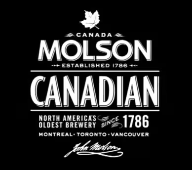
Prior to that, he spent four years as design director in advertising agency Ogilvy & Mather’s Brand Integration Group. He began his career at brand consultancy Landor Associates, where, among other products, he worked on the branding for Molson beer.
In the introduction to her 2007 interview with him for the Design Matters podcast, designer and writer, Debbie Millman describes Dye’s route into the business:
[He] dreamed of being a pro-basketball player, but his love of type and lack of a jump shot led to his becoming a designer.
Dye told Millman that his father was a significant influence:
I grew up in this wickedly creative family. My dad was a philosophy professor…and my mum was a junior high special education teacher, which means they were well equipped to raise a designer…my dad was a carpenter as well, and paid his way through college as a photographer.
I have early memories of making things in the workshop with my dad. It’s kind of what taught me about design. A lot of it had to do with process. I have these distinct memories of him telling me ‘measure twice, cut once’…
Playing to type
A Wired piece on the development of the Apple Watch from earlier this year, gives a sense of how Dye applies that attention to detail to himself and his work:
A graphic designer by training, [he] is much more Burberry than BlackBerry: With his hair swept deliberately to the left and a Japanese pen clipped to the inside of his gingham shirt just so, he’s clearly not leaving any details to chance.
…After working in Apple’s marketing division, helping design the company’s now-iconic product boxes, Dye was handed the reins of the human interface group.
To some, the move from being a graphic designer to heading up the development of software user experience might seem odd. But in Apple’s philosophy, the way consumers interact with its packaging is as much a question of UX as time spent using iOS or OS X.
In 2010, Dye told students at his alma mater, Syracuse, that the corners of every single iPhone box were hand-painted (“We wanted a box that was completely black, and this is the only way to ensure it happens.”). Discussing the screen protector, he confessed: “If there was a bubble, it would break our hearts.”
Outside of his work with Apple, he continued to do freelance illustration work for high-profile publications and organizations including The New York Times, Wired, the NBA and New York Magazine.
The ticking heart of the Apple Watch project
The move from pure graphic design to the human interface group put Dye at the heart of the effort to reimagine the look of the company’s mobile operating system with iOS 7. That project then moved directly into the design effort around the Apple Watch.
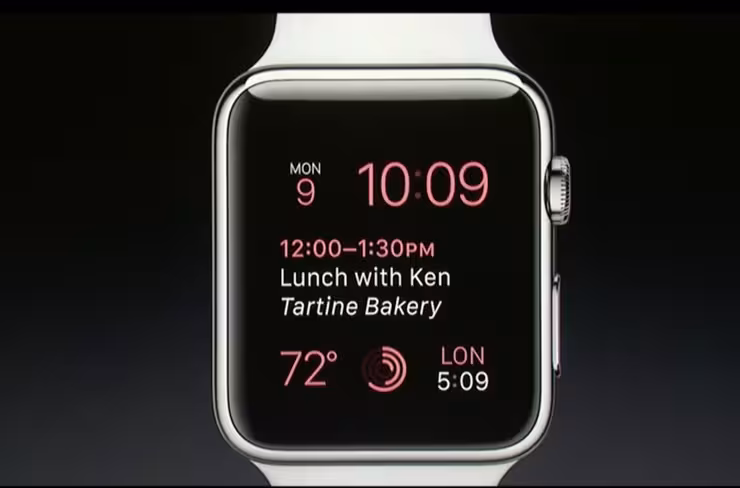
Speaking to Wired, Dye’s passion for type was once again evident, as he discussed the detail of Apple’s new San Francisco font:
The letters are more square, Dye says, “but with gentle, curved corners,” mimicking the Watch’s case. It’s wide and legible at small sizes, but when it gets larger the letters tighten up a little more. “We just find it beautiful.”
In the same article, you get quotes that suggest the designer would be easily able to demo new features onstage at an Apple event should his new role call on him to do that:
There was a sense that technology was going to move onto the body. We felt like the natural lace, the place that had historical relevance and significance, was the wrist.
He’s got that Apple tone of elevated importance nailed down, though being American, he can’t match his boss’s pronunciation of “aluminium.”
A New Yorker profile of Ive found Dye exploring his sketchbooks to reveal some of the design thinking behind the Apple Watch’s visual language:
I spoke to Dye at a table by the lawn at Infinite Loop. He had brought a sketchbook, and he opened it to a page where he’d drawn simple outlines: shuttlecock, light bulb, thundercloud, tree. He had been imagining possible elements in a vocabulary of doodled messages for the Apple Watch. “This is silly stuff,” Dye said, describing the exercise of seeding a future language.
Above the fray…
Now he’s been promoted, it’s unlikely that Dye will be as accessible to the press as he once was, but designers seeking some advice from him can always turn to this short essay he wrote for the American Institute of Graphic Arts (AIGA):Print may not be dead, but the tools we have to tell stories these days are dramatically different from those of even just a few years ago.
In other words, there are plenty of designers out in the world who know how to make a nice poster, but the select few who are going to thrive in the months and years to come are going to be the ones who can tell a complex story across a range of media in a simple, clear and elegant way.
That approach might just explain how Dye went from designing the boxes your Apple products arrive in to a central role in deciding how you’ll interact with almost every part of them.
Read next: The anatomy of the Apple Watch font dissected
Feature image credit: Adobe/AIGA/Magnet Media
Get the TNW newsletter
Get the most important tech news in your inbox each week.