Welcome to TNW Basics, a collection of tips, guides, and advice on how to easily get the most out of your gadgets, apps, and other stuff.
If you’re working with spreadsheets on a regular basis, you know that it’s important to keep your tables of data easy to explore and digest. You can do this by cleaning your data, and by styling and structuring your data appropriately.
For instance, you could freeze your top header row, in order to keep it in place when you’re scroll down your table of data. You do this by selecting the row, hitting the View menu item, and then Freeze, and picking 1 row.
Another way to use styling to keep your table compact and enjoyable for the eye, is to make sure the headers aren’t too long. This is to prevent the columns from needing to become too wide or different in width, or the header cells to become multiline. Of course, you could simply use abbreviations or other terms for your headers. But there’s a neat little function baked into Google Sheets, that might do the trick even better, and will even give your table a sassy look.

The 💜 of EU tech
The latest rumblings from the EU tech scene, a story from our wise ol' founder Boris, and some questionable AI art. It's free, every week, in your inbox. Sign up now!
Now before revealing this to you, let’s look at a table of data that hasn’t been treated by this neat little function yet.
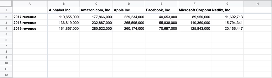
As you can see, the header in the F column is being cut off, because its text is too wide. To make sure the columns keep the same width, but the text to be fully readable, we can use the text rotation function. Simply select the first row, and then click the menu icon that shows an angled ‘A’ and an upward point arrow below it. Next, you’ll have the choice of multiple rotation options. Let’s select the second option called ‘Tilt up’. The result should be as follows.
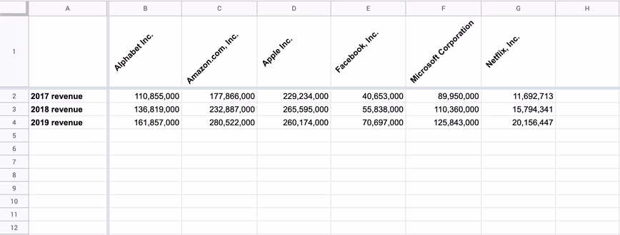
Much better already. To make it look even prettier, you could start playing with coloring, for instance giving the header row one color, and the data rows alternating colors. So, what are you waiting for? Back to work, and show off your sheet wizardry!
Get the TNW newsletter
Get the most important tech news in your inbox each week.