Craig Mod, creator of the popular app Flipboard, has shifted his design-centered approach away from news and media and towards writing and photography with his new project, simply titled Hi.
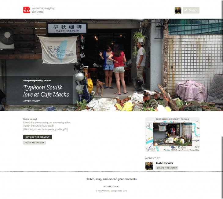
Mod calls Hi a “narrative mapping platform.” At its core, there are two tiers of content one can contribute to Hi. The first tier, called a “Sketch,” is simply photo-and-text – users can take a picture with their mobile devices, upload it to Hi, and type up to twenty words (that’s a fixed limit) of accompanying text. Create a few sketches a day for one week, and you’ll end up with a nice picture-diary.
Sketches are placed on a map, and when users hover their mouse over a specific location, they can take a look at sketches that were made nearby by other users.

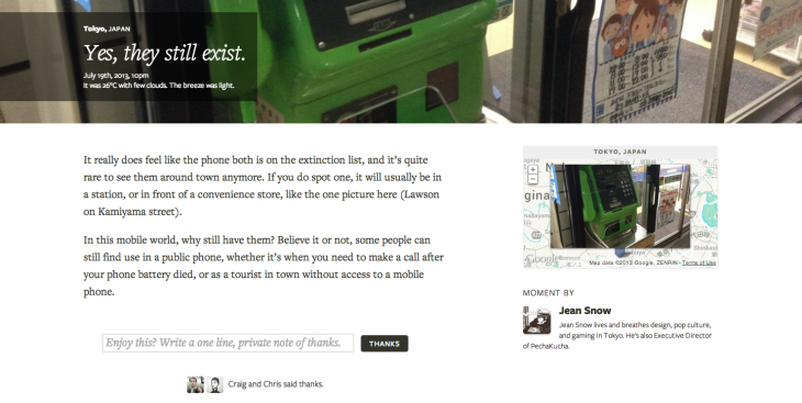
If you decide you’d like to add more to your sketch, you can “extend” your sketch into a “moment” by writing a longer bit of text that basically serves as a blog post. There’s no minimum or maximum length for a moment, but the Hi team recommends about 500 words. If you like a particular moment from someone, you can send him or her a note of thanks or request that he or she extend the moment further.

There are many directions that the Hi team could pursue as clear user habits emerge. The explicit focus on location-based mapping coupled with the photography element could lead to a surge in users that use Hi as a tool to check out what’s going on around the world – that could mean clicking through pics of the Black Keys show you missed last week, gazing at pop culture curiosities in Japan, or sifting through snapshots of the latest political protest in the Middle East.
But there’s also potential for bright personalities to stand out. Post frequently enough and you’ll soon realize that moments trump sketches. Already one can cruise through posts on the site and find a few voices with compelling moments to share, even if these moments capture everyday occurences.
With that said, Hi currently has its hand in two different spaces. The photo-and-abbreviated text element recalls the quick-paced content whirlwinds of Twitter and Instagram. But the interaction mechanism revolves around liking medium-length blog posts, which recalls social publishing platforms like Medium and Svbtle. Hi straddles this fence gracefully, but if it hopes to see mass adoption, it may have to nudge its offerings toward one side or the other.
Hi is currently only available as a Web app, but it has been optimized for mobile browsers. Standalone apps for mobile devices remain in development.
Image credit via Thinkstock
Get the TNW newsletter
Get the most important tech news in your inbox each week.


