Twitter Bootstrap is great. In fact, I did a coding course last year and I know it’s a super-easy way to create nice looking, mobile-ready websites in a flash.
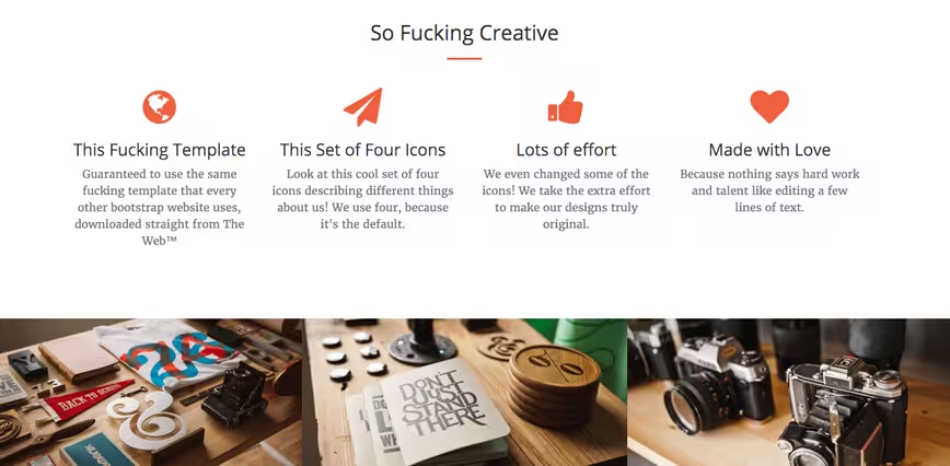
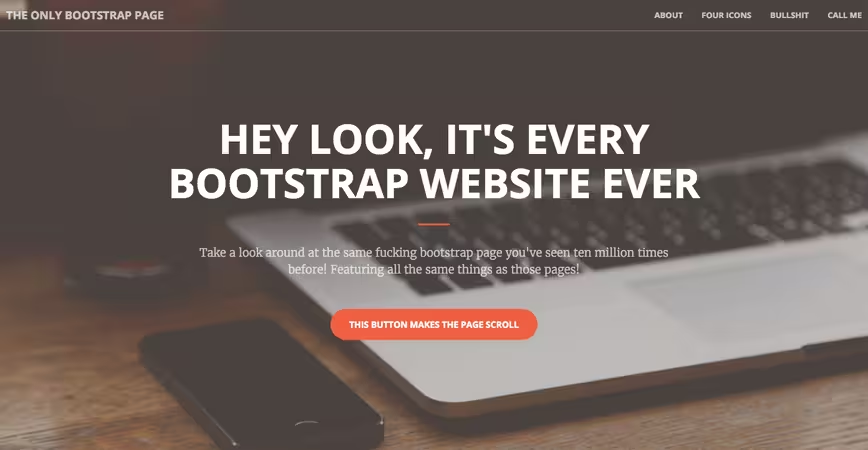
Trouble is, everyone else knows that too, and now dev Jeremy Karbowski has made a Twitter Bootstrap website about it.

Bootstrap’s had a pretty meteoric rise since its open-source launch to the public in 2011. According to Built With, it’s now powering almost 7.5 million websites, including one in 10 of the top 10,000 sites.
That’s nothing compared to the 60 million or so using WordPress, but it’s a lot, and although it’s easy to build on, clearly many companies haven’t taken the time, skills or effort to do that when it’s all right there for you.
Indeed, Lyft, Vogue and Newsweek have used Bootstrap too, but they’ve done a good job of putting their stamp on it.
Twitter probably didn’t intend for its “vanilla CSS” to become the front-end of the Web, but it’s happened nonetheless. It even gives extra themes, plus hints and tips on how you can easily customize your site.
Jeremy is likely looking to help unimaginative companies out of this creativity funk, if you know what I mean, and this is a pretty creative way to go about grabbing their attention.
➤ The Only Bootstrap Page [Jeremy Karbowski]
Get the TNW newsletter
Get the most important tech news in your inbox each week.


