Apps can change drastically in what seems like a very short span of time. Just ten years ago, the word “apps” would probably not have conjured such an instant reaction in any of our brains.
Now, though, apps are a major part of how we communicate, entertain ourselves, and interact with the world.
Many apps have come and gone over the years, and some that were incredibly popular at time of launch aren’t even available now. But some have stuck around for several years. They’ve evolved so much since then that seeing the previous iterations of some of them can look very alien. Did our favorite apps really look so primitive at the time?
Here are a few favorites, how they used to look, and how they look today.
Back in the day, Facebook was just a simple, tile-based interface. Compared with today’s app and its pretensions to being Snapchat, the original app couldn’t do very many things, but it was utilitarian.
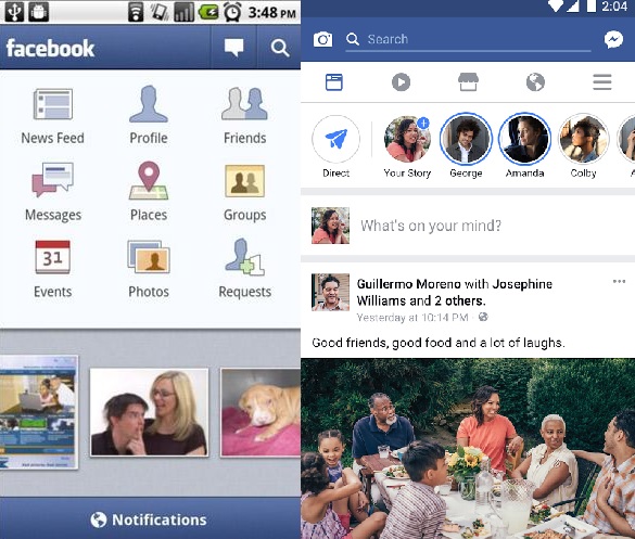
Originally, Facebook ran from a special mobile URL on iPhones before releasing an official app for iOS in 2008. An Android app followed in 2009.
Everyone’s favorite short-form social media app didn’t really have a mobile app on either of the two major mobile OSes until 2010.
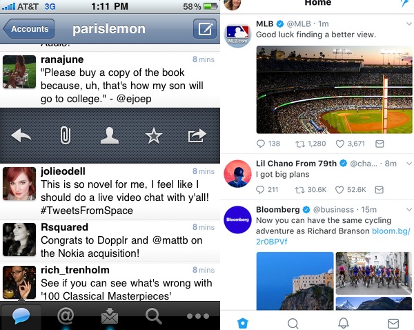
The current Twitter app was originally a third-party client called Tweetie. Twitter acquired the app in 2010 and rebranded it. The version of it you see on the left was part of Tweetie’s design, but several elements have carried over into the modern app we all know and use today on iPhones. Twitter for Android was released the same year.
Evernote
One of the top apps for both iPhone and Android when each were launched, Evernote has changed significantly since its release.
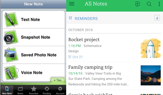
The notetaking app has been around for almost ten years now, and it has evolved to be cleaner and brighter. Still, its basic functions — creating notes from text, pictures, and audio — are intact, and the modern iteration is much more navigable.
Shazam
The go-to app for music identification had already been around (albeit not in the same form) for six years before it hit the App Store. Since then, it’s become a mainstay on music lovers’ phones.
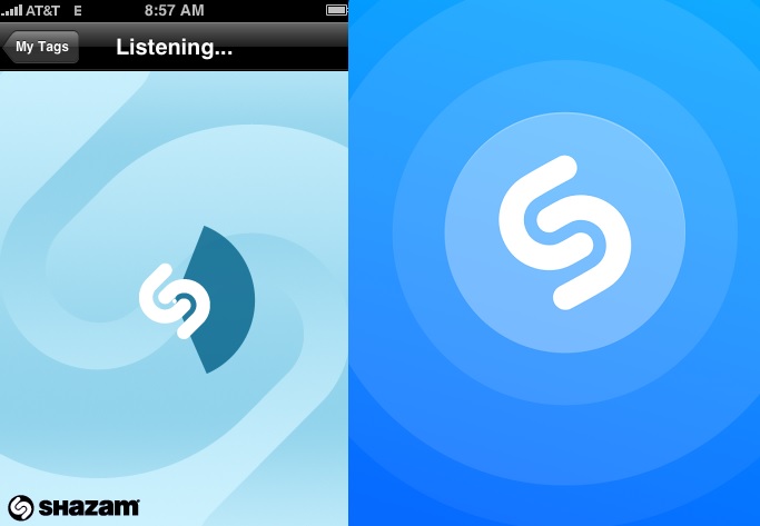
The app has changed surprisingly little in terms of recognizable aesthetics. The major difference between the two is how the circle in the center now pulses instead of swirls while you’re trying to identify a song. The app would always link to a digital store, allowing you to easily purchase the music. It has since expanded its options to include Spotify and Pandora connections.
Netflix
Out of all the apps I use on a daily basis, I think Netflix has changed the most dramatically in terms of aesthetics.
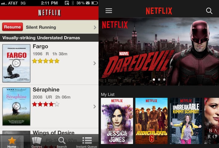
From a simple, red-and-bisque-colored interface that emphasized user ratings to a black interface that emphasizes the content’s art and feel. Needless to say, Netflix has also moved into its own programming, which is usually put forth much more than older movies.
Pandora
The app which transformed radio in the age of the smartphone was named Time’s iPhone app of the year when it officially debuted in 2008 — though the app was partially developed on jailbroken iPhones, before the release of Apple’s SDK.
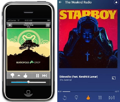
The app has become more personalized, with the color scheme reflecting the album playing. The service has also launched a Premium version, with unlimited access to albums and songs.
Google Earth
The app that lets you explore the globe was fairly sophisticated even when it debuted on iOS in 2008. It allowed you to survey 3D portions of terrain, and read information from Wikipedia on each location you tapped.
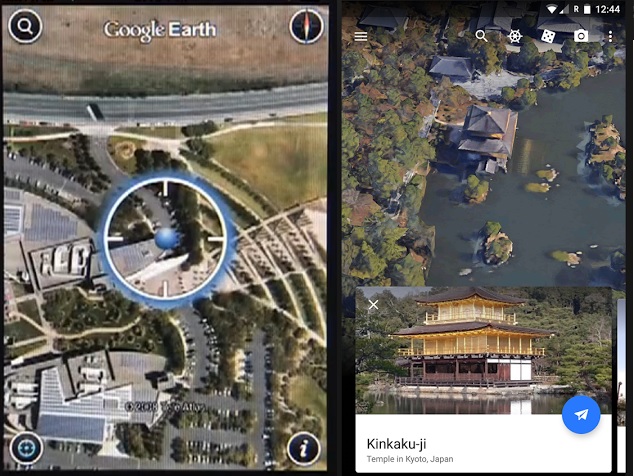
Now the app includes more detailed 3D imagery, along with info cards from Google itself. As of a few months ago, it also includes guided tours of the planet.
What were your favorite apps from previous mobile generations? How have they changed? Feel free to get nostalgic in the comments!
Get the TNW newsletter
Get the most important tech news in your inbox each week.
