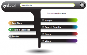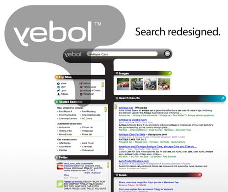
 Like Wowd in the last post, search engine Yebol is also unveiling a new design. (See image on right.)
“Branch Out, Harvest the Knowledge” is the mantra from Yebol, and since its launch Yebol has been designing cognitive ways to visualize search results from news, images, videos, top sites, categories, related searches and even Twitter. Each category can be expanded or collapsed.
“Typical search engines are often overwhelming, visually fragmented and don’t show the potential of a search in a cognitive way,” said Stephen Cascio, Yebol’s interface and brand designer. Yebol’s ambition is to also become iPad ready.
Yebol wants to provide a productive experience for both main types of search – general investigation (or discovery / browsing) of a topic and specific targeted search. That way, users who want to research and explore a topic receive information from several dimensions and users who want a specific type of targeted results can quickly focus on their category and get right to the target. Give the new design a try and then leave a comment!
Get the TNW newsletter
Get the most important tech news in your inbox each week.


