The new Surface Book may have stolen the show at Microsoft’s event today, but kickstand lovers still have a lot to look forward to with the new Pro 4. I only had some brief hands-on time, yet it’s pretty clear so far that it takes everything I already liked about my Surface Pro 3 and makes it better.
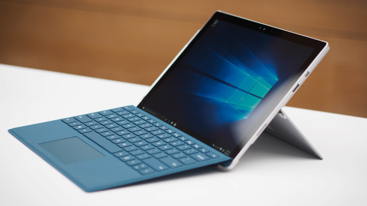
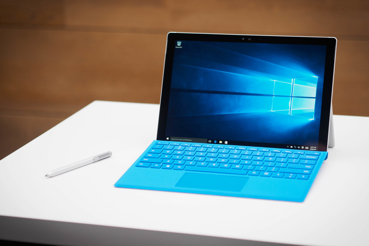
Turns out that rumor about an edgeless display was wrong, but that doesn’t mean the Pro 4 isn’t a beautiful device. It’s largely the same as the Surface Pro 3 at first glance, but Microsoft managed to make the bezels smaller (removing the capacitive Windows button along the way), increase the screen size up to 12.3 inches (from 12), and make it a little thinner at 8.4mm (instead of 9.1mm).

Speaking of the display, it’s gorgeous. Microsoft is using a new LCD array it calls ‘Pixel Sense.’ The panel was able to get visibly brighter than the one on my Surface Pro 3, while the blacks are darker thanks to a 1300:1 contrast ratio.
It’s sharper too, upping the pixel density to 276 ppi (2736×1824) from the old 216 ppi; it makes the SP3’s already-sharp screen look fuzzy by comparison. And to make photographers happy, Microsoft claims the panel can display 100 percent of the sRGB color gamut.
Above the display, you’ll find the new Windows Hello compatible camera, which allows you to log in via a face scan. Though I couldn’t try it out myself, it worked very quickly in the demo, and I can see myself using the feature instead of a traditional password.
The most tangible improvement in your day-to-day usage will be the new Type Cover, which truly feels like a top notch laptop keyboard and trackpad this time around. The 1.4mm key travel is the same as on the MacBook Pro, and the combination of new chiclet-style keys and a larger overall footprint adds some separation between keys for a better typing experience.
Despite making the keyboard larger, Microsoft also managed to improve the trackpad, which now covers a 40 percent larger area using a glass surface. It’s not quite as nice as the Force Touch trackpad on the 2015 MacBook (you can’t click on the top of the trackpad), but it was one of the most responsive trackpads I’ve used on a Windows devices, and right up there with what you’d expect from Apple’s best until this year.
Also, if you can’t shell out for a new Type Cover, the SP3’s still works, even if it’s not as nice. Likewise, Surface Pro 3 users can upgrade to the new keyboard for the extra $130.
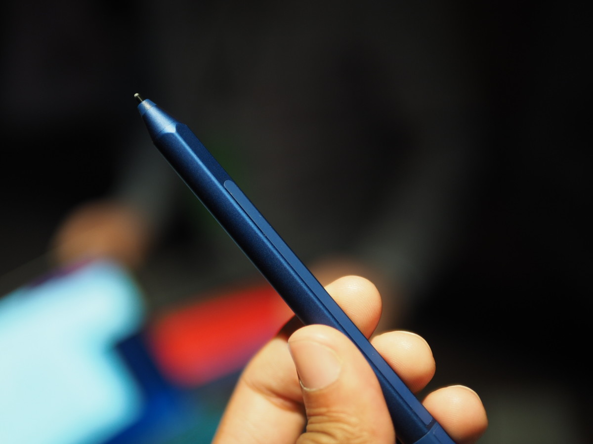
The new Surface Pen should also make artists and heavy note-takers happy. The Pen uses a new nib, which I found to provide much better resistance for drawing than the old slippery-ish one on the SP3.

Better yet, you can now buy nibs with different textures; it may not sound like much, but designers and artists will surely appreciate the feature. Using it side by side with my SP3’s old pen, it felt closer to writing on paper than any tablet stylus I’ve used yet – something surely aided by the new 1,024 levels of resistance (vs 256 on the old pen) and lower latency.
Oh, and you can finally just attach it magnetically to the the Surface and not have to worry about the annoying elastic Pen look on the older model, which has been rendered all by 1.5 years of usage on my SP3.

Of course, Microsoft has also bumped up the internal specs. The 4th generation Haswell processors have been replaced by 6th-gen Skylake m3, i5, or i7 processors, which the company says should provide a 30 percent improvement over the respective SP3 models.
In any case, the PCIe SSD drive should provide a more palpable performance boost over the SP3’s SATA one, especially if you use the tablet for a lot of image or video editing.
You’ll have to shell out for the Surface Book if you want dedicated graphics, but Intel’s made some substantial improvements on the graphics front since the Surface Pro 3, especially if you opt for the i7 and its Iris GPU. Microsoft says it’s improved the cooling system too, so hopefully the new tablet will avoid some of the throttling the SP3 sometimes suffered from when being pushed hard.
In fact, the only thing that doesn’t seem to have improved much is claimed battery life. Microsoft is still saying 9 hours; we found only occasionally true on the Surface Pro 3, so we’ll have to see how that holds up in the real world.
Still, it looks like Microsoft has another winner in its hands. The Surface Book might start blurring the lines between Microsoft’s product categories, but if you mainly held out on the Surface Pro 3 because of its divisive keyboard and trackpad, its successor does a great job of eliminating those cons.
That said, price will likely be a deciding factor for most folks, so we’ll let you be the judge of its value. The SP4 start at $899 for the m3 processor with 4GB of RAM and goes up to $2,199 for for the i7 with 16GB. We suspect the $1,299 i5 model will hit the sweet spot for most folks.
The Surface Pro 4 goes on sale October 26, and can be pre-ordered from the Microsoft Store now.
Get the TNW newsletter
Get the most important tech news in your inbox each week.


