Nokia finally launching an Android-based handset might not be the biggest surprise given the number of leaks leading up to Mobile World Congress this year, but there’s a world of difference between leaks and rumors and using the device in the flesh, so we went hands on to see what the device had to offer at first glance.
With just a 1GHz processor on board, I hadn’t expected it to perform particularly snappily – and indeed, it’s not quite as fast as a high-end smartphone when navigating around, but then, priced at less than €90, it doesn’t attract the same kind of cash commitment either.
That’s not to say it lags horribly in normal use either. We’ll need to take a more detailed look at the device to see how well it handles multitasking when you have lots of apps open at once.
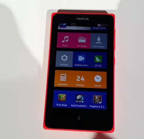
Like the Asha range, it features the Fastlane UI that provides a chronological list of everything you’ve done with the phone so you can quickly jump to anything you need to access again. I actually really like this feature, so it’s good to see it making its way up the hardware chain a little and outside of Asha-branded devices.
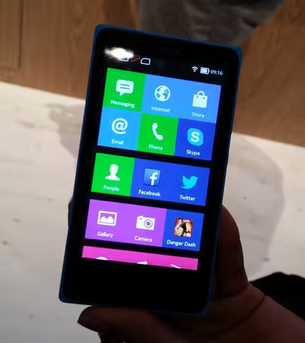
Rather than adopt the standard Android home screen, the page is split into Live Tile-esque icons, although they’re not actually live tiles and won’t update automatically in the same way.
Similarly, rather than have a sea of apps and numerous possible home screens, scrolling left or right from the main screen takes you to the Fastlane UI. Carry on scrolling and you’re returned back to the main home screen. No matter which direction you go in, the home screen has infinite horizontal scroll between them.
It makes sense that Nokia would want to differentiate the experience of using a Nokia X from any other Android smartphone through a custom UI, and as the devices are aimed primarily at growth markets, there’s a good chance that this will be the first fully-fledged smartphone that some users will touch. So it equally makes sense to keep the main menus and home screens straightforward and uncluttered.
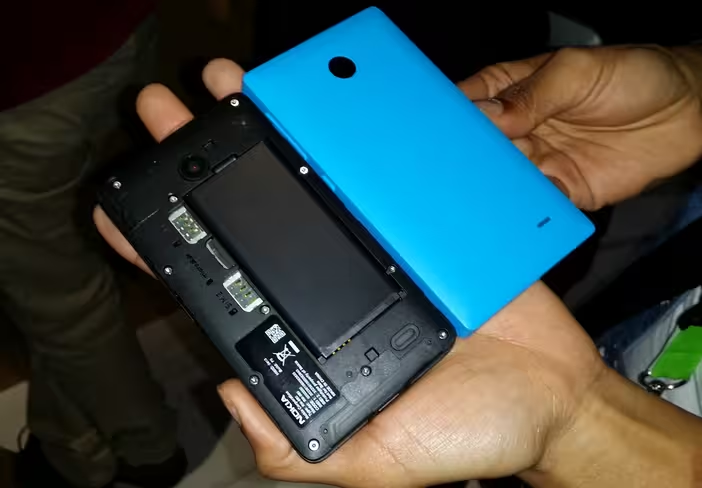
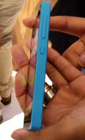
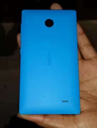
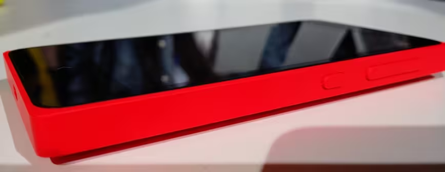
Similarly, it’s no prom queen in terms of size or weight but it’s also not excessive by any means, and whether you like the slightly blocky industrial design of the device is down to you – either way, it’s very much in keeping with the rest of Nokia’s line-up. It also doesn’t feel quite as cheap as I feared it might with its all plastic chassis and relatively low price tag.
Unfortunately, with patchy WiFi on the show floor at MWC 2014 and no opportunity to see what photographs look like on a larger screen, it’s hard to say how well the camera perfoms – we’ll have to wait to get a full review model for more on this, but don’t go expecting Lumia-like performance.
The XL offers much of the same experience – with little to no obvious differences when actually using it from the Nokia X – but with a larger 5-inch display.
Overall, the Nokia X family is an interesting development for the Finnish company – and at first look seems like it could satisfy some buyers’ desire for a Nokia branded Android phone. However, if what you really wanted was a Lumia camera phone running the Android OS, then you’re left wanting. We’ll have a full review up of the Nokia X devices in the near future.
Visit our MWC 2014 page for more coverage
Get the TNW newsletter
Get the most important tech news in your inbox each week.
