You might think it sounds a bit odd, but when you get to play with all the latest and greatest phones (we know and appreciate that we’re spoilt, yes), you come to expect certain things. You can pretty much guarantee they’ll all have spiffy screens, zippy processors, more storage than you can shake a stick at, and a camera that puts some point-and-shoots to shame. And many of them do.
But what is sometimes lacking is that sense of excitement – we crave something different that isn’t thrown in for gimmicky reasons. Some of Samsung’s handsfree software tweaks might sound good on paper, but in reality they can be unreliable and downright frustrating.
Adding on a feature for the sake of differentiating from the competition isn’t enough – consumers see through this quickly when the so-called features are a hindrance.
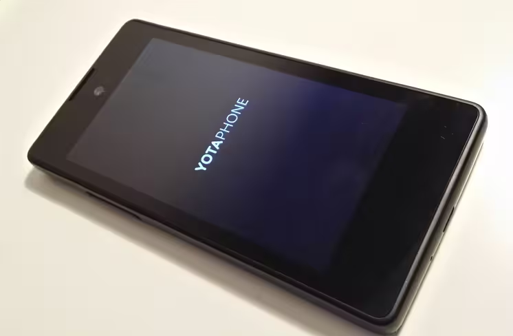
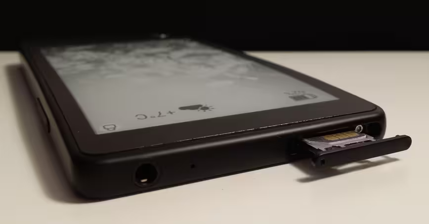
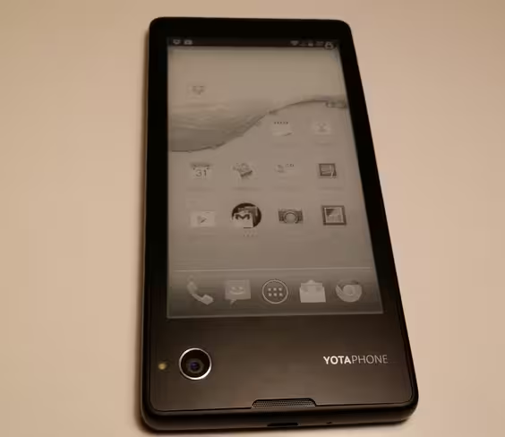
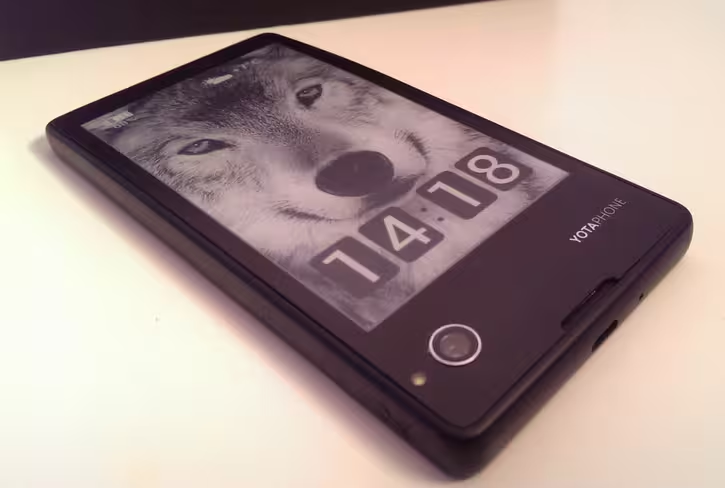
As most manufacturers concentrate on software differentiation, the hardware of smartphones has normalized around the single-faced black slab that we’re all now very familiar with – but not Yota Devices. Although, what you can see below does look a lot like that.
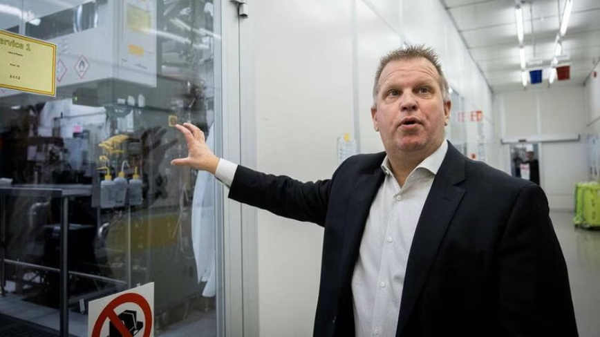
I first caught up with the company at Mobile World Congress in February and had a chat with the COO, Lau Geckler. I also got the chance to be guided around the concept handset that had a normal LCD touchscreen on the front and an e-paper display on the rear.
At that point, I thought the idea was novel – it allows you to make use of the back of your device in a way that requires no attention from you and barely has any impact on the battery. Well, that’s the theory.
Now, the product has made it to final release stage and I’ve had a little time to play with it, but it should still be noted that what I have is a second build of the prototype device, rather than the boxed retail version.
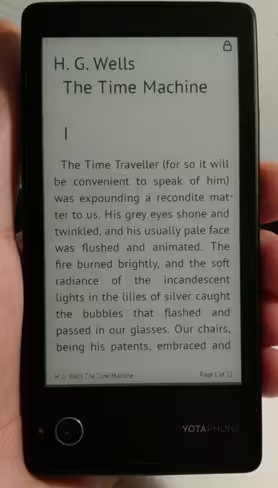
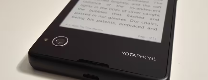
Between then and now, much has changed, although the overall approach remains the same. Two screens for twice the fun, or at least twice the convenience, and more than twice the battery life. Naturally, it also makes it perfect for reading e-books, but it doesn’t stop there.
Creating a dual display device turned out to be trickier than Yota had intended and along the way the company has had to overcome a number of unanticipated challenges. YotaPhone’s CEO, Vlad Martynov, explains:
“EPD is very sensitive. In order to get a good quality image we had to make sure the temperature difference between the upper part and lower part was about five degrees, and that’s a challenge because you have the battery, processor and other electronic components generating heat. There’s a lot of heat coming from this [Qualcomm chipset] … In conventional smartphones, they use a back panel to [take the heat out] but we have an electronic paper display there!
Martynov also said that as there were two displays, there were fewer places to put the nine antennas. They eventually got around this problem by using double-shot injection moulding in the chassis. A bit like making a primary chassis with the antennas embedded, and then making another atop of that.
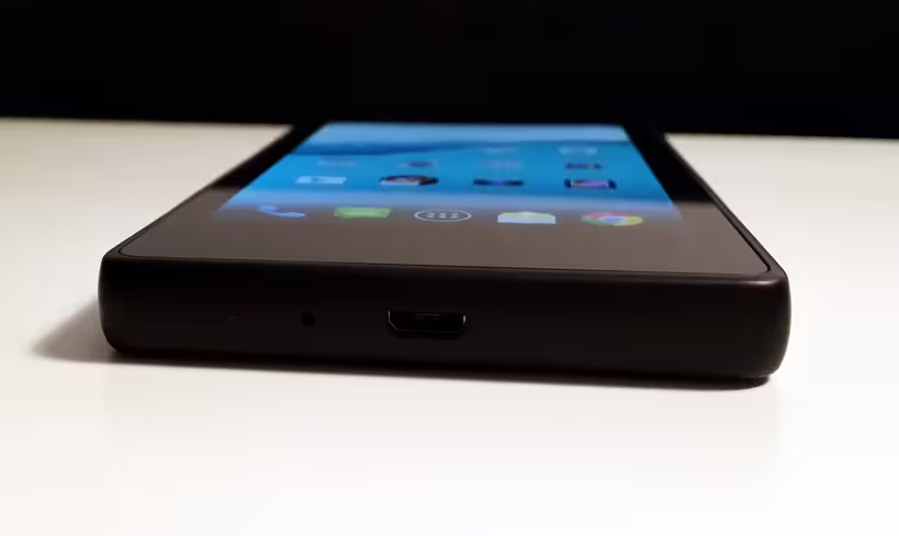
Along the way, the magnetic charging system that had previously been touted was replaced with a standard micro USB, which I’m thankful about. Proprietary chargers are a pain as far as I’m concerned, even fancy ones.
Design and hardware
There’s more to life than just specs, but making sure there’s enough oomph under the bonnet is still a necessary part of any smartphone worth its salt. Thankfully, on the surface of things, there should be no problem with the YotaPhone in that department.
Spec-wise, it offers a dual core 1.7 GHz Krait processor (it was originally clocked at 1.5GHz in the concept device), 2GB RAM, a 4.3-inch 720 x 1280 pixels LCD multi-touch display on the front, and that 4.3-inch 360 x 640 pixels EPD (Electronic Paper Display) on the rear. From my brief testing, it doesn’t appear to be underpowered or laggy in normal operation.
With heritage as a modem and router company, it’s little surprise that the YotaPhone also comes with 4G support on the LTE 800 MHz/1800MHz/2.6GHz bands. Storage wise, there’s 32GB of space on board but no provision for microSD cards.
As well as having dual screens and a dual core processor, the handset also comes with front and rear-facing cameras. A 13-megapixel affair on the rear as the main camera, and a 1-megapixel front-facing one for stills and video calling.
So far, so normal – but the regular-looking spec list doesn’t tell the whole story.
The device is actually pretty different compared to most Android devices on the market today. It bears more than a passing resemblance to the Motorola Razr in terms of its overall shape in that it’s thicker at one end than the other – although for this device, it’s slightly thinner at the top, rather than the bottom as it was with the Motorola.
There are other oddities here too – like the fact that the SIM card slot and power button are combined into one, and that the camera on the rear of the phone is in the lower-left hand corner.
As I mentioned already, as a result of the device’s unique design challenges, it’s not the most svelte around. Officially, the YotaPhone measures up at 133.6 x 67 x 9.99mm and weighs 146 grams. Yes, it’s a little thicker than range-toppers like the HTC One or iPhone 5s – but it’s actually thinner than a Lumia 1020, and lighter. And it has a whole other display on the back.
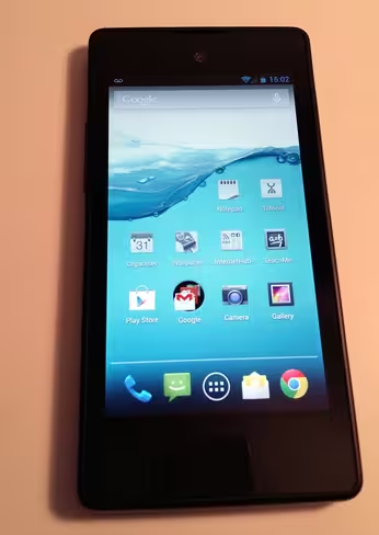
You might have noticed by this point that there’s a complete absence of buttons on the front of this particular Android device, although you will find a volume rocker on the side.
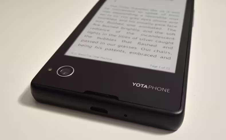
Instead of buttons, there are touch-sensitive strips below the front and rear displays (between the camera and the display in the image above), which allow you to do things like navigate the device, jump back to the home screen and control the content on the rear EPD. More on these later.
In use
Out of the box, the user is taken on a tour of that rear screen and how to use the device in general. A word of advice: if you plan on getting one of these – don’t skip this tour first time around. As a seasoned smartphone user I’d like to think I knew how to do the basics, but in this case, the device is pretty unusual in its operation so it’s worth being shown what’s what first time out.
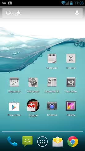
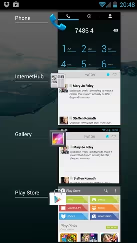
If you’re an Android user, you’ll be familiar with a lot of the regular operation – it essentially runs a tweaked version of Android 4.2.2 for the content that you see on the front display.
As well as the normal options, though, there’s also some features designed specifically for that rear EPD. For example, the apps shown in the image above (Notepaper, Tutorial, Organiser, Wallpaper, InternetHub and TeachMe) are all interactive. The latter one is designed to teach you some key words and phrases in foreign languages, so you’ve always got a quick translation at the ready.
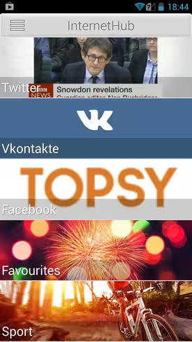
The InternetHub (shown below) is the main source of useful information and live updates when using the rear display. You simply connect up the accounts and services you wish to see, and you can then control it when sent to the back of the device.
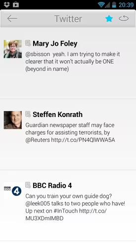
Once you’ve selected a source, Twitter in the example below, you simply hit the button in the top-right hand corner of the screen to send it to the EPD, where tweets can be viewed individually, or in a short stream. You can see I’ve also ‘starred’ Twitter to add it to my list of favorites. Doing this means you can view updates from different places all in one list, by selecting the ‘Favourites’ category (shown above).
While the OS is familiar Android, a lack of buttons means different controls for other usually simple functions, like taking a screenshot. In this case, you swipe two fingers down from the top of the device on the front screen and it will send a snapshot of whatever was showing to the back screen. It’ll also save it in a special two-finger swipe folder, just like screenshots get saved on a normal Android device.
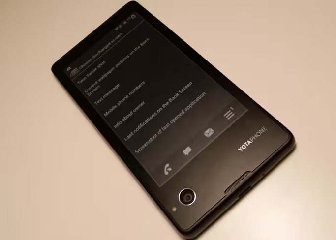
If you do take a lot of screenshots, you’ll likely find yourself pulling the notification bar down accidentally a few times (I did anyway). Below is the menu screen as it looked when sent to the rear display – I’d recommend using clear black and white images for the rear as color ones do not look good.
The rear EPD display has certain apps that can be used to deliver updateable, interactive information, and anything else can be sent to the back screen as described above – as a screenshot.
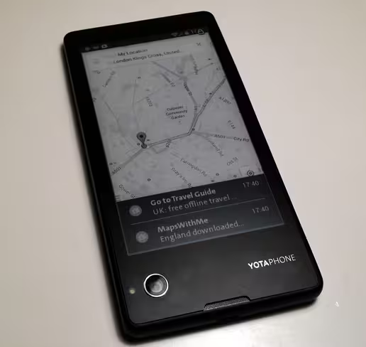
Why would you want to do that? Well, when the battery dies, you have options to still display content on the rear screen – so, for example, in the image below, I’d still know the bus route to Kings X, even though my phone was actually switched off. In the image below (the phone was actually on) you can also see that you get notifications over the top of whatever you’re looking at.
Likewise, other information, notifications or pictures can be shown too. Shown below on the rear display is a screenshot of the options that are available.
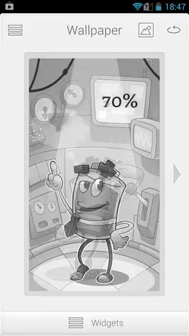
Whenever you’re not using the back display, it can be used to display a screensaver of your choice. This could be something taken with the camera on the device, an image from a Facebook album or one of the preloaded options. There’s also a few interactive ones, shown below is one which changes depending on the battery level – as it falls, the character becomes less happy.
Once you’ve chosen the type of screensaver you’d like, you can also choose which apps you want to overlay, like the clock, battery and weather info, as shown in the image below.
Controls
Using the swipe strips below the displays isn’t natural at first – so you might well feel a bit lost for a while. It feels a little like using the Galaxy Gear for the first time.
On the front, swiping from left to right, always takes you back to the home screen and swiping from right to left just steps you back one action, whatever that was. Double tapping the middle of the strip on the front brings up a list of open apps.
That’s a little odd to get used to, but the operation of the rear display using the rear touch panel is even trickier to get your head around.
Here, swiping left or right locks or unlocks the touch zone. Once unlocked, double-tapping in the middle switches between your chosen screensaver and any of the available apps, like Teach Me or InternetHub. Once you’re using an app designed for the EPD, swiping left or right, and single tapping in the middle carries out other operations, like scrolling through notifications, or pages of a book. It’ll take a little bit of getting used to.
First impressions
I really like the idea of the YotaPhone, and I’ve said it before, but anything that helps eke out the battery life of my phone is welcomed. Without enough time to have tested its claimed battery life of around 65 hours reading time (if used as an e-reader), it’s hard to say whether the convenience and battery savings achieved by not using the main screen outweighs any demands it might make.
In 12 hours of pretty much on-off use (a few calls, emails, and automatic refresh of information every three minutes on the EPD, the battery has dropped by around 80 percent.
Likewise, I haven’t really had a chance to properly test the camera – so can’t comment on the quality there.
Much as I like it, the YotaPhone that I have in my hands isn’t perfect. I can overlook the slightly chunky build but it’s harder to ignore the occasionally unresponsive touch strips, I’ll need to see how they fare over time. I was warned in advance that this could be the case as I don’t have the final retail hardware, so it’s not exactly unexpected. The company said bugs like this had been ironed out in the retail devices that go on sale from today. Testing out a newer version is the only way to know for sure.
Ultimately, in an Android market swimming with cookie-cutter handsets, the YotaPhone is a breath of fresh air – whether or not I’ll find the rear display a genuinely useful innovation or simply another novelty differentiator remains to be seen, but either way – I’m looking forward to finding out.
The YotaPhone is on sale from today in Russia, Germany, France, Austria and Spain from the YotaPhone website – or in-store in retailers in Russia and Germany. Priced at €499 (~$680), the device will then make its way to the UK, some other European countries (Czech Republic, Greece, Cyprus) and the UAE in January next year. It’ll then be made available in Denmark, Finland, Norway, Sweden, Switzerland, Saudi Arabia and Egypt some time later in the first quarter of next year.
Get the TNW newsletter
Get the most important tech news in your inbox each week.

