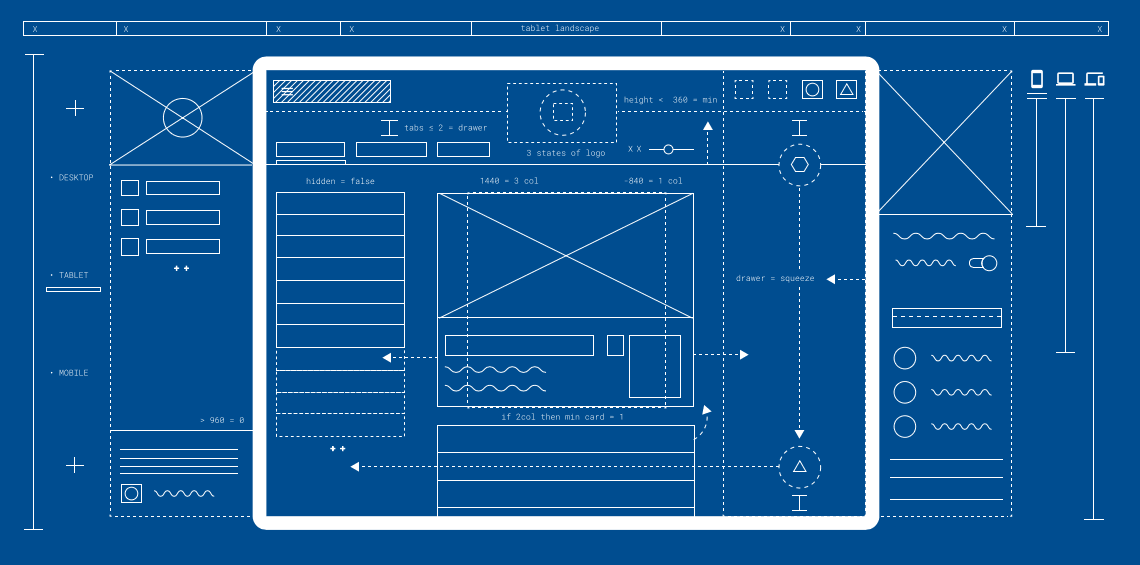
Crafting an experience that’s intuitive and powerful is a tricky proposition. To help Web designers achieve a balance, Google is introducing Resizer.
The tool allows designers the ability to test Material Design across platforms, and see where the breakpoints are. Rather than hope for the best when designing a Webpage, Resizer shows you — in real time — if the site is recursive for mobile.

Meant for Material Design, the tool works with any URL. As you can see in the image above, I plugged the TNW homepage URL into Resizer (which was not created using Material Design principles).
Once you input a URL, you can toggle between desktop or mobile experiences. Resizer is totally interactive, and closely mimics actual performance; I tested it side-by-side for desktop and mobile, and Resizer’s refresh and navigation transitions were pretty dead-on.

Resizer also has a few default URLs in the input bar where you can get a good idea of Google’s best practices.
Still, Resizer is meant to test breakpoints, responsive grids and surface behaviors and UI patterns for Material Design on the Web. While it won’t help you design a Webpage, it’s a really handy tool for performance testing.
➤ Introducing Resizer [Google Design]
Get the TNW newsletter
Get the most important tech news in your inbox each week.


