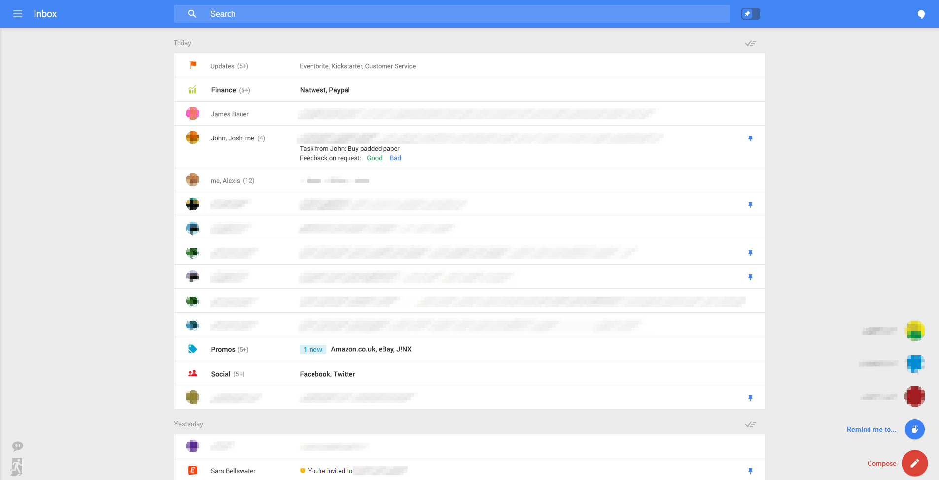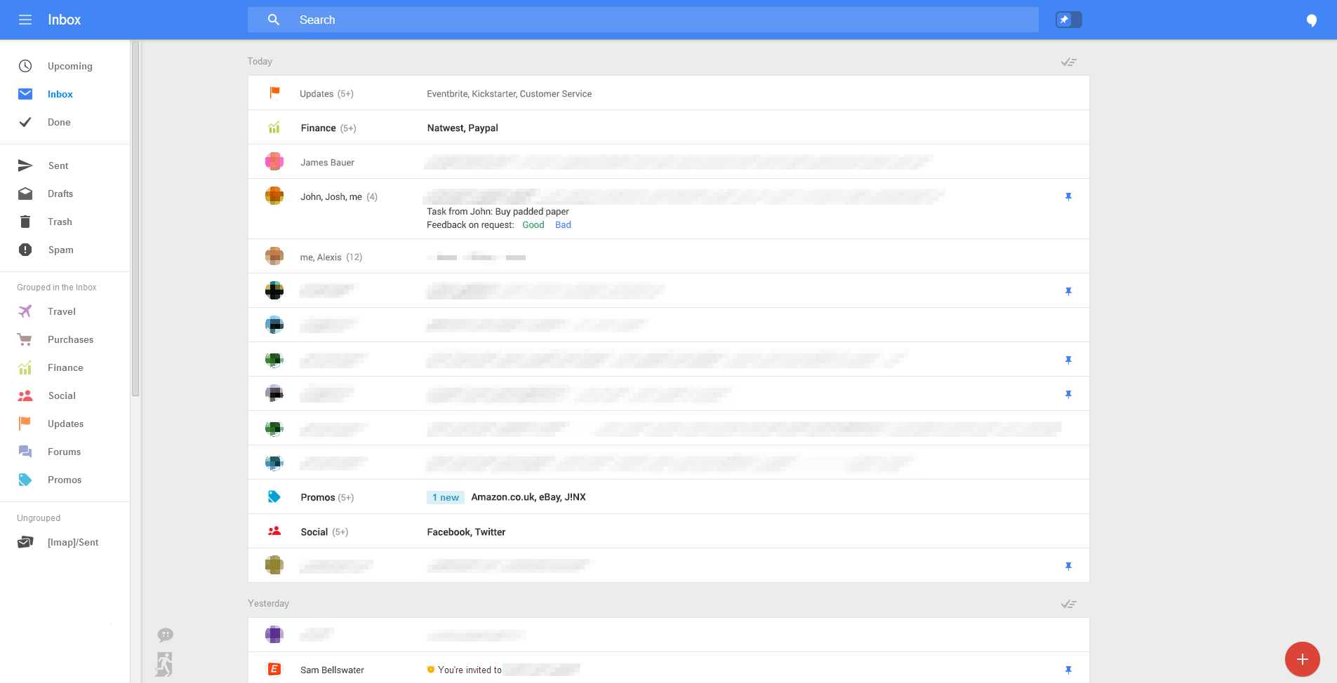
Google is constantly testing new designs and features, but Geek recently spotted a beautiful new visual overhaul of Gmail’s web interface.
The leaked images show a radically simpler inbox with less clutter and a big focus on email itself. These leaked desktop designs also match up with a previous leak of mobile Gmail’s new interface.
A hamburger menu on the top left hides labels to reduce visual overhaul and a new button on the lower right reveals a menu that offers actions the user can perform, such as composing email or setting a reminder.
Stars appear to have been renamed ‘pins’ and the inbox also appears to allow the user to ‘snooze’ an email for reminder later, just like in Mailbox.
Gmail hasn’t made many major design tweaks to Gmail since its current layout was rolled out to users in 2011.
It appears Google could be preparing to release this new design in the near future (perhaps at Google I/O), but we don’t have any further details on when it’ll be hitting your inbox just yet.
Update: We contacted Google for comment on this leak but it simply replied “we don’t comment on rumor or speculation.”
➤ Google is testing new web-based Gmail features [Geek]
Don’t miss: Google updates its terms of service to explicitly say it’s analyzing your emails for tailored ads
Image credit: Shutterstock
Get the TNW newsletter
Get the most important tech news in your inbox each week.


