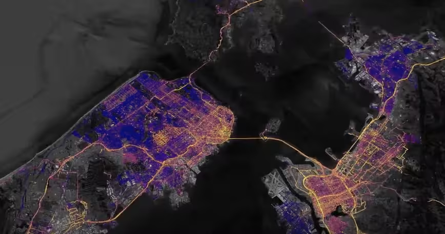
Google has undertaken yet another initiative that aims to raise awareness of the importance of protecting the environment. The company has teamed up with envirotech firm Aclima to measure air pollution levels in California and map out the findings on its Earth platform.
The effort will see the two companies release hyperlocal air quality data for the regions of the San Fransisco Bay Area, Los Angeles and Central Valley. To put this information together, the two companies covered more than 100,000 miles over the course of 4,000 hours using Google Street View cars.
“Scientists and air quality specialists can use this information to assist local organizations, governments, and regulators in identifying opportunities to achieve greater air quality improvements and solutions,” said Google Earth Outreach program manager Karin Tucen-Bettman.
“The measurements indicate that traffic-choked freeways, traffic on local streets, and weather patterns that blow pollution inland all influence the patterns of air pollution,” she continued.
Scientists doing research in air pollution can request access to all this data by filling out this form. “[W]e hope this information helps us build smarter more sustainable cities, reduce climate changing greenhouse gases and improve air quality for healthier living,” added Tucen-Bettman.
The company says that so far it has registered over one billion air quality data points, but promises this is merely “the beginning.”
The Mountain View heavyweight conducted a similar experiment earlier this year in Oakland, where the company partnered with the Environmental Defense Fund and the University of Texas at Austin to identify areas with elevated levels of pollution.
The collaboration ultimately resulted in this interactive map that reflects the most severely contaminated areas.
Meanwhile, those who dig this sort of interactive climate projects should also check out this sun map the Big G made to help users decide whether they need a solar panel on their roofs.
Get the TNW newsletter
Get the most important tech news in your inbox each week.